Matlab is great for producing high-quality graphs and plots for all kinds of science and engineering problems. Plots can exported to many formats, and inserted directly into reports or journal articles.
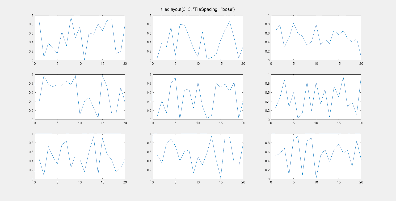
Matlab is also great when you want to create multiple plots together on a single figure. The standard way to do this is with the subplot() command. Indeed, you can create attractive figures with a grid of plots. The following code creates a 3 x 3 set of 9 plots:
figure('units','normalized','outerposition',[0 0 1 1]);
for i = 1:9
   subplot(3, 3, i)
   plot(rand(1, 20));
end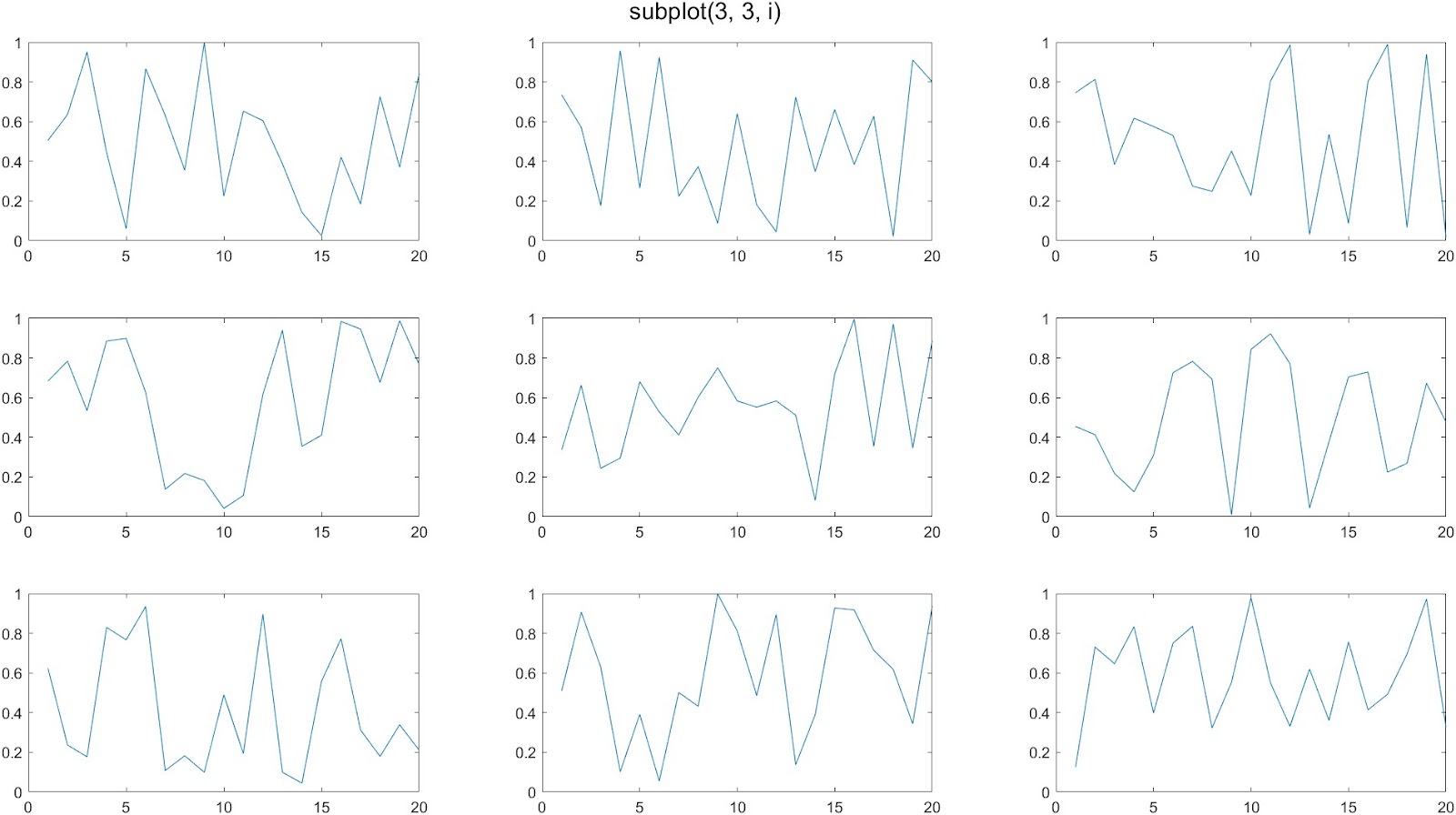
A common complaint about the subplot function is that it leaves too much whitespace in between the plots. This is especially noticeable when you are making plots without tick labels on the x-axis or y-axis:
tiledlayout()
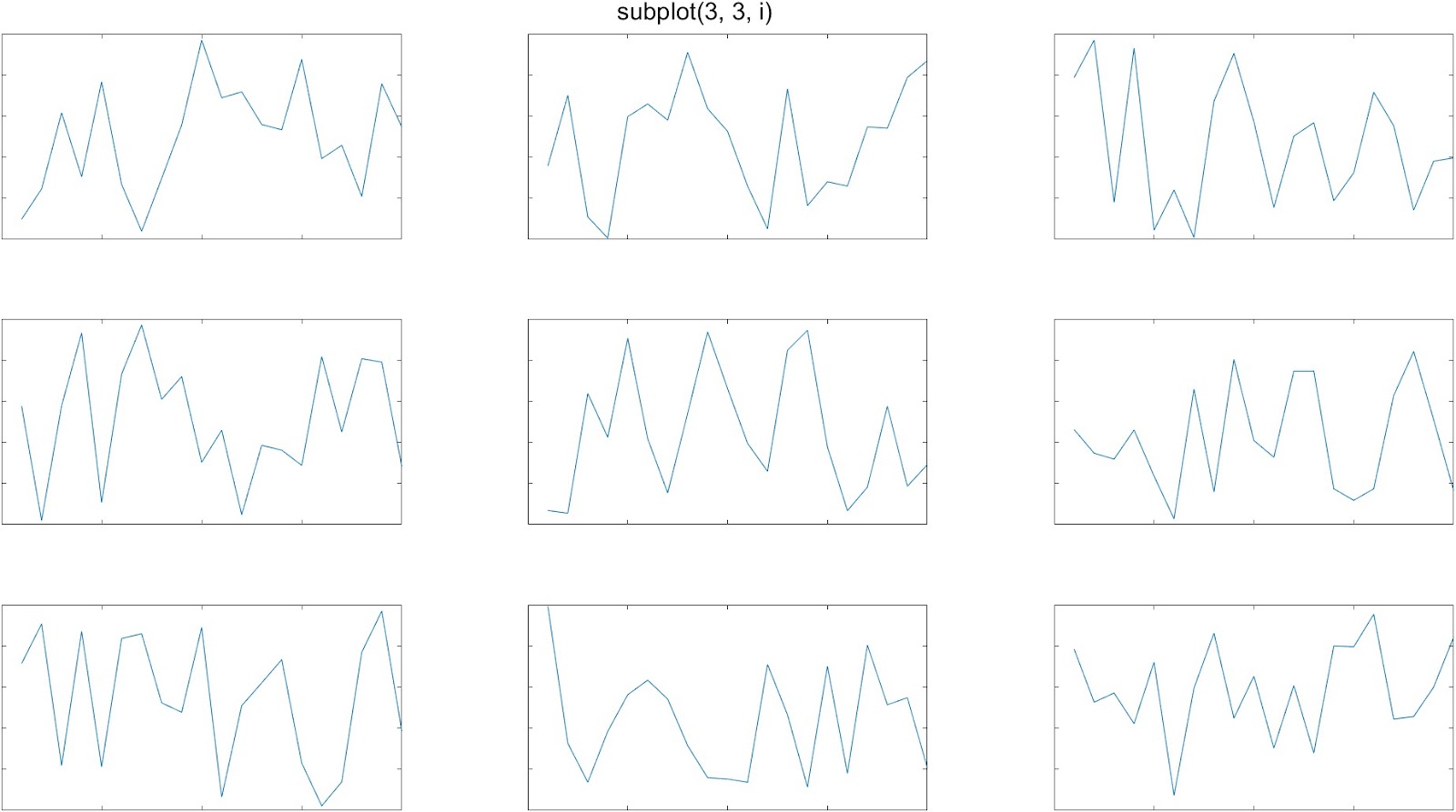
In 2019, Matlab introduced the tiledlayout() function as an alternative to subplot(), which gives you more control over the amount of space between the individual plots. Here’s an example of it’s use:
figure('units', 'normalized', 'outerposition', [0 0 1 1]);
t = tiledlayout(3, 3, "TileSpacing", "tight");
for i = 1:9
   nexttile
   plot(rand(1, 20));
end
The ‘TileSpacing’ parameter can take the values ‘tight’, ‘none’, ‘compact’, or ‘loose’. This gif shows the difference:
tight_subplot()
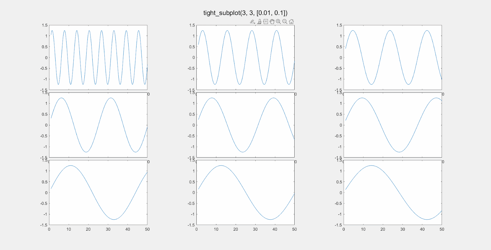
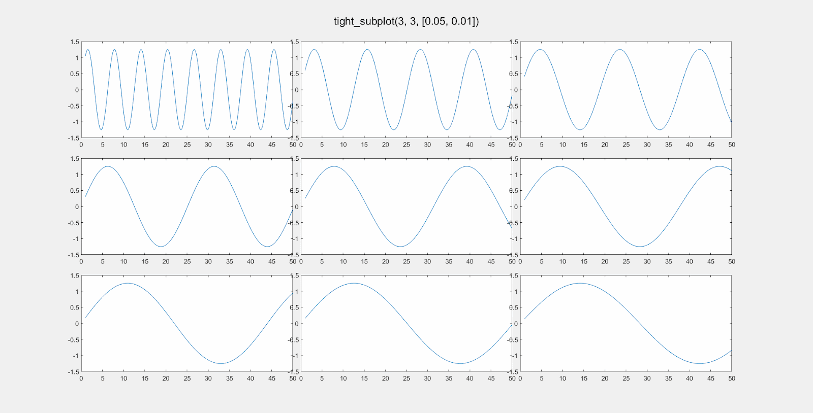
The tiledlayout function works well, most of the time. If you need even more control over the layout of your subplots, head over to the Matlab File Exchange, and download the function tight_subplot(). There are many similar contributions, but this one appears to be the most popular, with 47K downloads as of early 2023. It works perfectly and is simple to use once you get the hang of it.
With the tight_subplot() function, you can specify exactly how much space you want between plots.
You can separately adjust the vertical spacing and horizontal spacing between subplots.
To do this, adjust the parameters gap_h and gap_w for the gap distance between plots in the horizontal and vertical directions.
[ha, pos] = tight_subplot(rows, cols, [gap_h, gap_w]);The function returns two variables. The first is an array of handles of the axes objects. You have to activate the axis in order to make a plot. For example:
[ha, pos] = tight_subplot(3, 3, [0.05, 0.05]);
for i = 1:9
    axes(ha(i));     % Don't forget to 'activate' the axis.
    plot(rand(10, 1);
end
The values for gap_h and gap_v are “normalized units” from 0 to 1, where 1 is the full width or height of the computer screen is 1. So setting gap_h to 0.01 means the horizontal gap between the plots will be 1% of the screen width. Here is an illustration of changing gap_h:
Here is the effect of modifying gap_w:
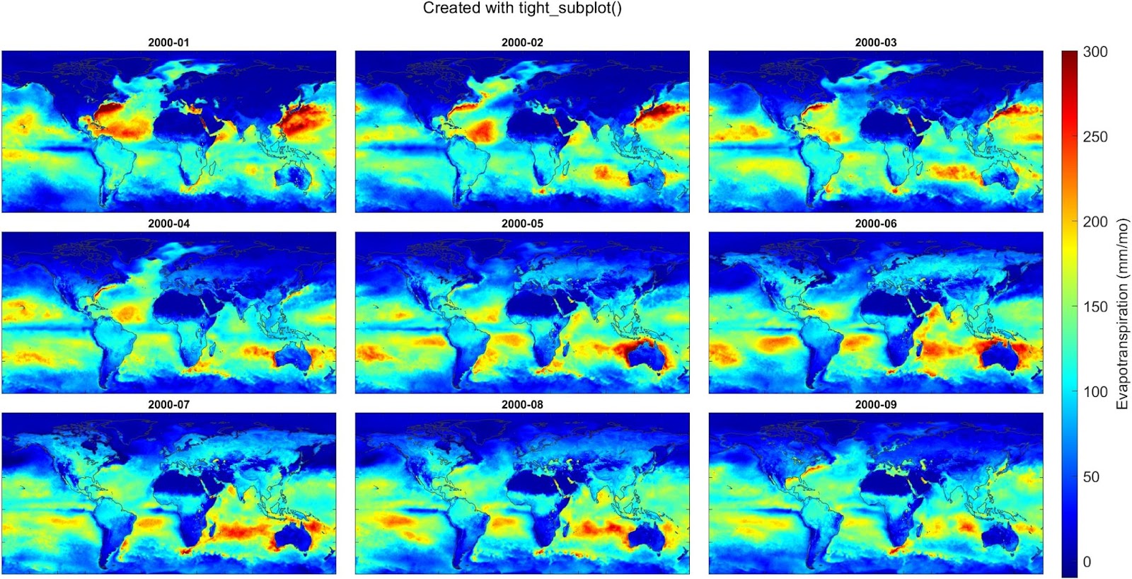
And here’s an example where I used the tight_subplot function to create a set of maps of global evapotranspiration over 9 consecutive months, using data from a meteorological reanalysis model called ERA5. This works well because we don’t need axis labels. I also used the trick of creating a single colorbar and customizing its position on the figure.