The watershed delineation code delineator is now a Python package available on PyPI, the official Python package repository. The best part: it’s totally free and open-source.
This package is based on code that I wrote during my PhD and released on GitHub back in 2022. It enjoyed moderate popularity (I think?) with a few stars and forks. The code has a few nice features that make it fast and efficient compared to other methods. It lets you create huge watersheds using high-resolution data on a laptop. This same task would have required a supercomputer a few years ago.
Last year, I submitted a manuscript about the software to a journal, which was rejected. ☹️ Before revising and resubmitting elsewhere, I decided to do a major rewrite of the software to make it easier to install and use. Previously, it was a collection of Python scripts that required careful setup and configuration. Now it’s as simple as running pip install delineator to get started. With just one line of code, you can generate geodata for the watershed boundary and the river network like this:
This code is basically the engine behind the popular Global Watersheds web app. With the delineator Python package, you can do all the calculations on your own machine, with locally hosted data. The package will automatically download the data files that you need at run-time, as long as you are connected to the internet. You can also customize certain parameters that are hard-coded in the web app, making it more flexible. For example, you might want to adjust the pour point snapping threshold, one of the elements that makes watershed delineation and art and a science.
If you’d like to try it out, first make sure you have Python 3.10 or higher installed. Then follow the installation instructions and the Quick Start guide here: https://github.com/mheberger/delineator. Drop me a line if you have any thoughts or feedback about the package!
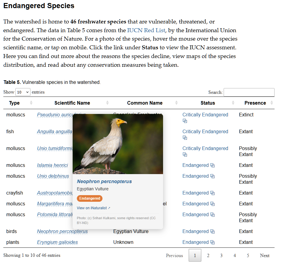
This week, I added an exciting new feature to Global Watersheds — Watershed Data Reports now include information on endangered species. The app finds species whose range overlaps the watershed and displays some basic information about them, with links to more detailed info. For example, see this Report on the Seine upstream of Paris, France.
Data on endangered species comes from the IUCN Red List, by the International Union for the Conservation of Nature. The IUCN is an international organization that compiles authoritative information on endangered species around the world. If I understand correctly, much of the actual work is done by volunteers.
To build this new feature, I downloaded the geodata on species range from the IUCN, focusing on “freshwater species.” This includes plants, fish, mollusks, and crabs, but also a large category “other” that included mammals, birds, amphibians, fungi, etc. It makes sense, as these species rely on freshwater too.
By default, the species are ranked by their conservation status, with “critically endangered” species at the top. This means that the population is declining and there is an imminent risk of extinction. Another category is “vulnerable,” meaning there is a high risk of extinction in the wild. Finally, “near threatened” means that the species “is close to qualifying for or is likely to qualify for a threatened category in the near future” according to the IUCN.
If you hover over the scientific name, you can view photos of many of the species, courtesy of iNaturalist.com. Click through to iNaturalist to view more photos and find a wealth of other information. The table also includes a link to the IUCN’s latest latest assessment of the species status. Here, you can get detailed information on the species, view a map of its range (where it lives, breeds, or migrates), and read about the reasons for its decline and any conservation actions that are being taken to protect the species.
I noticed that the maps on the IUCN’s web page don’t always load correctly. I emailed the IUCN about this, and got this prompt reply: “We are indeed aware of this issue and working to solve it. At the moment, images of the maps can be found in the assessment PDF, and the underlying spatial data can be downloaded as well. Both of these are available from the “Download” button on the top-right of each species page.”
I have found this new feature to be extremely eye-opening and somewhat alarming. There are threatened and endangered species in every watershed on Earth.
I had no idea there were so many endangered freshwater mollusks. (I also didn’t know much of the English-speaking world spells it mollusc, with a C!) Many of these snails and bivalves don’t even have a common name. Is this lack of familiarity be a barrier to their conservation?
The photos of birds are so gorgeous; it would be such a shame to allow such beautiful creatures to go extinct.
I decided to add a section with the title What Can I Do? Hopefully this will inspire people to take action. I hope this has the right tone. While the situation for many species is dire and they face many threats, there is much that can be done and we can’t give in to despair.
Let me know what you think. What do you notice in your watershed? How do you think this information could be used? Please don’t hesitate to be in touch to share your thoughts.
I first heard about AI-generated podcasts about a year ago. I have pretty mixed feelings about them. I’d rather listen to real human hosts with a passion for their subject. But I also read that graduate students were using them to summarize papers, and listening to them while doing the dishes or on a walk. Knowing how impossible it is to keep up with the latest developments in science, I was intrigued by this, so I gave it a try, using Google’s NotebookLM.I uploaded a handful of papers I wanted to read, and created a podcast episode.
The results were fairly mixed. With technical papers, I didn’t feel like I gained much insight or understanding. The AI hosts engaged in a lot of “puffery.” They tend to exaggerate the significance or importance of things. Everything is a “big deal” and a “game changer.” Still, it was interesting. I’ve long wished there was a podcast where the host would geek out on the latest research in hydrology and earth science.
I’m left thinking there’s real potential here, but it will require more “human in the loop” creation process, where a person with knowledge and interest curates and edits the discussion. That might help the AI hone in on the more interesting or innovative aspects of a paper, or to reign in some of AI’s worst impulses, like repeating the phrases “deep dive” or “delve into.”
On a whim, I decided to create an AI podcast about my Global Watersheds web app. I uploaded the app’s Help/About page to Notebook LM, and asked it to create an “Audio Overview.” It is actually pretty good. I’m not sure how useful it is though to listen to people talking about software. In this case, it seems like a video would be more instructive.
The thing that is really uncanny about this is the emotion and realism of the AI voices. The AI hosts seem genuinely interested in the subject. There is something deeply flattering listening to two people discuss something you wrote and say how great it is.
On a second whim, I asked Notebook LM to create an infographic. It’s also not terrible. I’m actually a little jealous of how colorful and interesting it looks compared to some conference posters I’ve made.
The API for watershed and flowpath delineation has gotten popular. Last month users made nearly 4,000 requests every day. Unfortunately, increased traffic can lead to lagging response and errors. If the situation continues, I may add throttling to limit the number of requests based on your IP address.
So, a request to all API users: Please space out your requests, and avoid making asynchronous requests. You can do this by adding a pause of 5 seconds between requests.
Spacing out your requests will protect against accidental overload and ensure the service remains responsive for everyone. The app is hosted on a shared web server. I love my host, Opalstack, but I’m also not in a position to upgrade my hosting plan, as it would cost quite a bit more than the $25 per month that I’m currently paying. (If you want to help keep the site free for everyone, you can always support the site via Buy Me a Coffee!)
To my fellow watershed explorers — I’m excited to share a couple of new features I’ve been working on for the Global Watersheds web app.
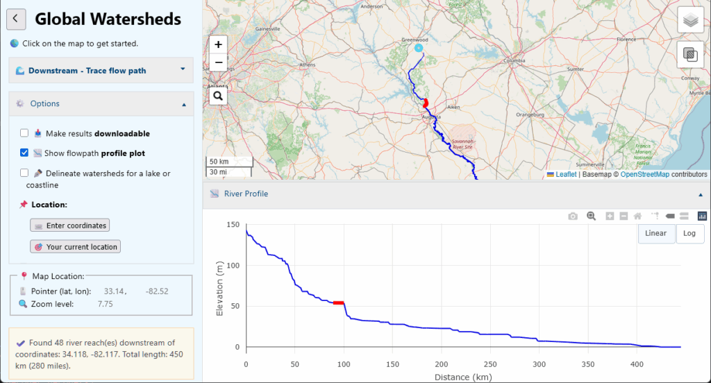
Flowpath Profiles
Under Options, check the box: 📈 Show flowpath profile plot. Now, create a new flowpath on the map. You should get an interactive plot of the river’s distance vs. elevation. Hover over the river or the profile to highlight a river reach on the map and the plot.
A few notes about the profile plot. First, It’s only available when you use MERIT-Hydro as your data source (and not HydroSHEDS or USGS). Also, the plot will only include the portions of rivers that are mapped in the MERIT-Basins dataset. In “higher-precision” mode, your flowpath starts right at the point you clicked, and maps the flow over land and through small channels and creeks. It is possible to calculate the elevation profile of the overland flowpath. But for global coverage, I would have to put over 50GB of raster elevation datasets on my web server, which is beyond my current allotment unless I pay for more disk space.
Calculating river lengths is a tricky business. The distances reported here are probably a little smaller than the truth. This has to do with the way that river flowlines have been digitized from gridded data, and do not always capture all the curves and meanders of real-life rivers.
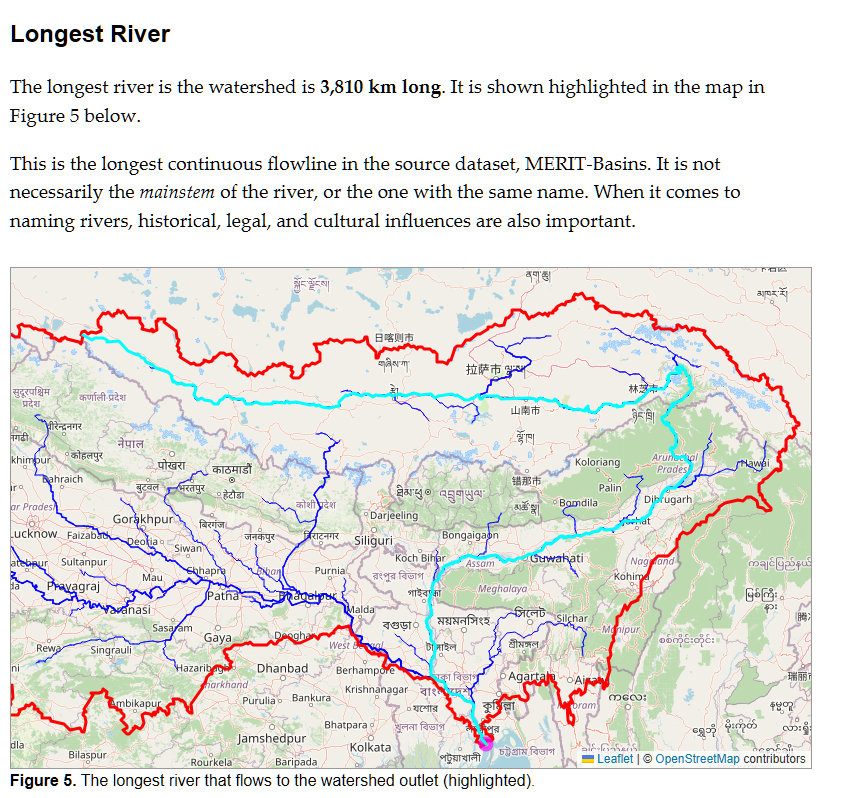
Longest River and Elevation Plots on the Watershed Data Report
After you’ve delineated a watershed, you have the option to create a “Watershed Data Report” that summarizes various scientific and socioeconomic data within your watershed’s boundaries. Now there is a new feature that shows you the longest river in the watershed.
It is not always the one you expect. In this example, if you trace the “source” of the Ganges/Bramaputra Rivers, it will lead you up a curvy path into Himalayas in Tibet to a mountain river called the Dangar Chu, and to a lake called Dzanangting Tso. This is only a few kilometers from the traditional source of the river at Chemayungdung glacier. However, if you try the Mississippi River basin, you may be surprised that it does not follow its namesake river, but instead follows the Missouri River upstream, all the way to Montana.
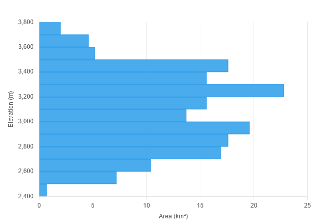
Elevation Plots
Under the heading Topography, the report also shows some statistics related to watershed elevations and a histogram of elevations it the watershed. This was something a few users emailed me to ask for. Is this interesting to most folks? I’m not sure, but I’m happy with the way it came out.
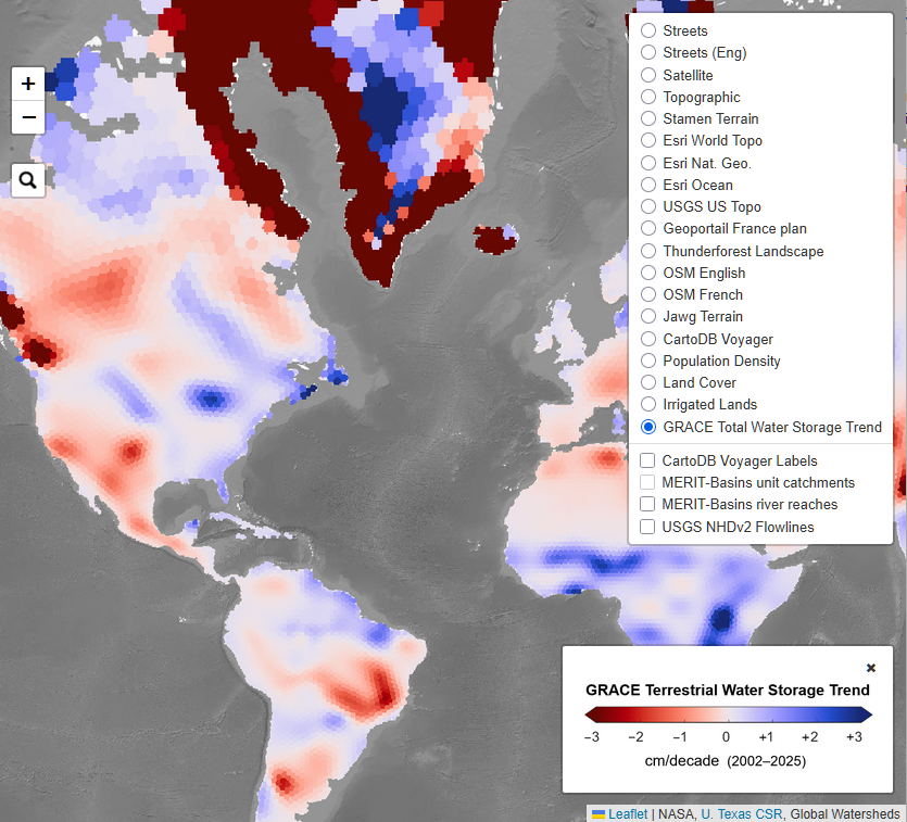
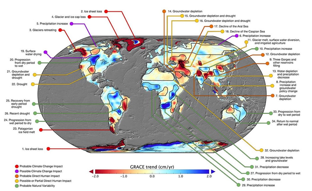
Mapping Watershed Trends with GRACE
I’ve been wanting to add a map layer using GRACE data because I think it’s incredibly cool and can tell us a lot about what is going on with water cycle. The GRACE satellites give us extraordinary insight into changes in “terrestrial water storage.” I’ve created a new map layer that shows the trend in terrestrial water storage between 2002 and 2025.
The GRACE satellites make highly accurate measurements of the Earth’s gravitational field, and provide measurements of changes in the mass of water on a monthly time scale. These measurements do not tell us how much water there is in a region, but rather, how the amount of water has changed compared to a historical baseline. The measurement includes all forms of water, including rivers, lakes, reservoirs, soil moisture, groundwater, glaciers, snow, and ice. For a longer introduction to GRACE, see this section 1.2.3 of my PhD thesis, under the heading Remote Sensing of the Water Cycle.
I obtained GRACE data from the Center for Space Research at University of Texas, Austin (download link). For this map layer, I have calculated the linear trend in every 0.25° pixel in the global dataset. Trends are based on observations of the total water storage anomaly from April 2002 to April 2025. I used Matlab and the Climate Data Toolbox, and I’m happy to share the code to repeat these calculations to anyone interested. I am basically repeating the analysis in a 2018 paper by NASA scientists in the journal Nature, “Emerging trends in global freshwater availability.” It is interesting to compare how the trend as of 2016 compare to those today.
Annotated map of terrestrial water storage trends (Figure 1 in Rodell et al., 2018)
Upgrades to the Report and Share Pages
I also refactored the way that the report works — you can now link directly to reports. This means you can share them with friends, family, and colleagues. For example, here is the report for the Amazon River, one of the most frequently requested watersheds on the app:
You may also notice a small difference in the shared watershed pages, with shorter URLs, and a button to open a Watershed Data Report on every share page.
Let me know what you think about these new features. And if you see any bugs or have any suggestions, let me know!
In November 2022, I posted a tutorial on how to use the US Geological Survey’s web service NLDI to delineated watersheds in the continental United States. Since then, they updated the API, and that old code no longer works. Here is an updated Python script. I’m using the library pynhd, which gives convenient access to the NLDI. You could also use the API directly with the requests library.
This NLDI gives access to data from the National Hydrography Dataset Plus version 2. This is an older version of the NHD that is no longer being updated. At this time, the USGS does not have an API to access the latest version of its geodata, the 3DHP. So if you wanted to use those data for watershed delineation, I suppose you would have to download the data and use GIS or write your own routines.
Let me know what you think. Would you be interested in a Python package that you could install with pip? What kind of output is most useful?
Now the Global Watersheds web app can use USGS data and methods (NLDI) to delineate watersheds in the continental United States. This means more accurate watersheds and flow paths in the US.
To access it, make sure to do a full reload of the page: https://mghydro.com/watersheds. In most browsers, you can hit: Ctrl + Shift + R or Ctrl + F5.
To use the USGS option, click on Options, then under Data Source, select “USGS.”
Here, the app is using a free API from the USGS called the Hydro Network Linked Data Index, or NLDI. This option was available a couple of years ago, but at one point, the USGS updated their API and it broke my code. It took me a while to get around to fixing it!
A few notes: Sometimes the USGS API will time out without returning results. I’ve set up the app to automatically retry 3 times, but if you get an error message, please wait a moment and try again. You can also try clicking on a slightly different point, like 0.001° from your original request. Be patient — their server can take a few minutes sometimes.
I’ve also added another feature that should help you to get good results — the NHDv2 Flowlines layer on the map. (The National Hydrography Dataset version 2 is the dataset used by USGS for the NLDI.) In the map layer selector at the upper right, choose this layer at the bottom of the list. (See image below.)
To get good watershed delineation results, click on the flowline for the river whose watershed you are seeking. This will help snap the pour point correctly. This should help reduce the spurious small tributary watersheds that often come up.
More about the National Hydrography Dataset
The NHD is “the nation’s water data backbone,” and gives access to geodata that has been compiled by state and federal agencies over the course of decades. Unfortunately, the version used by the NLDI is not the latest hydrography dataset created by the USGS. The naming of the different versions of the NHD is confusing, but as best as I can tell, the NLDI is based on NHD v2. This version was released in 2012, and was digitized from maps at the 1:100,000-scale. There is a later version called NHDPlus HR, for “high-resolution,” which was never quite completed for the whole nation. As of 2023, this is no longer being developed, and the USGS is now focused on creating a hydrography data product called 3DHP. There is not yet an API to access these datasets, but they are available for download.
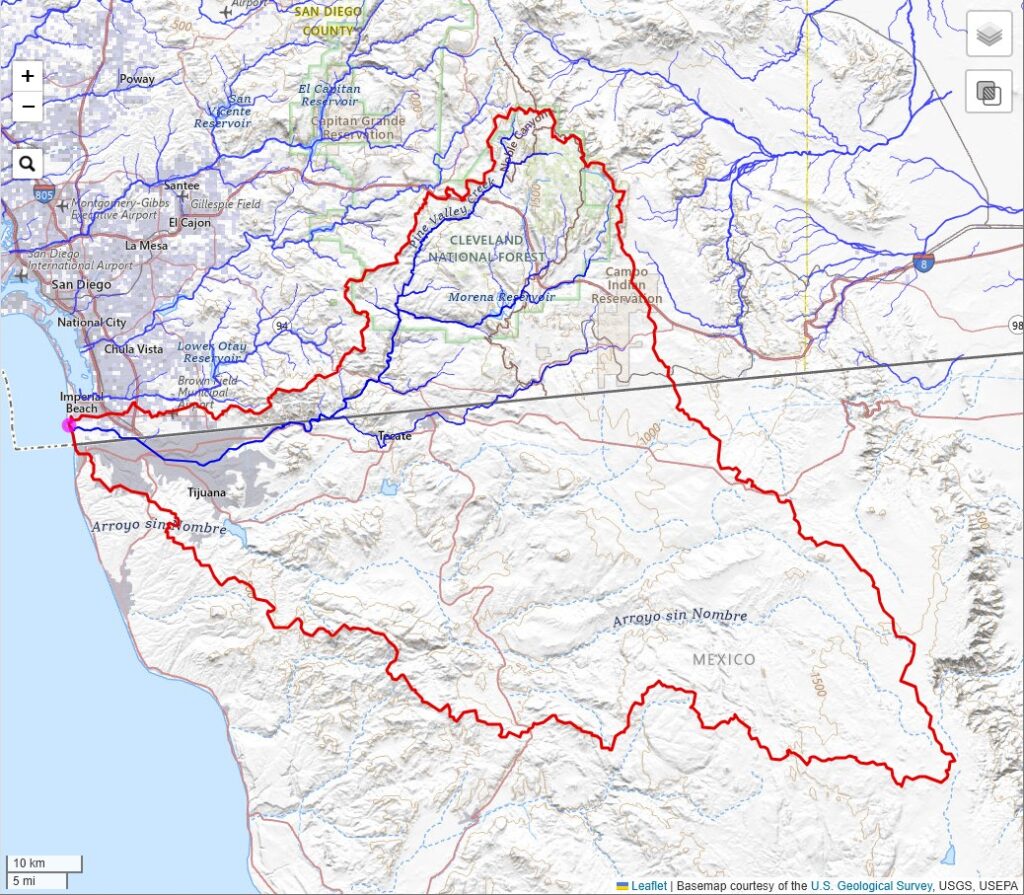
One quirky thing about the NHD is that it is only for the continental United States, affectionately referred to as CONUS. So you will see missing data around the border with Mexico and Canada. For example, here is the watershed of the Tijuana River — the watershed boundaries are complete, but most of the rivers in Mexico are missing.
Let me know how this new feature works for you. I always like hearing from folks using the app. If you found the app helpful, consider supporting the site by buying me a coffee! ☕☺️
If you’ve studied hydrology or climate science, you’ve probably come across the Budyko curve, or the Budyko Framework. Soviet climatologist Mikhail Ivanovich Budyko published what is now the well known Budyko curve, a conceptual model describing the relationship between the water and energy balances of a catchment or region. It has been hotly debated for decades and scientists still write hundreds of papers about it every year.
I was curious about the original source for this. Some sources report it as Budyko’s Book Water for Life, published by UNESCO in 1974. However, the original publication predates this by almost 20 years. And I was surprised to find it, of all places, on the website of the CIA!
I cleaned up the PDF by cropping the pages, running character recognition, and compressing the images. You’ll find the famous Budyko curve at the top of page 74 in the book (page X in the PDF).
Citation: Budyko, M. I. (1956). Teplovoĭ Balans Zemnoĭ Poverkhnosti (Heat Balance of the Earth’s Surface). Gidrometeorologischeskoe izdatel’stvo (Hydrometeorological Publishing House), Leningrad, USSR (Translated by N. A. Stepanova, U.S. Weather Bureau, 1958, 259 pages).
If you enjoyed adding this classic to your library, consider buying me a coffee. 🙂
I’ve just published a bunch of updates to the free Global Watersheds web app. Please check them out, and, as always, let me know if you have any questions or comments. I always love hearing from folks who use the app.
New Thematic Map Layers
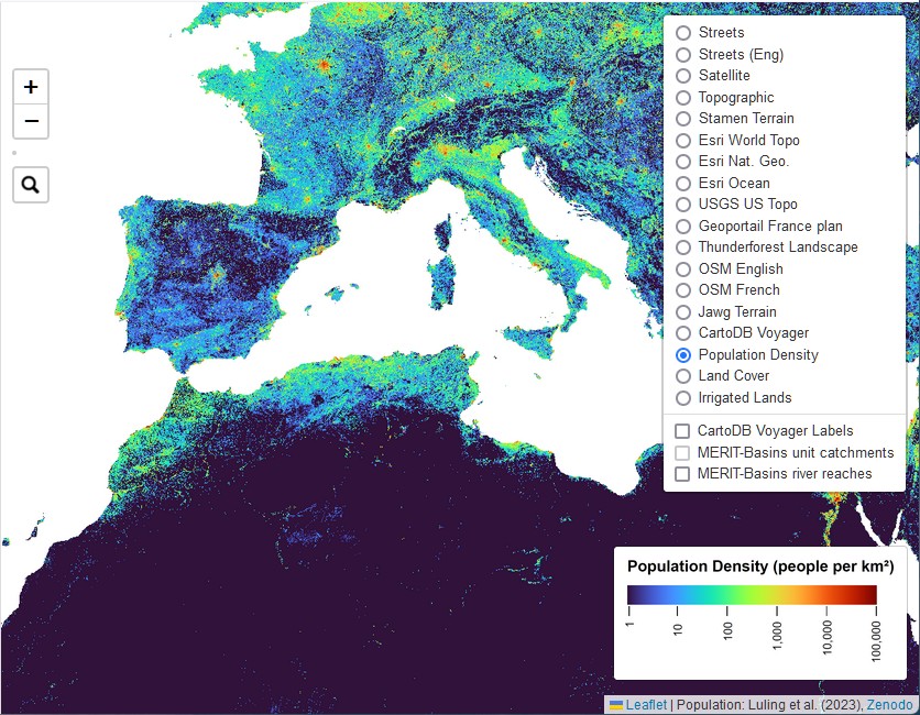
Did you know you can change the basemap shown on the map, by clicking the layer selector at the top right? I’ve added three new thematic map layers — population density, land cover, and irrigated lands. These layers help illustrate human activities that can have big impacts on watersheds.
I chose to use a datalayer of population called GlobPop, by researchers in Beijing. This seemed to be the best among the alternatives I looked at (GPW4, GRUMP, LandScan, and WorldPop). This was actually quite surprising, as some of these other datasets are well-known and backed by large institutions.
Three new thematic map layers. Population density is shown here.
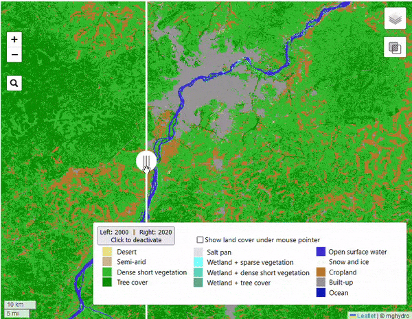
The thematic map layers were developed by different teams of researchers using satellite imagery and machine learning. While they’re not perfect, they show how these tools can help us better understand our planet. I’m particularly excited to show you the “slider” feature on that lets you compare land cover in 2000 and 2020.
This example shows the area around Bamako, the capital of Mali in West Africa. The Niger River traverses the scene from the southwest to the northeast. Bamako’s footprint grew enormously in the last two decades. You can also see forested and shrubland that have been converted to farmland.
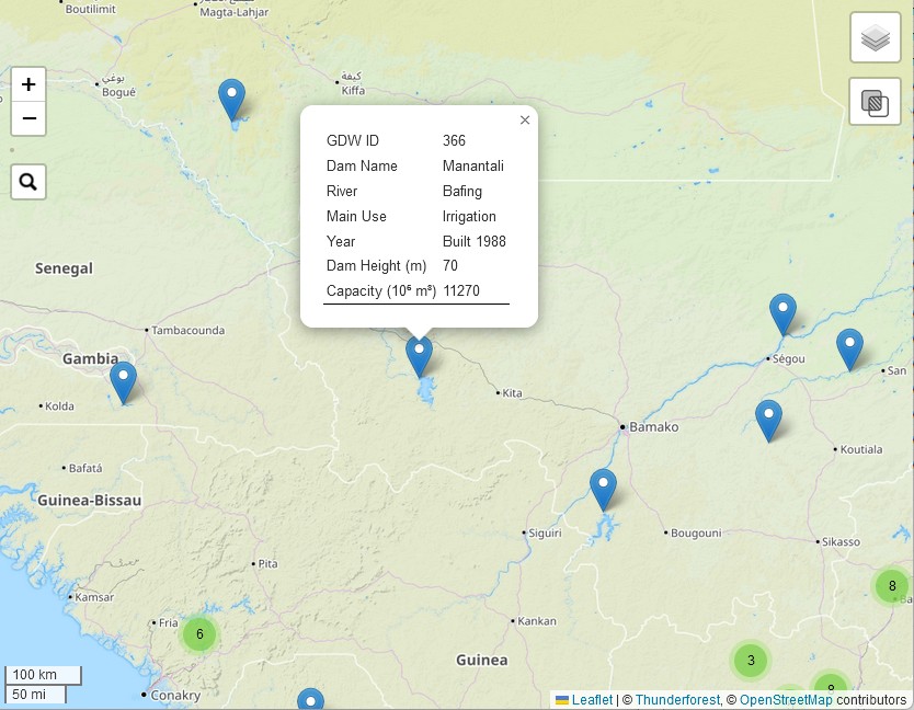
Another new layer displays dams from the Global Dam Watch database. It contains a total of 41,145 dams.
For more information about where these data come from, you can visit the About / Help page, or create a Watershed Data Report.
Watershed Data Report
After you’ve created a new watershed, you’ll see a new blue button on the left-side menu. Click this button to create a Watershed Data Report. The report summarizes a variety of information about the watershed:
I included some text in each section containing a brief introduction on how human and environmental factors affect watersheds.
Political Boundaries
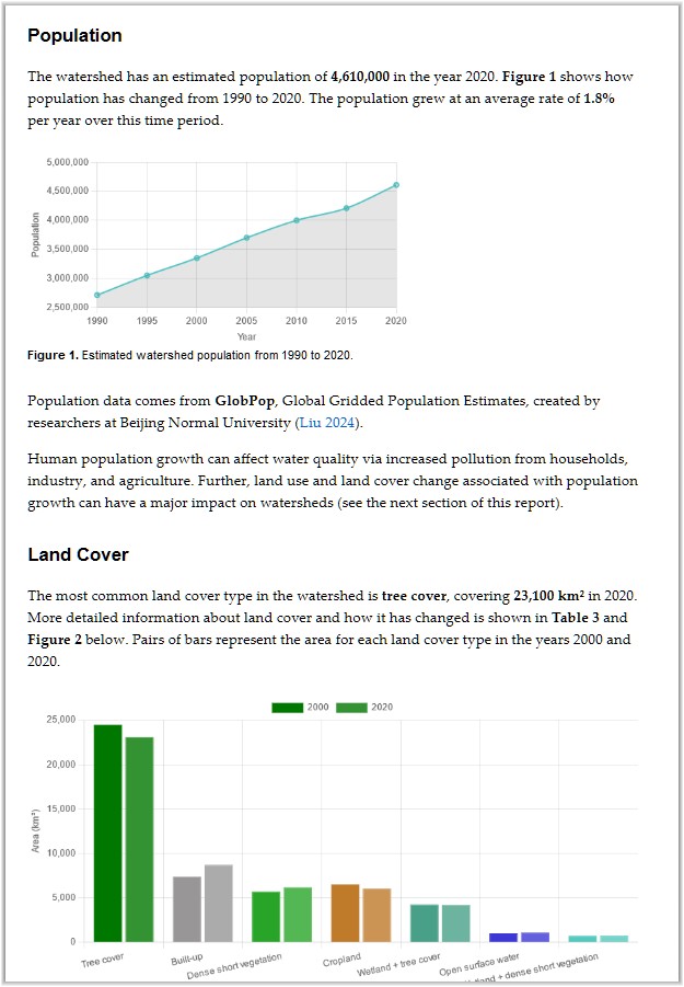
Population
Land Cover
Hydrology
GRACE Total Water Storage
Irrigation
Dams
Some of the information in the report comes from the thematic layers that you can display on the map (for example, population, irrigated area, and land cover). The app calculates sums or averages over the pixels that overlap the watershed. In geographic information science, or GIS, this is referred to as “zonal statistics.” For a discussion of how I do these calculations, see Section 3.4 in my PhD thesis, Calculating Basin Means of [Gridded] Earth Observation Variables.
Snippet of the Watershed Data Report. This one is for the Apalachicola-Chattahoochee-Flint River Basin, which has seen significant population growth, urban expansion, and loss of forests and cropland.
Finally, if you found the app useful for your classroom, business, or research, why not show your appreciation by buying me a cup of coffee?
Let me know if you found something interesting in your watershed report. How do you think this information could be useful for education, advocacy, or management? Are there any other environmental datasets you’d like to see included?
The water quality of the Seine has been making headlines, thanks to the 2024 summer Olympics in Paris. A few days ago, I discussed these issues with Kelly Yu from Radio Hong Kong.
I did my Master’s thesis on bacteria contamination of urban rivers, so it’s something I know a bit about… Paris has invested massively in improvements to the wastewater system, but much more needs to be done before the Seine will be consistently able to meet water quality standards for swimming.
This map shows the watershed, or drainage basin, upstream of Pont Alexandre III in Paris, where the Olympic open-water swimming events will be held:
The watershed covers 44,000 square kilometers, and includes cities, suburbs, farms, and forests. The watershed is an important determinant of the water quality in a river. In this case, every time it rains, pollutants are washed off of land surfaces and into lakes, rivers, and streams. Here is what I wrote about nonpoint source pollution in my MS thesis in 2003:
Runoff from land areas in the watershed is also a significant pathway by which bacteria enter surface waters. Urban runoff typically contains a variety of pollutants, including organic matter, oil and grease, nutrients, pesticides and herbicides, as well as bacteria and viruses. Bacteria in runoff can come from waste from pets and wildlife or may be attached to soil particles. In an urban setting, where storm drains are designed to get water away from roads and buildings as quickly as possible, nonpoint source pollutants are quickly delivered to surface waters, with little time for settling or decay to occur.
Paris also has a major illicit discharge problem, where boats and homes discharge sewage water directly to rivers or streams. I learned about this in an excellent article from the NY Times; this topic has received scant coverage in French-language media.