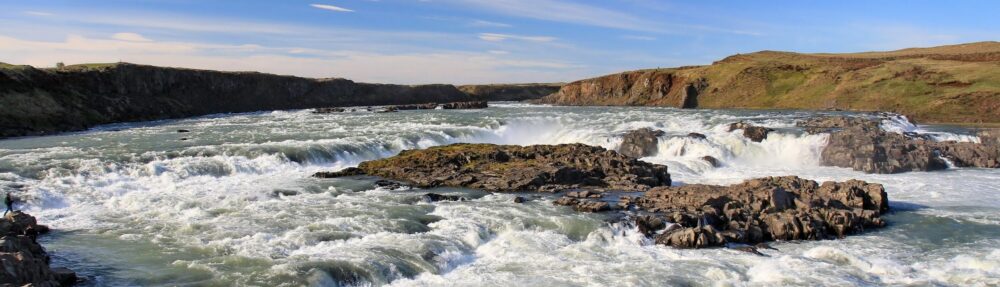
I recently became aware that the Global Watersheds app occasionally goes down when it’s under heavy load. At its peak, the app is delivering a watershed every 1.2 seconds. You all are loving the site to death! 🙂
I’ve upgraded my hosting plan to 2GB of RAM. Let’s see how much that helps. It costs a few hundred dollars per year, which is a lot for a hobby project by a full-time student. If you’ve enjoyed using the app, or it’s been valuable in your work, would you please support it by sending a few dollars? Thank you! 🙏 💕
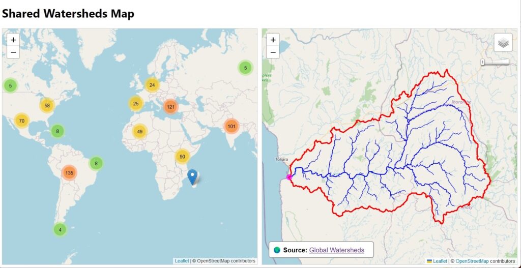
The Global Watersheds web app has a nice feature that it seems only a few people have discovered. You can create a permalink to an interactive map of your watershed (or flowpath). Then you can embed the map on a web page, send it to a friend, or post it on your favorite social media site. Just look for these buttons at the bottom left after you have created a new watershed:
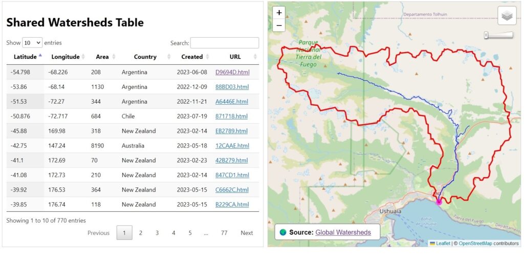
Since the app was launched in October 2022, users have created 770 shared watersheds. Here is a map and a table showing all of them. In that same time, users have made over 237,000 watersheds and over 36,000 flow paths.
Matlab is great for producing high-quality graphs and plots for all kinds of science and engineering problems. Plots can exported to many formats, and inserted directly into reports or journal articles.
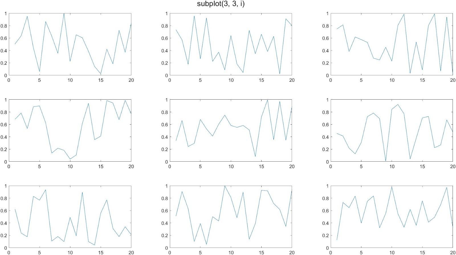
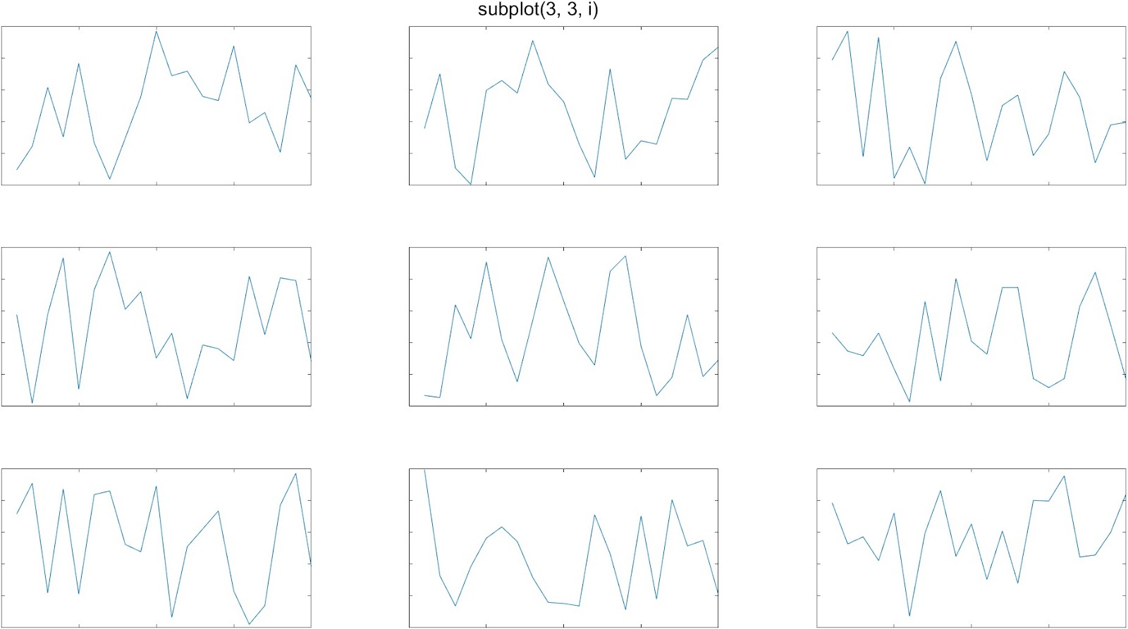
Matlab is also great when you want to create multiple plots together on a single figure. The standard way to do this is with the subplot() command. Indeed, you can create attractive figures with a grid of plots. The following code creates a 3 x 3 set of 9 plots:
figure('units','normalized','outerposition',[0 0 1 1]);
for i = 1:9
   subplot(3, 3, i)
   plot(rand(1, 20));
end
A common complaint about the subplot function is that it leaves too much whitespace in between the plots. This is especially noticeable when you are making plots without tick labels on the x-axis or y-axis:
tiledlayout()
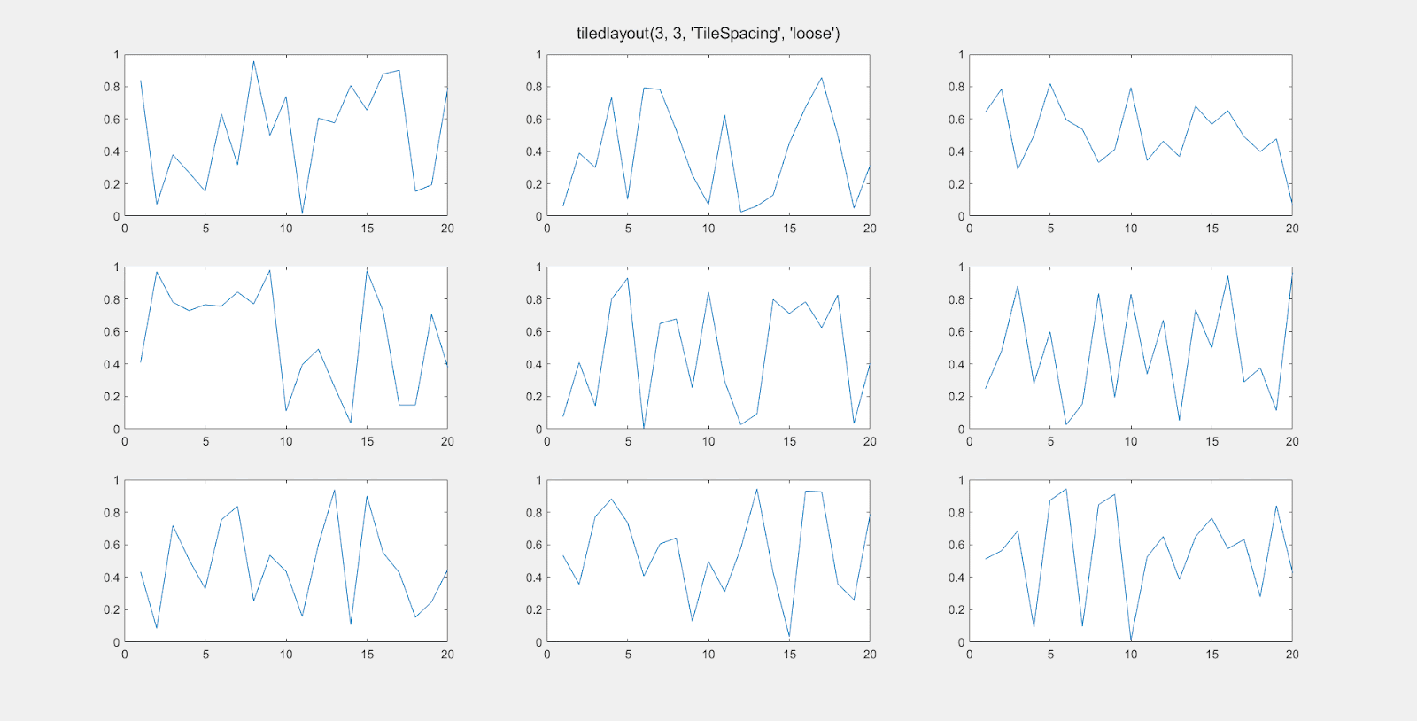
In 2019, Matlab introduced the tiledlayout() function as an alternative to subplot(), which gives you more control over the amount of space between the individual plots. Here’s an example of it’s use:
figure('units', 'normalized', 'outerposition', [0 0 1 1]);
t = tiledlayout(3, 3, "TileSpacing", "tight");
for i = 1:9
   nexttile
   plot(rand(1, 20));
end
The ‘TileSpacing’ parameter can take the values ‘tight’, ‘none’, ‘compact’, or ‘loose’. This gif shows the difference:
tight_subplot()
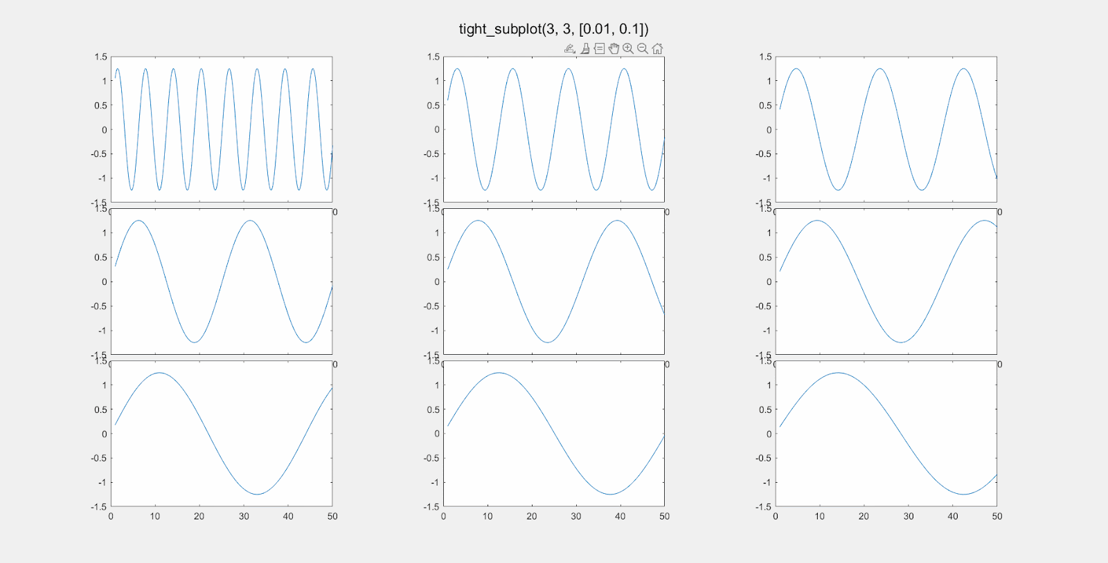
The tiledlayout function works well, most of the time. If you need even more control over the layout of your subplots, head over to the Matlab File Exchange, and download the function tight_subplot(). There are many similar contributions, but this one appears to be the most popular, with 47K downloads as of early 2023. It works perfectly and is simple to use once you get the hang of it.
With the tight_subplot() function, you can specify exactly how much space you want between plots.
You can separately adjust the vertical spacing and horizontal spacing between subplots.
To do this, adjust the parameters gap_h and gap_w for the gap distance between plots in the horizontal and vertical directions.
The function returns two variables. The first is an array of handles of the axes objects. You have to activate the axis in order to make a plot. For example:
[ha, pos] = tight_subplot(3, 3, [0.05, 0.05]);
for i = 1:9
    axes(ha(i));     % Don't forget to 'activate' the axis.
    plot(rand(10, 1);
end
The values for gap_h and gap_v are “normalized units” from 0 to 1, where 1 is the full width or height of the computer screen is 1. So setting gap_h to 0.01 means the horizontal gap between the plots will be 1% of the screen width. Here is an illustration of changing gap_h:
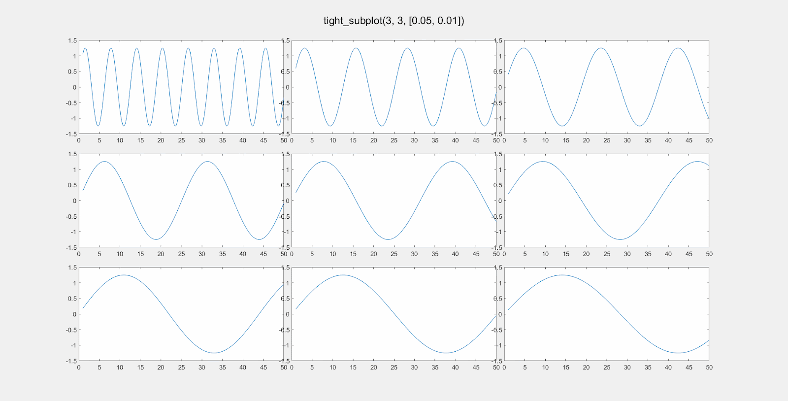
Here is the effect of modifying gap_w:
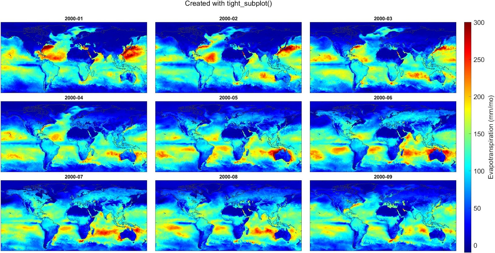
And here’s an example where I used the tight_subplot function to create a set of maps of global evapotranspiration over 9 consecutive months, using data from a meteorological reanalysis model called ERA5. This works well because we don’t need axis labels. I also used the trick of creating a single colorbar and customizing its position on the figure.
In this post, I’ll give a short tutorial for how to calculate the average precipitation over a watershed or river basin. This is a common task in hydrology and environmental science.
Historically, hydrologists used data from rain gages, which report precipitation at a single location. Yet, everyone knows that rainfall varies a lot from one place to another. So for a large watershed, you might have gathered data from several gages. Hydrologists have developed several clever methods for averaging point observations from multiple gages.
Today, gridded climate data are widely available. For precipitation, gridded data can give you much more information about how rainfall varies with geography. Also, they can give you information for remote or sparsely populated regions where rain gauges are scarce.
If you’re in the US, you might be using PRISM, which is based on a sophisticated interpolation of data from hundreds of gages. Or you could be using a global dataset based on satellite remote sensing, for example CMORPH. If you are looking back at history and need long records, you might choose output from a reanalysis model like NCEP or ERA5.
Below, I show how to calculate the spatial mean of these data. I use precipitation as an example, but the same methods will work with any kind of gridded environmental data – evaporation, temperature, land use, vegetative cover, etc. I’m also talking about watersheds, but the same methods could be used to get the average over a city, a province, the boundaries of a bioregion, etc.
If you only need to do this calculation once, you can use GIS to calculate a zonal average. I’ll show how to do it with the free software QGIS. If you need to do this calculation many times (i.e. with daily precipitation), you will want to write code to automate this. I’ll show how to do that in a future post.
Example Application: Flooding on the Winooski River
Here, we’ll estimate the amount of rain that fell over the Winooski River watershed in Vermont on July 11, 2023, a day where there was major flooding. Here are the steps:
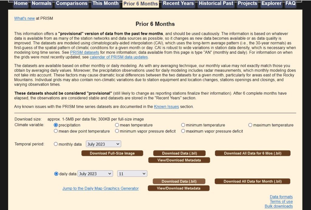
1. Get PRISM precipitation
Go to https://prism.oregonstate.edu/. There are lots of different options. I downloaded provisional daily precipitation for July 11, 2023. Here’s what the download page looks like:
Unzip the files to a convenient location. The data are in BIL format. This is an older ESRI format for aerial photos and remote sensing data, but it shouldn’t pose a problem if you have a full installation of QGIS.
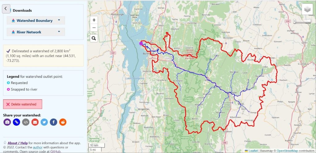
I panned and zoomed until I found where the Winooski drains to Lake Champlain.
Under Options, check the box for “Make results downloadable.”
Click on the map then click “Delineate!” button in the map popup. Or you can click “Enter coordinates” and enter 44.53, -73.27. It should look something like this:
If the results don’t look right, click in a slightly different location and try again.
On the left of the page, scroll down. Under Downloads, click Watershed Boundary. Click the button to download the watershed boundary. I recommend choosing a GeoPackage, but the other formats will work fine too.
3. Create a map in QGIS
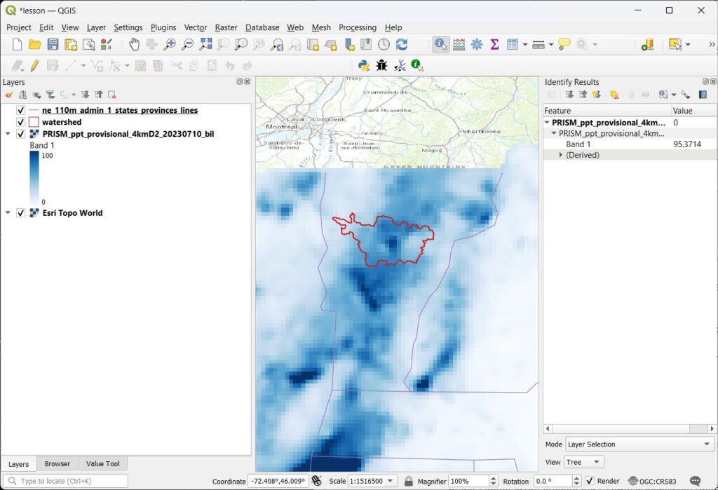
Open QGIS, and create a new project.
Add the watershed: Select Layer > Add layer > Add vector layer, then choose the watershed layer.
Add the precipitation layer: Select Layer > Add layer > Add raster layer, then choose the PRISM precip. layer. Choose the .bil file.
Here, I adjusted the Symbology of the layers to make them look nice.
Use the “Identify features” tool to check a few values of the precipitation. We can see a pixel in the center of the watershed where the precip was 95 mm on July 11. That is about 3.7 inches. A lot of rain in 24 hours!
4. Calculate the basin average
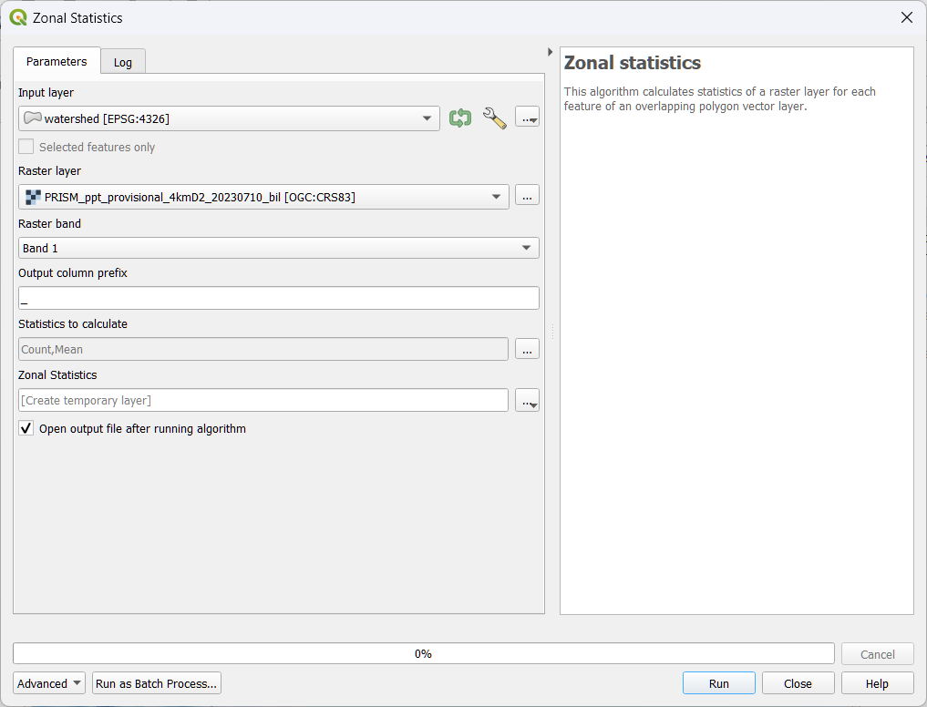
In QGIS, open the Toolbox. It looks like a little gear in the menu bar, or choose Processing > Toolbox.
Search for the tool Zonal Statistics, and double click it to open. We have to make the right selections in the window that pops up:
Under Input layer, select the watershed vector layer.
Under Raster layer, choose the PRISM precipitation raster.
Under Raster band, keep the default, Band 1. (This raster only has one band. Sometimes a raster will have multiple bands. For example, an image will have separate bands for Red, Green, and Blue.)
Under Statistics to calculate, make sure Mean is included.
Near the bottom, you can keep [Create temporary layer], or you can choose to save the results. Your choices are a variety of geodata layers. Since the results will be a table (not geodata), I chose .csv, a comma-delimited text file.
Click Run.
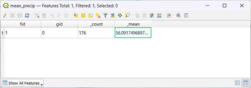
In a moment, you should see a new table appear in your map’s Table of Contents. Right click on it and choose Open Table.
Note that the table has only one row. That is because our input vector file only had a single feature.
In the table, the mean is 56. That means the watershed received an average of 56 mm of precipitation that day. The field _count has a value of 176. That means that QGIS averaged the value of 176 pixels that intersect our watershed.
Next Steps
That’s it! Now you know how to calculate the average precipitation over a watershed. This kind of calculation is extremely important in many areas of science and engineering. It’s useful for analyzing floods and droughts, in water budget studies, etc.
The approach we used required a lot of clicking. If you need to do it over and over, you can write some code to automate the calculation. Let me know if you’re interested in seeing this in a future post.
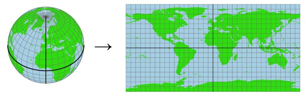
Important note: This method, using the zonal average in GIS, works well when your watershed is small. That is because the pixels all have roughly the same area. If you are dealing with a large watershed, the results will not be accurate, because the area of the pixels varies a lot with latitude. This illustration shows how grid cells get much smaller toward the poles.
This means that, for larger watersheds, you should calculate a weighted average that accounts for the varying area of the pixels. This means you’ll have to write some code to do it. In my research for my PhD, I did this calculation thousands of times, for some very large watersheds, so it was important to handle this carefully. One of my advisors wanted more details on this calculation, so I wrote a whole section about it. See Section 3.4, Calculating Basin Means for Earth Observation Variables.