I’ve just published a bunch of updates to the free Global Watersheds web app. Please check them out, and, as always, let me know if you have any questions or comments. I always love hearing from folks who use the app.
New Thematic Map Layers
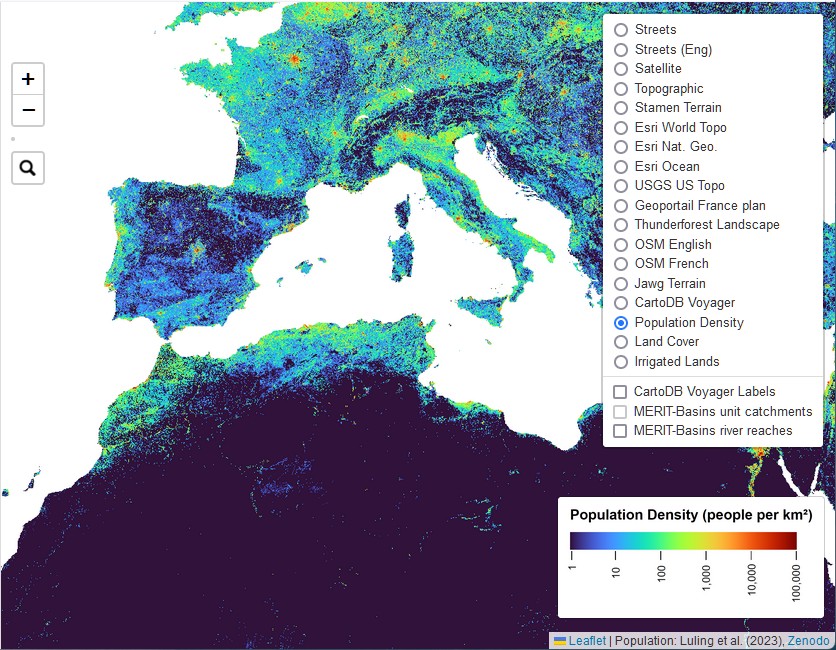
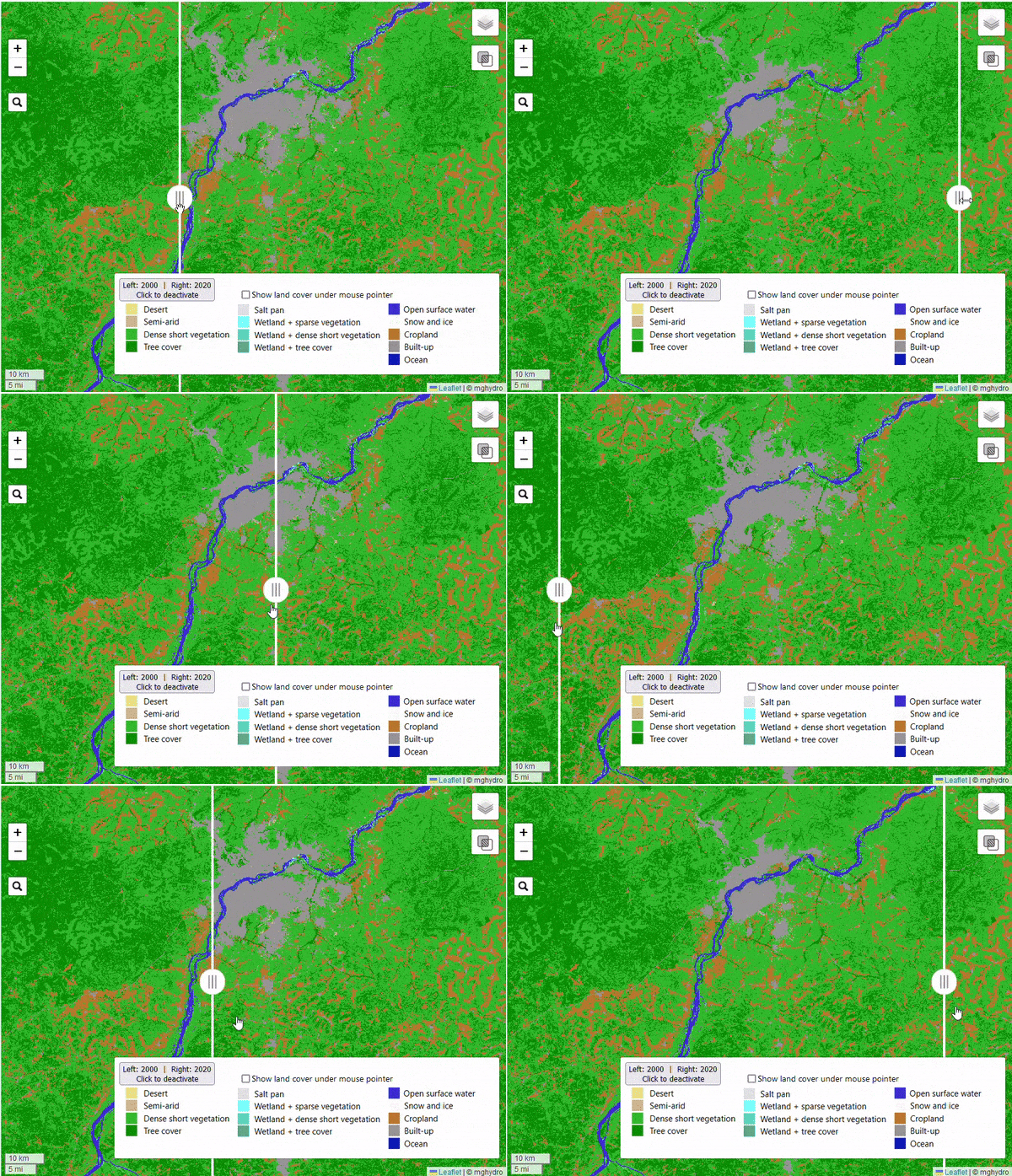
Did you know you can change the basemap shown on the map, by clicking the layer selector at the top right? I’ve added three new thematic map layers — population density, land cover, and irrigated lands. These layers help illustrate human activities that can have big impacts on watersheds.
I chose to use a datalayer of population called GlobPop, by researchers in Beijing. This seemed to be the best among the alternatives I looked at (GPW4, GRUMP, LandScan, and WorldPop). This was actually quite surprising, as some of these other datasets are well-known and backed by large institutions.

The thematic map layers were developed by different teams of researchers using satellite imagery and machine learning. While they’re not perfect, they show how these tools can help us better understand our planet. I’m particularly excited to show you the “slider” feature on that lets you compare land cover in 2000 and 2020.

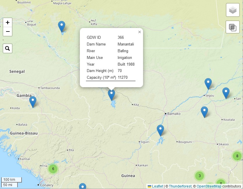
Another new layer displays dams from the Global Dam Watch database. It contains a total of 41,145 dams.

For more information about where these data come from, you can visit the About / Help page, or create a Watershed Data Report.
Watershed Data Report
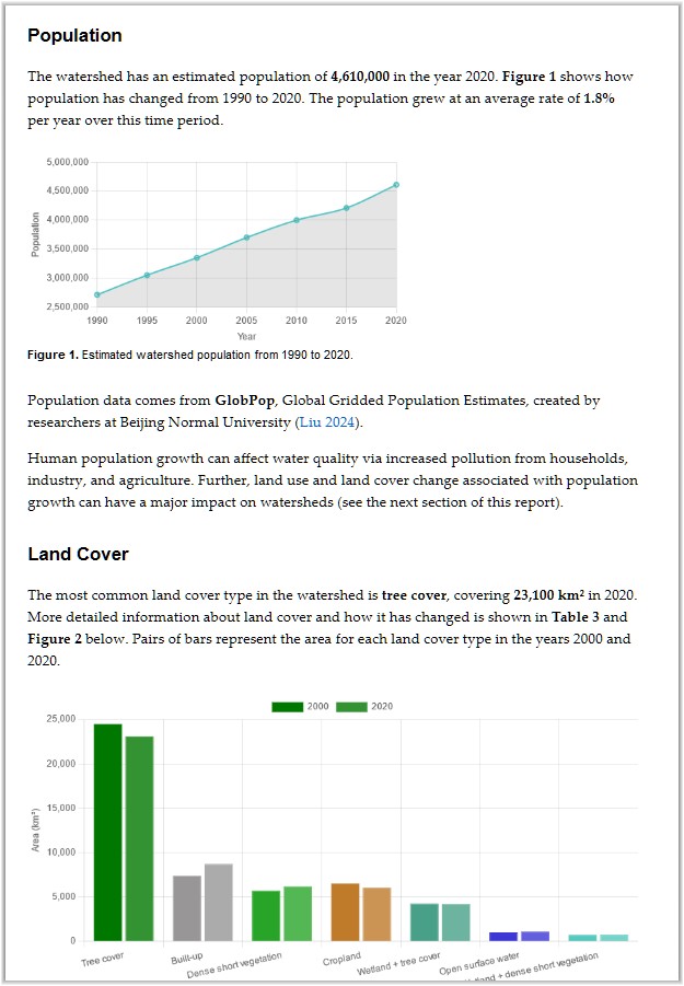
After you’ve created a new watershed, you’ll see a new blue button on the left-side menu. Click this button to create a Watershed Data Report. The report summarizes a variety of information about the watershed:
I included some text in each section containing a brief introduction on how human and environmental factors affect watersheds.
- Political Boundaries
- Population
- Land Cover
- Hydrology
- GRACE Total Water Storage
- Irrigation
- Dams
Some of the information in the report comes from the thematic layers that you can display on the map (for example, population, irrigated area, and land cover). The app calculates sums or averages over the pixels that overlap the watershed. In geographic information science, or GIS, this is referred to as “zonal statistics.” For a discussion of how I do these calculations, see Section 3.4 in my PhD thesis, Calculating Basin Means of [Gridded] Earth Observation Variables.

Finally, if you found the app useful for your classroom, business, or research, why not show your appreciation by buying me a cup of coffee?

Let me know if you found something interesting in your watershed report. How do you think this information could be useful for education, advocacy, or management? Are there any other environmental datasets you’d like to see included?
