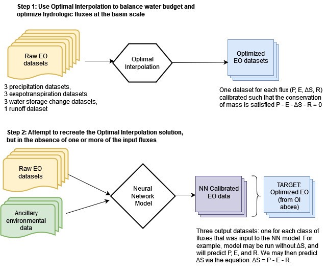
This chapter describes modeling approaches to balance the water budget with remote sensing datasets. In the previous chapter, we saw how optimal interpolation (OI) can be used to balance the water budget by making adjustments to each of the four main water cycle components: precipitation, P, evapotranspiration, E, total water storage change, ΔS, and runoff, R. A major disadvantage of this approach is that we must have all four of these variables. This usually means that OI can only be applied over river basins, where we have access to observed discharge at stream gages. I explored a workaround to this limitation by using a gridded dataset of synthetic runoff estimated by a statistical model (GRUN, Ghiggi et al. 2021). Even where we have access to runoff data, information on total water storage change (TWSC) is often a limiting factor. This water cycle component became available fairly recently, in 2002, with the launch of the GRACE satellites. So while there are a number of remote sensing datasets available from as early as 1980, we cannot use OI before 2002, because of missing data for TWSC. Further, there are a number of gaps in the GRACE record, as we saw in Section 2.4.1.
The main emphasis of the research for this thesis involved trying to find a model that can “recreate” the OI solution. Figure 4.1 shows a flowchart style overview of the steps in the modeling. In this chapter, I describe these two major modeling approaches. The first method uses simple linear regression models. The second approach uses more complex neural network models. Each class of models has distinct advantages and disadvantages, which will be discussed in this chapter. I applied these methods to both gaged basins and our synthetic basins where we used runoff from the GRUN dataset. The most useful model would be one that can be applied with one or more missing water cycle components, i.e., without R or ΔS. To this end, there is a major advantage to calibrating individual EO datasets, one at a time. The goal of the calibration is to make them closer to the OI solution and hence more likely to result in a balanced water budget. There are two main steps to the NN modeling method, as shown in Figure 4.1:
Over the course of this research, I created many different models, with different configurations, sets of parameters, etc. How do we determine which of these is best? There is no single best indicator of goodness of fit of a model, or its predictive skill. I begin with a description of methods used for assessing model fit, and briefly describe the context in which they are useful. Recall that the overall purpose of this research is to more accurately estimate individual components of the hydrologic cycle. An additional goal is to use these predictions to better estimate long-term trends, particularly over large areas or areas with sparse ground-based measurements.
This chapter also includes a discussion on the tradeoff between model complexity and its overall ability to make good predictions. A key consideration in the design and training of NNs is to avoid unnecessary complexity and overfitting, where a model fits the training data well, but performs poorly when asked to make predictions with new data.
In the following chapter, I present the results of the modeling analysis using techniques described in this chapter, including both regression-based models and neural networks.
In this section I describe indicators that can be used to assess the goodness-of-fit between model predictions and observations. I also describe graphical methods of assessing model fit. No one indicator or plot is best, and often a combination of several should be used to choose the best model (Jackson et al. 2019). The methods described here can be applied to assess the results from the modeling methods describe in the following parts of this chapter.
During the course of my research, I obtained many solutions to the problem of creating a balanced water budget via remote sensing data. This involved many different model structures and parameterizations. This section is concerned with how to determine which of these is “the best.” There is a rich literature on evaluating the goodness of fit of a model, or how well a simulation matches observations. Nevertheless, common practices vary in the fields of statistics, hydrology, and remote sensing. In each of these fields, prediction and estimation are important tasks, and we would like to know which model is the best at simulating or predicting “the truth,” or is the closest fit to observations.
In the context of this research, there are several challenges to using conventional goodness-of-fit measures. First, the EO datasets that we are using in this study, have already been ground-truthed, or calibrated, to create a best fit to available in situ data. Therefore, it is unlikely that independently re-evaluating the fit to surface measurements will greatly improve these datasets. In other words, there would be little value to evaluating precipitation datasets against terrestrial observations from rain gages.
The second consideration when it comes to choosing a metric has to do with the geographic coverage of our meteorological and hydrological data. The output of our models is distributed across grid cells over the Earth’s land surfaces. I searched for solutions that perform well across the globe – on different continents, and in different climate zones. The output of our model is also a time series (in river basins or pixels). Therefore I also looked for a solution that performs well in different seasons and times of the year. Overall, the following questions governed the search for a viable model for optimizing EO estimates of the water cycle:
In this thesis, I refer to two related concepts, measurement errors and modeled or estimated residuals. The error of an observation is the difference between the observation and the true value of the variable, which may not always be known or observable. Residuals are the differences between the observed values of the dependent variable and the values predicted by a model. Residuals are calculated as follows:
\[ e_i = y_i - \hat{y}_i \label{eq:residual} \]
where:
There are two important concepts related to the quality of a measurement. The accuracy of a measurement refers to how close it is to the truth. A measurement’s precision has to do with how repeatable a measurement is. In other words, if we repeat the same measurement multiple times, how close are the estimates to one another?
This is often illustrated with a target or bullseye, and clusters of points, and the analogy is that of a target shooter (presumably with a bow and arrow or a gun). When the cluster is centered on the bullseye at the center of the target, it is said that the shooter is accurate. When the points are tightly clustered together, it is said that the shooter is precise. This has become a meme, as such figures can be found in many math, science, and engineering textbooks. However, I believe this is less than optimal as a visual aid for learners. First, the target is superfluously two-dimensional. We are not dealing with a scatterplot of \(x\) and \(y\) values. Rather, the quantity that we are interested in is univariate – the distance from the target. It would be more instructive to drop the analogy with shooting and instead describe a scientific measurement.
As an example, suppose we are measuring the temperature at which water boils. The results may be displayed quite simply on a number line as a dot plot, as in Figure 4.2. On these plots, the green line represents the “truth” (100 °C, the boiling point of water at sea level). The blue dots represent 20 individual measurements.
Suppose the four plots show measurements with four different thermometers, or done by four different teams, each of which is more or less skilled or careful. The series of measurements looks something like: 101, 99.5, 98.5, 100.5, etc. The red bell curve is the probability density function for a normal distribution fit to the observations, with a vertical red line at the observed mean. Where the mean is close to the truth, we say that the measurements are accurate. Where the measurements are spread out relative to one another, we say that they are less precise. On the top right, we can see that one of the four teams takes careful measurements. The observations are all close to one another. But they are all quite far from the truth, so while the precision is high, the accuracy is low. Conversely, in the bottom left plot, the observations are centered on the truth. On average, the measurements are good. However, the values are spread out, or we would say there is a lot of variability in the observations.
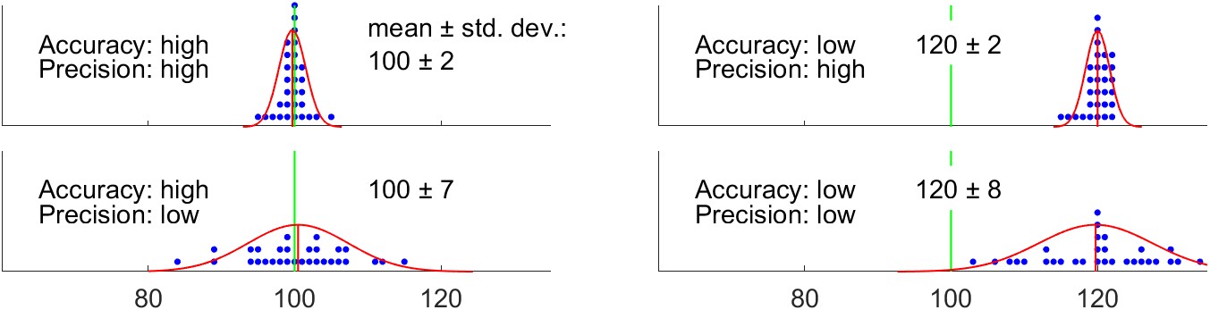
In the context of a model, the analog to accuracy is bias, and the analog to precision is the standard error, equivalent to the standard deviation of the residuals. It is common for time series models to either over-predict, under-predict the target variable (Jackson et al. 2019). Such a model is said to be biased.
This is also called root mean square difference RMSD, where difference refers to the residual between observations and model predictions. The plots in Figure 4.3 illustrate the concepts of the bias and standard error of model predictions.
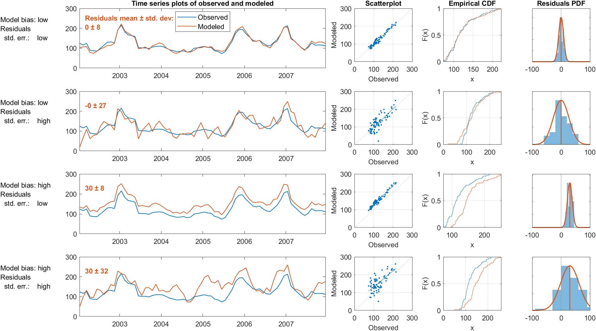
Time series plots are easily constructed and (usually) easy to understand. This is usually the first type of plot to inspect when working with sequential or time-variable data. Time series plots with separate lines for observed and predicted time series allow the viewer to quickly ascertain their similarity or difference. However, such plots can also be misleading or difficult to interpret. It is common for environmental data to have a skewed distribution, with frequent observations at lower values and fewer high values. In such cases, it is often helpful to display the vertical axis on a log scale. However, time series plots also have their limitations. Data often exhibit high levels of variability and noise, which can make it challenging to identify patterns or trends in the data. This can be particularly problematic when comparing observed and simulated data, as it may be difficult to determine whether any differences between the two datasets are meaningful or simply due to random variation. While visual inspection of the plots can provide some insight into the agreement between the two datasets, it does not provide a rigorous or objective assessment. For this reason, analysts rarely rely on such plots alone to judge the accuracy or reliability of models.
Scatter plots of observed versus predicted values are another useful graphical method for evaluating the model predictions. Thomann (1982) suggested that the most useful way to evaluate model fit is to plot the observed and predicted values, and calculate the regression equation and its accompanying statistics, slope, A, intercept, \(b\). While the discussion by Thomann was related to water quality models, the concepts are directly applicable to any type of predictive model. The best-fit model will be one where \(a \approx 1\) and \(b \approx 0\). We are also looking for a tight cluster of points about the 1:1 line (\(x=y\)), indicating a close agreement between observations and prediction (Helsel et al. 2020, sec. 6.4). For this reason, in this manuscript scatter plots comparing observed and modeled data are square, have the same limits on the horizontal and vertical axes, and include a 1:1 line. When points fall mostly on one side of the 1:1 line, it is evidence of a biased model, which can be confirmed by calculating the mean or median residual as described below (see Bias, Section 4.1.7).
Empirical cumulative distribution function (ECDF) plots allow one to compare the distribution of datasets, and are useful for evaluating whether observations and predictions have comparable distributions. These plots are less intuitive than the plots described above, and require some orientation or training to read and interpret. By examining the vertical distance between the two ECDF curves at specific quantiles, researchers can assess the agreement or discrepancy between the two datasets at different points in the distribution. These plots also provide a visual representation of the tails of the distribution. By examining the behavior of the ECDF curves in the upper and lower tails, researchers can assess whether the model is able to predict extreme values or outliers that are present in the observed dataset.
The axes of an ECDF plot can be scaled according to the quantiles of a normal distribution, which allows the viewer to judge whether distributions are approximately normally distributed. When the y-axis of an empirical CDF plot can be transformed to a probability scale to create a Q-Q plot (so named as it plots theoretical quantiles vs. sample quantiles). When the normal distribution is used, it becomes a normal probability distribution. Similar plots can be constructed for any known probability distribution – common examples are the Weibull distribution. Hydrologists frequently use such plots, particularly for the study of high flows and flooding. On these plots, the plotted points (and the curve connecting them) becomes a non-exceedance probability, and are useful for estimating the expected frequency of high flows.
Histograms approximate the probability density function through sampling, and are a conventional way of visualizing the distribution of a dataset. By plotting the upper edge of histogram bins, or connecting their peaks, a histogram can be plotted as a line. This greatly facilitates comparing one distribution to another, as they can be overlaid on the same axes and maintain legibility.
We can also approximate the probability distribution function via a kernel density plot. Kernel density estimations (KDE), are a nonparametric method used to visualize the distribution of data. They provide a smoothed estimate of the probability density function (pdf) of a dataset, allowing for a more detailed understanding of the underlying distribution. The kernel density plot is created by placing a kernel, which is a smooth and symmetric function, at each data point and summing them to create a density estimate. The choice of kernel function and bandwidth, which determines the width of the kernel, is crucial in shaping the KDE and subsequent interpretations. A good balance must be struck between over-smoothing the data and hiding detail versus showing discontinuities.
Plots of model residuals, \(e_i\), versus time or the predicted variable are a valuable display of model fit. The goal is model residuals that are independent and randomly distributed. A good model will have a residuals pattern that looks like random noise, i.e. there should be no relationship between residuals and time (Helsel et al. 2020). If there is some structure in the pattern over time, it could be caused by seasonality, a long-term trend, auto-correlation among the residuals may be the cause. All of these are evidence that the model does not fully describe the behavior of the data. A plot of residuals versus predicted values is also useful for analyzing the structure of errors. Ideally, the variance of the residuals should be constant over the range of values of \(y\). This is referred to as homoscedasticity. When the variance is non-constant, or heteroscedastic, this is evidence that the model has not adequately captured the relationship among the variables.
The error in the water balance, or the residual, is also referred to as the imbalance. The imbalance I is calculated following Equation \ref{eq:imbalance}.
\[\label{eq:imbalance} I = P - E - \Delta S - R\]
One of the main motivators of this study is to discover a way to update or modify EO datasets to minimize the imbalance. So, we will judge a model in part by how close the imbalance is to zero. Therefore, the mean and standard deviation of the imbalance are two of our key indicators in judging the quality of our model. In summary, we seek to:
If we are only concerned with driving the imbalance to zero, the model may make wild and unrealistic changes to the input data. A “good” model should achieve a balance between modifying the input data the least amount necessary while also reducing the imbalance as much as possible. This is therefore a problem where we are seeking to simultaneously optimize more than one objective, and so other fit indicators are required in addition to the imbalance.
It is customary to square the residuals before adding them to prevent positive and negative errors from canceling each other out. This also has the effect of penalizing model predictions more the further they are from the true value. The sum of squared errors, SSE, is:
\[\operatorname{SSE} = \sum_{i=1}^{n} e_i^2 \label{eq:sse}\]
We are usually interested in the average error of a model’s predictions. The mean square error (MSE) is calculated by averaging the squared residuals:
\[\text{MSE} = \frac{1}{n} \sum_{i=1}^{n}e_i^2 \label{eq:mse}\]
One frequently encounters MSE as an objective function in machine learning applications. However, the units are usually not physically meaningful or intuitive as they are a squared quantity. Among earth scientists, it is customary to take the square root of the MSE, to express the error in the variable’s original units.
\[\mathrm{RMSE}=\sqrt{\frac{\sum_{i=1}^n\left(\hat{y}_i - y_i\right)^2}{n}} \label{eq:rmse}\]
where:
The RMSE is always 0 or positive. A value of zero indicates perfect model fit, and lower values indicate a better overall fit. A disadvantage of the RMSE is that comparisons cannot be made among different variables with incompatible units.
In recent hydrologic modeling literature, one frequently encounters a scaled form of the RSME. The RMSE standard deviation ratio (RSR) normalizes the RMSE by dividing by the standard deviation of observations. RSR combines error information with a scaling factor, thus the RSR value can be compared across populations, for example at sites with different flow rates and variances). The optimal value of RSR is 0, which indicates zero RMSE or residual variation and perfect model simulation. The lower the RSR, the lower the RMSE, and the better the model simulation performance.
\[\text{RSR} = \frac{\text{RMSE}}{\sigma} = \frac{\sqrt{\frac{1}{n} \sum_{i=1}^n\left(\hat{y}_i-y_i\right)^2}}{\sqrt{\frac{1}{n} \sum_{i=1}^n\left(y_i-\bar{y}\right)^2}}=\frac{\sqrt{\sum_{i=1}^n\left(\hat{y}_i-y_i\right)^2}}{\sqrt{\sum_{i=1}^n\left(y_i-\bar{y}\right)^2}}\]
Bias, in the context of model predictions, refers to a systematic error or deviation in the predictions that is not due to random chance but rather to a consistent and skewed pattern. A model that consistently overestimates or underestimates a variable is said to be biased. The best model will be one that is unbiased, that is, the average value of all the errors is zero. This is another way of saying that the expected value of the model prediction is the value of the response variable. Mathematically, bias of an estimator is defined as the difference between the expected value of the estimator and observed values, \(\mathbb{E}(\hat{y} - y)\). Practically, the bias is readily estimated as the mean of the model residuals, as follows:
\[\mathrm{Bias} = \text{Avg. prediction error} = \frac{1}{n} \sum_{i=1}^{n} e_i = \frac{1}{n} \sum_{i=1}^{n} \left( \hat{y}_i - y_i \right) \label{eq:bias}\]
Equation \ref{eq:bias} is equivalent to calculating the bias as the mean of predictions minus the mean of observations. Some analysts prefer to use the median rather than the mean, as it is a more robust estimator of central tendency with skewed data or in the presence of outliers.
It is helpful to scale the bias by dividing it by the mean of the observations. In this way, the bias can be compared across populations. For example, we may wish to compare flow predictions across basins with different average flows. The percent bias, or PBIAS is:
\[\text {PBIAS} = \frac{\text{bias}}{\bar{y}} \times 100 = \left[\frac{\sum_{i=1}^n\left(\hat{y}_i - y_i\right)}{\sum_{i=1}^n y_i}\right] \times 100 \label{eq:pbias}\]
All is not lost when models output biased results. If the bias is consistent, it can often be corrected. Simple methods of bias correction involve adding or subtracting a constant value to model output. More complex methods include quantile matching or cumulative distribution functions (CDF) transformation. The most complex methods of bias correction involve the use of a statistical or machine learning model to “post-process” model results (F. King et al. 2020). Bias correction is particularly common in climate science, especially when looking at the local or regional impacts of climate change. In general, global general circulation models (GCMs) do a poor job of predicting local conditions due to their coarse grid cells, their inability to resolve sub-grid scale features such as topography, clouds and land use. However, downscaling results often suffer from bias, and therefore bias correction methods are commonly used (Sachindra et al. 2014).
Somewhat confusingly, the term bias is used in different ways in the fields of statistics and machine learning. This will be discussed below in Section 4.2 on the bias-variance tradeoff. In this context, bias does not refer to a statistic of the residuals, as defined here. Rather, it refers to the overall fit of a model relative to the data used to train the model. Additionally, in the fields of artificial intelligence and machine learning, one frequently encounters the term bias to describe discrimination and unfairness in model predictions. This is an important aspect of AI that needs to be urgently addressed; fortunately, it has no impact on the research being described here.
The term variance is used in different ways across various fields in the natural sciences and machine learning. In univariate statistics, variances is a measure of how much spread there is in a variable’s values. More specifically, variance is calculated as the average of the sum of squared deviations from its mean, as follows:
\[\label{eq:variance} \mathrm{Variance} = \sigma^2 = \frac{1}{n} \sum_{i=1}^{n}\left( x_i - \bar{x} \right)^2\]
where:
In this section, we are concerned with assessing the quality of models. The variance can be readily used to quantify the spread in prediction errors, E. To calculate the residual variance, we simply substitute the residuals, E for \(x\) in Equation \ref{eq:variance}. The custom is to refer to the sample estimate of the variance as \(s^2\), and the variance of a population as \(\sigma^2\). The sample standard deviation, \(s\), is the most common measure of sample variance, and is simply the square root of the estimated variance. The standard deviation of residuals is also referred to as the standard error.
Overall, we are interested in finding a model that minimizes both bias and standard error (has low residual variance). The concepts of bias and standard error are analogous to accuracy and precision, which are commonly used when discussing observation or measurement methods.
Variance is also the name for a key concept in statistics and machine learning that will be discussed further in Section 4.3.7 on Cross-Validation. In this context, variance does not refer to a statistic of a random variable, as we defined above in Equation \ref{eq:variance}. Rather, it refers to how much a model changes each time it is fit to a different sample of observations from a population. I believe this unfortunate naming has caused significant and unnecessary confusion among students and practitioners.
The Pearson correlation coefficient is a well-known estimator of the linear association of two variables:
\[R=\frac{\sum_{i=1}^n\left(x_i-\bar{x}\right)\left(y_i-\bar{y}\right)}{\sqrt{\sum_{i=1}^n\left(x_i-\bar{x}\right)^2 \sum_{i=1}^n\left(y_i-\bar{y}\right)^2}} \label{eq:correlation_coefficient}\]
Values for R range between \(-1\) and +1. When \(R=1\), it means that a model’s predictions are perfectly correlated with observations. It does not, however, mean that the predictions are perfect, or even unbiased. This is discussed in more detail in the discussion of the related indicator \(R^2\) below.
A value of \(R \approx 0\) means that the variables are not correlated with one another. A hypothesis test can be conducted using R, where the null and alternate hypothesis, \(H_0: R = 0 \text{ or } H_A: R \neq 0\). However, this test is not valid in the presence of outliers or with skewed data (Helsel et al. 2020, 212). The test statistic is computed by Equation \ref{eq:correl_test_statistic} and compared to the critical values of a t-distribution with \(n − 2\) degrees of freedom.
\[t_R=\frac{R \sqrt{n-2}}{\sqrt{1-R^2}} \label{eq:correl_test_statistic}\]
The coefficient of determination, \(R^2\) gives the proportion of the variation in a dependent variable that can be explained by an independent variable.
A general definition of the coefficient of determination is given by:
\[\begin{aligned} R^2 & = 1 - \frac{SS_{residuals}}{SS_{total}} \\ \label{eq:coefficient_of_determination} R^2 &= 1 - \frac{\sum _{i}(y_{i}- \hat{y}_i)^{2}} {\sum _{i}(y_{i}-{\bar {y}})^{2}} \end{aligned}\]
For a simple linear regression model, \(R^2\) is directly related to the correlation coefficient, R, and can be calculated simply as the square of R. In this case, \(R^2\) will range from 0 to 1. For other types of predictive models, \(R^2\) can take on negative values. The definition of the coefficient of determination gives rise to useful rules of thumb for its interpretation. A baseline model that consistently predicts the mean value \(\bar{y}\) will yield an \(R^2\) value of 0. Models with predictions less accurate than this baseline will exhibit a negative \(R^2\).
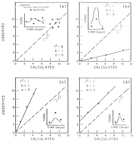
It can be misleading to rely solely on R or \(R^2\) as the sole determinants of model fit. In a number of cases a high \(R^2\) belies a poor or biased model. The best model is one with a slope \(m = 1\) and an intercept \(a = 0\). Figure 4.4 illustrates three cases where \(R^2 = 1\), but the model has a significant bias, indicated by a slope \(a \neq 1\) or intercept \(b \neq 0\).
Some authorities recommend the use of Mean Absolute Error (MAE) over the RMSE, as its interpretation is more straightforward. In this indicator, all residuals are given equal weight. This is unlike the MSE, where the residuals are squared, placing greater importance on larger errors. The MAE is simply the average of the absolute values of the residuals:
\[\mathrm{MAE} = \frac{1}{n} \sum_{i=1}^n \left| \hat{y}_i - y_i \right| \label{eq:mean_absolute_error}\]
The Nash-Sutcliffe Model Efficiency (NSE herein, also sometimes E) is a fit indicator originally introduced for evaluating the skill of models that produce time series output. While the coefficient of determination (\(R^2\)) is useful in evaluating the fit of an ordinary least squares regression equation, the NSE is a better determinant of model fit when comparing observed and modeled time series. Nash and Sutcliffe (1970) originally proposed this statistic for evaluating rainfall-runoff models, and it is widely used in the hydraulic and hydrologic literature. Because of its advantages, it has become more widely used in the geosciences and climate research. NSE is a normalized form of the mean square error (MSE). Table 4.1 compares NSE to \(R^2\), including notes on its interpretation. It is calculated as follows:
\[\mathrm{NSE}=1-\frac{\sum_{i=1}^n\left(x_i-y_i\right)^2}{\sum_{i=1}^n\left(x_i-\bar{x}\right)^2} \label{eq:nse}\]
Table 4.1: Comparison of the Nash-Sutcliffe Efficiency, NSE, and the Coefficient of Determination, R².
| Nash-Sutcliffe Model Efficiency, NSE | Coefficient of Determination, \(R^2\) |
|---|---|
| \(\mathrm{NSE} =\dfrac{\sum(y-\bar{y})^2-\sum(y-\hat{y})^2}{\sum(y-\bar{y})^2}\) | \(R^2=\dfrac{\sum(\hat{y}-\bar{y})^2}{\sum(y-\bar{y})^2}\) |
| \(-\infty < NSE \leq 1\) | \(0 \leq R^2 \leq 1\) |
| NSE = 1 means model is perfect, i.e., \(\hat{y}_i=y_i\) for all i | \(R^2=1\) means model predictions are perfectly correlated with observations (but says nothing about bias) |
| \(\text{NSE} < 0\) means model performs worse than the model \(\hat{y}=\bar{y}\) | \(R<0\) means a generic model performs worse than the model \(\hat{y}=\bar{y}\) (but this is not the case for OLS regression) |
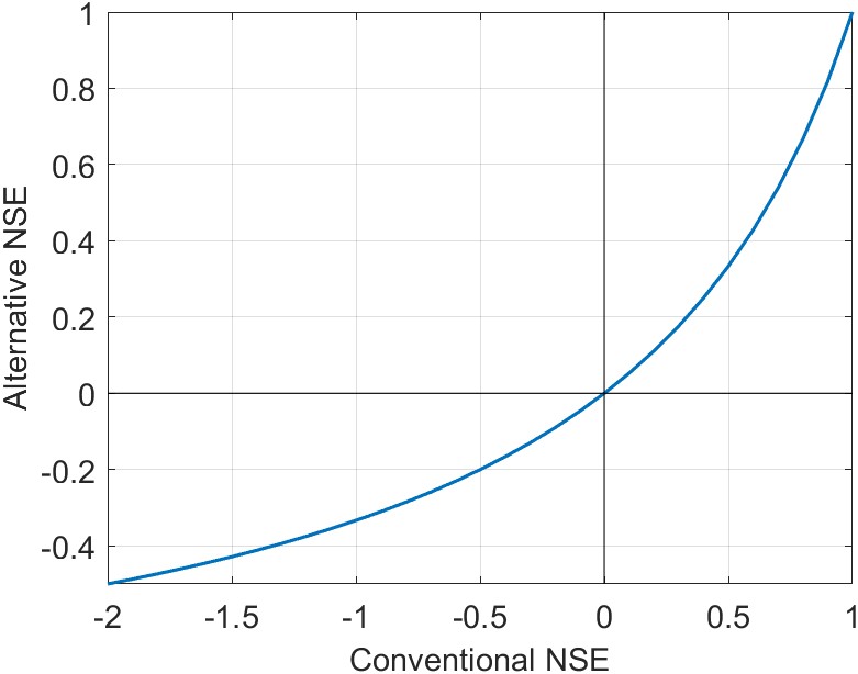
An inconvenience of the NSE is that it occasionally takes on large negative values for poor fits. This makes it challenging to average values over many locations. Mathevet et al. (2006) introduced a useful variant of the NSE which has a lower bound of \(-1\), and keeps the usual upper bound of +1.
\[\text{NNSE or NSE'} = \frac{\text{NSE}}{2 - \text{NSE}} \label{eq:nnse}\]
This variant is useful when calculating the average NSE, for example at multiple locations. Of course, another way around this limitation is to use an estimator of central tendency such as the median, which is more resistant to outliers. As a consequence of this transformation, positive values of \(\text{NSE}'\) are somewhat lower than the conventional NSE. The difference is illustrated in Figure 4.5, with (a) a plot of the conventional vs. the alternative bounded NSE, and (b) a table comparing the values.
| NSE | NSE′ |
|---|---|
| 1.0 | 1.0 |
| 0.9 | 0.81 |
| 0.7 | 0.54 |
| 0.5 | 0.33 |
| 0.0 | 0.0 |
| −0.5 | −0.2 |
| −1.0 | −0.33 |
| \(-1 \times 10^3\) | −0.998 |
| \(-1 \times 10^6\) | −0.999998 |
In a recent conference paper, Moshe et al. (2020) define a variant called NSE-persist. It follows the same general form, defining the model efficiency as:
\[E = 1 -\frac{\mathrm{RMSE(residuals)}}{\mathrm{RMSE(BASELINE)}}\]
where BASELINE is “a naive model that always predicts the future using the present reading of the target label measurement,” or \(\hat{y}_i^{t+1}=y_i^t\) (Moshe et al. 2020, 6).
This variant is useful for assessing assimilation models or certain types of machine learning models, such as long-short term memory (LSTM) neural networks. In such models, the prediction at time step \(t\) is a function of the observation at the previous time step \(t-1\). As such, the model predictions have high autocorrelation, and conventional metrics tend to inflate the predictive skill of the model.
Lamontagne, Barber, and Vogel (2020) introduced a new variant formula for calculating NSE, which is meant to respond to some of the critiques of the NSE in the literature. Their new formulations are more resistant to skewness and periodicity, common features of hydrologic data. In a series of Monte Carlo experiments with synthetic streamflow data, the authors show that their revised estimator is a significant improvement. As of this writing, the new estimator appears to have very limited use. Thus, I chose to use the conventional estimator of NSE in Equation \ref{eq:nse}.
Another variant on the NSE was introduced by Gupta et al. (2009) and further elaborated by Kling, Fuchs, and Paulin (2012). The so-called Kling-Gupta Model Efficiency (KGE) is a composite indicator, combining three components – correlation, bias and variability. It is now widely used in the hydrologic sciences for comparing model output to observations. It is calculated as follows:
\[KGE = 1 - \sqrt{\left ( R - 1 \right )^2 + \left ( \frac{s_x}{s_y} - 1 \right )^2 + \left ( \frac{\bar{y}}{ \bar{x} } - 1 \right )^2 } \label{eq:kge}\]
where:
Like NSE, KGE ranges from \(-\infty\) to +1. For the case where the model performance is equivalent to simply predicting the mean of observations \(\hat{y} = \bar{x}\), we have NSE = 0, and KGE \(\approx -0.41\). Thus, these two related fit indicators are not equivalent.
Similar to the bounded version of NSE in Equation \ref{eq:nnse}, some researchers prefer working with the bounded version of KGE (Mathevet et al. 2006). It has the advantage of being bounded by \(-1\) and +1, and makes it simpler to average or compare values from multiple sites. The bounded version of KGE is:
\[\text{KGE}_B = \frac{\text{KGE}}{2 -\text{KGE}}\]
While KGE is designed as an improvement upon \(R^2\) and \(NSE\), it is not without its detractors. Lamontagne, Barber, and Vogel (2020) state that its major flaw is that its components are based entirely on product moment estimators. This is acceptable when the data are well-behaved, i.e. normally distributed. However, hydrologic data is often highly skewed (hence far from normally distributed), so the ratios of the product moment estimators “exhibit enormous bias, even for extremely large sample sizes in the tens of thousands and should generally be avoided” (Lamontagne, Barber, and Vogel 2020).
An alternative form of the NSE considers the departure of model predictions from the seasonal mean. This formulation was introduced by J. Zhang (2019) and used in a recent water-balance study by Lehmann, Vishwakarma, and Bamber (2022). This is useful when the data we are modeling exhibits a strong seasonal cycle. This is the case for GRACE TWSC in many locations. Consider a naive model that can reproduce the seasonal cycle with fidelity but has no skill beyond this in predicting anomalies. Conventional fit indicators will inflate the skill of the model. Instead, it is more honest to assess the skill of the model in recreating the anomalies beyond the base seasonal signal. The Cyclostationary NSE (CNSE) is calculated as follows:
\[\mathrm{CNSE}=1-\frac{\sum_{i=1}^n\left(x_i-y_i\right)^2}{\sum_{i=1}^n\left(x_i-\tilde{x}\right)^2}\]
where:
This indicator is related to the Cyclostationarity Index (CI), an indicator of the strength of the seasonal signal introduced by J. Zhang (2019): the cyclostationarity index, or CI. The index is a ratio of the anomalies (non-seasonal variability) to the seasonal variability of an environmental variable:
\[\mathrm{CI}=1-\frac{\sum_{i=1}^n\left(x_i-\tilde{x}\right)^2}{\sum_{i=1}^n\left(x_i-\bar{x}\right)^2}\]
where \(\tilde{x}\) is the long-term monthly average of the variable \(x\) (sometimes called the climatology) and \(\bar{x}\) is the mean of \(x\).
Values of CI are dimensionless; a value of CI = 1 indicates perfect cyclo-stationarity (all variation is due to seasonal behavior). Conversely \(\textrm{CI}~\approx~0\) indicates that non-seasonal behavior is dominant. J. Zhang (2019) used CI as an indicator of seasonality in the terrestrial water storage observations from GRACE.
In summary, a number of qualitative and quantitative measures can be used by researchers to evaluate and compare the performance of predictive models. Plots of observed and predicted (e.g.: time series plots and scatter plots) are the first and most important check on a model. Care must be used in interpreting model fit statistics; those which are dependent on units of observations and sample size (e.g., sum of squared errors) cannot be readily compared from one data set to the next. Even using a normalized quantity such as the coefficient of determination (\(R^2\)) may obscure bias in the model. Finally, the Nash-Sutcliffe model efficiency (NSE) was shown to be useful in comparing observed and modeled time series. Recently proposed modifications to NSE make it more flexible, for example when averaging values across multiple cites, or where there is a strong seasonal signal among observations.
In this section, I wish to give a brief introduction to an important subject in the field of statistical modeling and machine learning. For a more detailed introduction to the so-called bias-variance tradeoff, I refer the reader to the longer discussion in James et al. (2013, sec. 2.2.2).
With any type of model, whether it is a simple linear regression or a complex machine learning model, we are interested in creating a tool or method for making predictions with new data. For example, suppose we are constructing a flood model to predict flooding given inputs such as temperature and rainfall. We would train or calibrate the model with historical data, seeking a good fit between model predictions and past observations of flooding. But our main interest is not in recreating the historical record, but in predicting future floods. Therefore, the usefulness of the model should be judged based on the accuracy of its predictions when fed with data it has not seen before, and which were not part of its training data. A model that provides a good fit to training data, but performs poorly with new data is said to be overfit. This is often the case with models that are overly complex or over-parameterized, or where the training dataset is small.
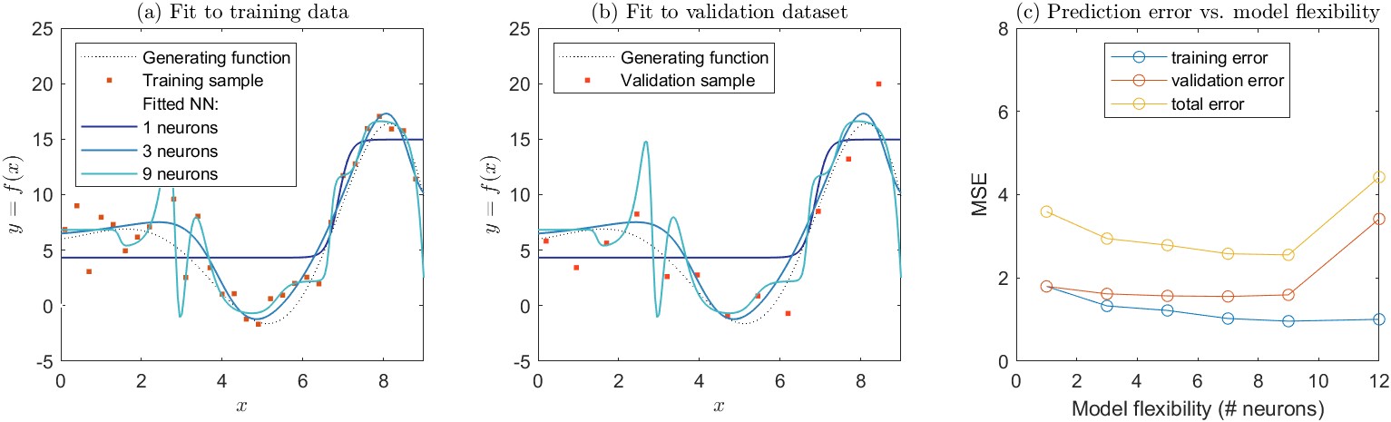
We can demonstrate this concept with an example. Figure 4.6 shows a simulation I created to demonstrate this concept. Here, we have a relationship \(y = f(x)\) that we will use to generate samples. This demonstration is unrealistic of course. In nature, we don’t usually know the true relationship between \(x\) and \(y\). (The function, which I created arbitrarily to have an interesting curvy shape is \(y = 6 - 0.5x \cdot \sin(x) \cdot e^{x/3}\).) I used this function to generate a training dataset. I sampled values of \(y\) at regular intervals on \(x\), adding error to each point with normally distributed random noise. I then fit a polynomial to the training dataset via the method of least squares. The polynomials are of the following form:
\[ \label{eq:poly1} \text{First order: } f(x) = a_1 x + b \]
\[ \text{Third order: } f(x) = a_1 x + a_2 x^2 + a_3 x^3 + b \label{eq:poly3} \]
⋮
\[ \text{20th order: } f(x) = a_1 x + a_2 x^2 + \ldots + a_{20} x^{20} + b \label{eq:poly20} \]
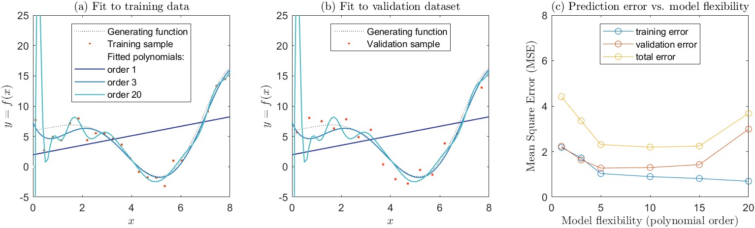
The polynomials fit to the training data are shown in Figure 4.6(a). In general, as we add more complexity to a model, it becomes more flexible, and can better fit the training data. However, this does not always translate to an improved fit to validation data. In this example, the relationship among the variables is poorly described by a first-order polynomial, which is a simple linear model (Equation \ref{eq:poly1}). The mean square error (MSE) is high for both the training data set and the validation data set. A third-order polynomial (Equation \ref{eq:poly3}) is able to capture more of the curvilinear relationship between \(x\) and \(y\), and has a correspondingly lower MSE, for both the training and validation datasets. As we increase the polynomial order, the curve we fit to the data becomes more flexible. With a twentieth-order polynomial, the curve is very wiggly, and attempts to go through individual data points in the training set. As a result, the training MSE is the lowest of all the curves we tested. Here, the fit polynomial is chasing after the noise, or random errors around the parent relationship. The resulting curve is a poor fit to the validation dataset, and the validation MSE is high. For the higher-order polynomials, the model is overfit to the training data and generalizes poorly.
In this example, we see that as we increase the flexibility of the model, we better fit the training data. Yet at a certain point, the model overfits the training data, and lacks generality. The evidence for this is that it performs poorly at making predictions with data that were not part of its training. This phenomenon is referred to as the bias-variance tradeoff.
The name “bias-variance tradeoff” is somewhat unfortunate, as it reuses two common terms in statistics and modeling in a way that is inconsistent with their use in univariate statistics. Both terms have a specific mathematical definition, described above in Sections 4.1.7 and 4.1.8. In the context of the bias-variance tradeoff, it helps to forgetthese mathematical definitions for a moment and think of the plain-language meaning of the words bias and variance.
Here, the bias of a model is the error that is introduced by the model’s simplified representation of the real-world problem. In this context, bias refers to model error more generally, not the difference between the means (or medians) of observations and predictions.
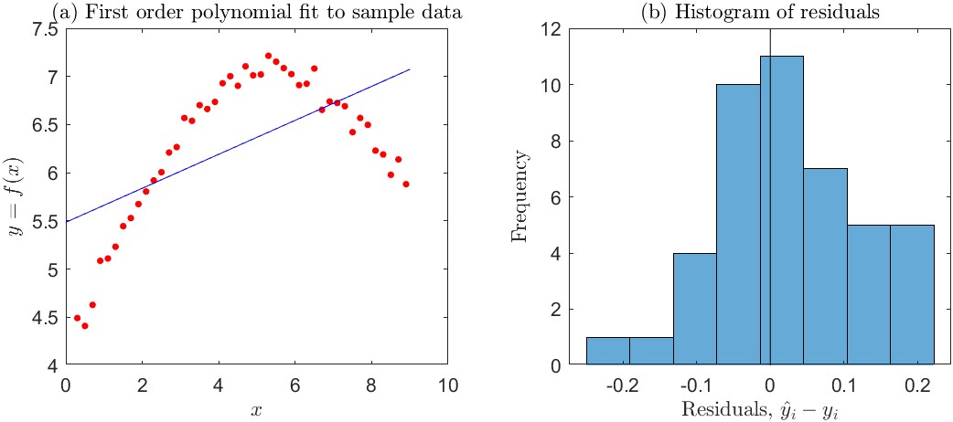
This is perhaps best shown with a simple example. Consider the simple curve-fitting experiment in Figure 4.7. Here, we are trying to model the relationship between the independent variable, \(x\), and a response variable \(y\) with a linear regression line. The simple linear model is not able to capture the true (curved) relationship between \(x\) and \(y\), and the fit is poor.
A machine learning practitioner would say that the model has high bias. Yet, we know from statistics that an ordinary least squares (OLS) regression fit by the method of moments is an unbiased linear estimator of \(y\). Indeed, when the regression line is fit by OLS, the mean of the residuals (\(e_i\) values) is exactly zero. Visual evidence for this is shown in the histogram in Figure 4.7(b). Furthermore, the mean of the predictions (\(\hat{y}_i\) values) equals the mean of the observed responses (\(y_i\) values). So a statistician would conclude that the model has no bias. (However, he or she would also conclude that the model form is incorrect by inspecting a plot of the residuals versus \(x\), as described above in Section 4.1.4.)
In the context of the bias-variance tradeoff, variance refers to how much the model parameters would change if we used a different training data set. In this context, it again helps to think of the plain-language meaning of the word variance. We are not talking about the mathematical definition for the statistic of a random variable, \(\sigma^2\), described above in Section 4.1.8. Rather, it refers to how much the model fit to data changes each time we use a new sample of observations for the training data set. To demonstrate this concept, I repeated a variant of the experiment above with synthetic data. Again I drew random samples from the generating function, adding random errors to each point. This time I generated five different training datasets. For each training dataset, I fit polynomials of various orders from 1 to 20. The results are shown in Figure 4.8.
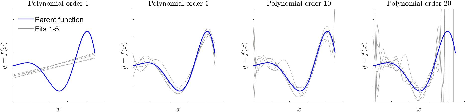
The dark line in Figure 4.8 is the true relationship between \(x\) and \(y\), which was used to generate training data via random sampling. The light gray lines are the polynomials fit to the five different training sets. Each was fit by the method of least squares. We can see that the fit of the first-order polynomial is relatively stable. In other words, each of the five lines is relatively similar. In this case, the model fit is said to have low variance. As we increase the order of the polynomial, there is greater variety in the shapes of the curves. In essence, the fitting algorithm is trying to find the best fit to each training data set (the training data are not shown in Figure 4.8). At the most extreme, the 20th order polynomial oscillates wildly to try to fit individual data points.19 As we increase polynomial order, the curve becomes more flexible. Here, a machine learning practitioner would say that there is higher variance. This is distinct from saying that the residuals have high variance, or are widely spread about their mean.
The bias-variance tradeoff is a fundamental consideration whenever one is fitting a model to data. The goal of the modeler is to minimize the expected test error. To do so, one must select a modeling method that results in both low variance and low bias. This is the central challenge across various fields of statistics and machine learning (G. James et al. 2013). One can easily fit a model with extremely low bias but high variance by fitting a model that passes through every data point. Such a model lacks generalizability. On the other hand, one can fit a model with extremely low variance but high bias, for example a model of the form \(y=\bar{x}\). However, such a model is not useful as a predictor, thus lacking utility.
Hastie, Tibshirani, and Friedman (2008) present the problem in a more formal and mathematical way by defining a relationship between an outcome variable \(Y\) and independent variable(s) \(x\) as:
\[y = f(X) + \epsilon\]
where \(\epsilon\) is the irreducible error which is normally distributed and has a mean of 0. Our job as modelers is to fit a model \(\hat{f}(x)\) that best approximates the true relationship \(f(x)\), which is unknown to us. The error associated with a given prediction at a point \(x_0\) is:
\[\operatorname{Err}(x_0)=E\left[(y_0 - \hat{f}(x_0))^2\right]\]
In general, the error of a model prediction stems from three sources:
\[\begin{gathered} \operatorname{Err}(x)=\text {Bias}^2+\text { Variance + Irreducible Error } \\ \operatorname{Err}(x)=\left( E[\hat{f}(x)]-f(x)\right)^2+E\left[\left(\hat{f}(x)-E[\hat{f}(x)]\right)^2\right]+\operatorname{Var}(\epsilon) \end{gathered} \label{eq:test_mse}\]
Equation \ref{eq:test_mse} defines the expected test MSE. This is the average test MSE one would get by repeatedly estimated \(f\) over many training sets, and testing each function at \(x_0\). The overall expected test MSE is calculated by averaging \(E\left[(y_0 - \hat{f}(x_0)^2\right]\) over all the values of \(x_0\) in the test set. In this equation, the squared bias term is the difference between the modeled average and the true mean for \(x\). The variance term is the expected squared deviation of \(\hat{f}(x_0)\) from its mean.
To achieve the minimum expected test error, we must select a model that has both low variance and low bias. Variance is always non-negative, and the squared bias term is also non-negative. We can conclude from Equation \ref{eq:test_mse} that the expected test MSE cannot ever be less the irreducible error, or \(\operatorname{Var}(\epsilon)\).
I also wanted to show that the issues discussed here apply equally to the selection of neural network models. Above, I created a set of sample training data and fit a set of polynomials. Here, I repeat the same experiment, using a set of neural network models with different numbers of neurons in a single hidden layer. The results are shown in Figure 4.9. The parent generating function which represents the true relationship between \(x\) and \(y\) is the same as the one shown in Figure 4.6. There is evidence of overfitting in the network with 9 neurons, as the curve appears to be chasing individual data points in the training set, causing it to oscillate.
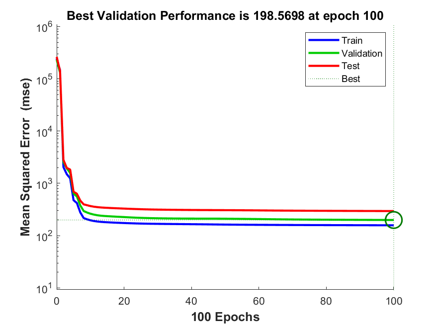
It is worth noting that the default settings of contemporary machine learning algorithms provide guardrails against overfitting. In Matlab, for example, the default setting for fitting a feed-forward neural network is to automatically divide the dataset into three sets, for training, testing, and validation. Users can also provide their own custom partition information. The training algorithm is programmed to stop when the test data set error rate stops going down or begins to increase (example in Figure 4.10). This makes it more difficult for even naïve users to overfit neural network models. Nevertheless, by customizing the settings, one can remove these guardrails for demonstration purposes, such as in the example above in Figure 4.9.
The first set of analyses to balance the water budget involves a simple class of models to optimize water cycle components. Recall that the goal is to calibrate EO variables so they are closer to the OI solution, which results in a balanced water budget. Here, we attempt to create models to optimize each individual EO variable, such that they will be closer to the OI solution. For example, we are looking for an equation to transform GPCP precipitation, \(P_{GPCP}\) data so it more closely matches \(P_{OI}\). Essentially, we are seeking a model \({P}' = f(P_{GPCP})\) where our objective is \({P}' \to P_{OI}\). Here, the function \(f\) is estimated by relatively simple linear models.
In this section, I describe the development of single linear regression models, so-called because there is one input variable. In later sections, I investigate the use of more complex models for \(f\) that are non-linear and include more input data. The regression models have between one and three coefficients that are fit with a variety of parametric, nonparametric and optimization methods. The next problem is how to generalize these results so that they can be applied anywhere, for example in basins that were not part of the training set, or at the pixel scale, which is discussed in the following section.
The first models are linear regression models of the following form:
\[\begin{aligned} &\hspace{10pt} y_i = a x_i + b + \epsilon_i \\ &\hspace{15pt} \text{for } i = 1 \text{ to } n \end{aligned} \label{eq:OLS}\]
where:
The parameters (A and \(b\)) are fit by the standard ordinary least squares method, which minimizes the squared difference between predicted and observed values. Here we are plotting the best-fit line between one of our input EO variables and the OI solution for the variable. The example in Figure 5.1 shows \(P_{OI}\) versus \(P_{GPCP}\) over three example river basins. The equation of the regression line tells us the best estimate (according to the linear model) of \(P_{OI}\) for a given value of \(P_{GPCP}\). The equation can therefore allow us to calibrate \(P_{GPCP}\), or nudge it in the direction that will be closer to the OI solution.
In our case, we fit an equation for each of the 10 EO variables, and in each of our experiment's 1,698 river basins.
\[P_{GPCP, cal} = a \cdot P_{GPCP} + b\]
where \(P_{GPCP, cal}\) is the calibrated version of the GPCP precipitation time series, \(P_{GPCP}\) in a given basin. The slope and intercept parameters, a and b are estimated independently in each of the 1,698 river basins.
There are certain advantages to a linear regression model. It is simple, explainable, and only requires us to fit two parameters. However, there are also disadvantages. A linear model may not adequately describe the relationship between our dependent variable and response variable. Furthermore, our data may not follow all the assumptions of this method. For example, the prediction errors should be normally distributed, independent, and homoscedastic (have constant variance over x. Nevertheless, linear models may still be useful and appropriate, even when all of these assumptions are not strictly met. It depends on the intended use of the model. See Table 4.2 for a list of assumptions which should be met based on the intended purpose of an OLS model (reprinted from Helsel et al. 2020, 228).
Table 4.2: Assumptions necessary for the purposes to which ordinary least squares (OLS) regression is applied (reprinted from Helsel et al., 2020)
| Assumption | Purpose | |||
|---|---|---|---|---|
| Predict y given x | Predict y and a variance for the prediction | Obtain best linear unbiased estimator of y | Test hypotheses, estimate confidence or prediction intervals | |
| Model form is correct: y is linearly related to x. | X | X | X | X |
| Data used to fit the model are representative of data of interest. | X | X | X | X |
| Variance of the residuals is constant (homo- scedastic). It does not depend on x or on anything else such as time. | - | X | X | X |
| The residuals are independent of x. | - | - | X | X |
| The residuals are normally distributed. | - | - | - | X |
A variant on OLS regression involves forcing the fitted line to pass through the origin at (0, 0). In such case, the regression equation is simplified to a one-parameter model:
\[y_i = a x_i + \epsilon_i\]
This follows Equation \ref{eq:OLS} but simply drops the intercept, b. Fitting a model with slope only, and no intercept, is called regression through the origin (RTO). It turns out that RTO is a surprisingly controversial subject among statisticians and scientists (Eisenhauer 2003). Some authorities state that it is an appropriate model when the dependent variable is necessarily zero when the explanatory variable is zero. For example, suppose we are modeling the height of a tree as a function of its trunk’s circumference. A tree with a circumference of zero cannot have a non-zero height. Regardless, it is nonsensical to talk about a tree with zero circumference. Other authorities insist that a linear model without an intercept is meaningless and inappropriate. Nevertheless, statisticians have shown with rigor that the coefficient of determination, \(R^2\), cannot be calculated with RTO. While alternative formulations for \(R^2\) have been proposed, it is not appropriate to use it to compare the OLS and RTO models. Instead, Eisenhauer (2003) suggests that it is appropriate to compare the standard errors of the OLS and RTO regressions (i.e. MSE or RMSE). I would add that one of the fit metrics commonly used by hydrologists (NSE or KGE, described above) would allow for a fair comparison of a RTO and OLS regression.
A well-known drawback with OLS regression is that individual data points can have a disproportionate impact on the regression line. To overcome this limitation, there are two main remedies. First, one can simply remove outliers, and repeat the regression analysis until satisfactory results are obtained. Or, one may use an alternative form of regression that is more resistant to outlier effects, such as the nonparametric regression methods described in the following section. This brief section introduces the concept of leverage, and discusses methods to detect outliers in bivariate datasets.
Outliers which have a large effect on the outcome of a regression are said to have high leverage. The leverage of the \(i_{th}\) observation in a simple regression is calculated by:
\[h_i=\frac{1}{n}+\frac{\left(x_i-\bar{x}\right)^2}{SS_x} \label{eq:leverage}\]
where \(SS_x\) is the sum of squared deviations for \(x\), or \(\sum_i \left(x_i-\bar{x}\right)^2\). From this definition of \(h\), we can deduce that the further an observation is from the mean, the greater its leverage will be. The leverage of a data point, \(h_i\), will always have a value from \(1/n\) to 1, and the average leverage for all observations is always equal to \((p + 1)/n\).
Observations are often considered to have high leverage when \(h_i > \frac{3p}{n}\), where p is the number of coefficients in the regression model. (Some statisticians prefer a lower value of \(2p/n\).) In the case of single-variable regression, \(p=2\), as we are estimating two coefficients, the slope and intercept. An observation with high leverage will exert a strong influence on the regression slope. According to an important text on statistics in water resources, “observations with high leverage should be examined for errors” (Helsel et al. 2020). However, high leverage along is not a sufficient reason to remove the observation from the analysis. In many cases, outliers may be the most important observations.
Another widely used measure of influence is Cook’s Distance, or Cook’s D (Helsel et al. 2020, 241):
\[D_i=\frac{e_i^2 h_i}{p s^2\left(1-h_i\right)^2}\]
where:
Cook’s D is used to determine the degree of influence of an observation by comparing its value to the critical value in an \(F\)-distribution for \(p +1\) and \(n − p\) degrees of freedom. In our case, single linear regression with \(n > 30\), for a two-tailed test and a 10% statistical significance (\(\alpha = 0.1\)), the critical value of \(D \approx 2.4\).
I tried 4 different methods to detect outliers: the two described above, plus bivariate leverage and a method called DDFITS. I was not sure which was best, so this was an interesting and valuable experiment. The first method (leverage) produced good results, so I decided to use that. Two of the other methods flagged many more outliers, and I concluded that it would result in omitting too much of the data.
Nonparametric regression techniques are useful where the data do not follow the assumptions required for ordinary, parametric regression methods described above. In general, nonparametric statistics refers to a class of methods that do not make assumptions about the underlying distribution of the data. Among the benefits of these methods are the ability to deal with data with small datasets, outliers, and errors that are not normally distributed. Theil-Sen regression is a robust method for estimating the median of \(y\) given \(x\). Compare this to ordinary least squares regression, which estimates the mean of \(y\) given \(x\). The Theil-Sen line is widely used in water resources and more recently in other disciplines (Helsel et al. 2020).
The Theil-Sen line is estimated as the slope and intercept of the median of \(y\) as follows:
\[\hat{y} = \hat{a}x + \hat{b}\]
To compute the Theil-Sen slope, \(\hat{a}\), one compares each point to all other points in pairwise fashion. For each set of \((x, y)\) points, the slope \(\Delta y/\Delta x\) is calculated. Then, the estimate of the slope of the Theil-Sen regression line is the median of all pairwise slopes:
\[\hat{a}=\operatorname{median} \frac{\left(y_j-y_i\right)}{\left(x_j-x_i\right)} \label{eq:theil_sen_slope}\]
for all \(i<j, i=1,2, \ldots,(n-1), j=2,3, \ldots, n\).
Several methods for calculating the intercept have been put forth, but the most common is:
\[\hat{b} = y_{med} - \hat{b} \cdot x_{med} \label{eq:theil_sen_intercept}\]
where \(x_{med}\) and \(y_{med}\) are the medians of \(x\) and \(y\). Further details, including how to compute P-values and confidence intervals for Theil-Sen regression coefficients are given by Helsel et al. (2020).
In addition to the 1- and 2-parameter SLR models described above, I also tried an alternate 3-parameter model. This model specifically avoids the problem of predicting negative precipitation or runoff, which occasionally occurs with an SLR model with 2 parameters (slope and intercept). Such a model was used in the context of water cycle studies by Pellet, Aires, Munier, et al. (2019). This model has an exponential term on the intercept that prevents the model from changing values of \(x=0\) :
\[y = a \cdot x + b\left ( 1- e^{-\frac{x}{c}} \right ) \label{eq:alt_regression}\]
where the variables A, \(b\), and \(c\) are model parameters to be fit. Fitting the model is not done with the ordinary least squares method as in SLR, but can readily be fitted with an optimization algorithm, such as the fit function in Matlab.
Another common method to improve the performance of a regression model is to apply a transformation to the dependent variable, the response variable, or both. The same methods can and should be applied for neural network models. In their book on neural networks, Bishop (1996) states that it is “nearly always advantageous” to pre-process the input data, applying transformations, before it is input to a network.
Hydrologists commonly log-transform observations to make their distribution less highly skewed and to reduce the number of outliers. Taking \(\log(x)\) or \(\sqrt{x}\) can also solve the problem of predicting negative values. However, there are a more methodical ways of seeking the best transformation. It is a good statistical practice to transform the independent variable, \(x\), such that the strength of the linear association is maximized. The conventional way to do this is via Tukey’s ladder of powers, suggested by 20th century statistician John Tukey, where the linear model is applied to the transformed variable:
\[y = ax^\theta + b\]
where \(\theta\) is a power transformation. One may choose any value for \(\theta\). Normally, when \(\theta = 0\), it results in no transformation, as \(x^0 = 1\). Tukey suggested that it is convenient to substitute \(\log(x)\) when \(\theta = 0\). A list of common transformations is shown in Table 4.3.
Table 4.3: Ladder of Powers (from Helsel et al., 2020, p. 167).
| \(\theta\) | Transformation | Name | Comment |
|---|---|---|---|
| Used for negatively skewed distributions | |||
| \(i\) | \(x^i\) | \(i^{th}\) power | - |
| 3 | \(x^3\) | Cube | - |
| 2 | \(x^2\) | Square | - |
| Original units | |||
| 1 | \(x\) | Original units | No transformation. |
| Used for positively skewed distributions | |||
| \(\frac{1}{2}\) | \(\sqrt{x}\) | Square root | Commonly used. |
| \(\frac{1}{3}\) | \(\sqrt[3]{x}\) | Cube root | Commonly used. Approximates a gamma distribution. |
| 0 | \(\log (x)\) | Logarithm | Very commonly used. Holds the place of \(x^0\) |
| \(-\frac{1}{2}\) | \(-\frac{1}{\sqrt{x}}\) | Negative square root | The minus sign preserves the order of observations. |
| \(-1\) | \(-\frac{1}{x}\) | Negative reciprocal | - |
| \(-2\) | \(-\frac{1}{x^2}\) | Negative squared reciprocal | - |
| \(-i\) | \(-\frac{1}{x^i}\) | Negative \(i^{th}\) reciprocal | - |
One is not limited to using the values for \(\lambda\) in Table 4.3. A related approach for transforming a variable seeks to make its distribution as close to normal as possible. The Box-Cox transformation for a variable \(x\) is given:
\[x_\lambda^{\prime}=\frac{x^\lambda-1}{\lambda} \label{eq:box-cox}\]
where \(\lambda\) can take on any value, positive or negative. Equation \ref{eq:box-cox} can be interpreted as a scaled version of the Tukey transformation above. Again, where \(\lambda = 0\), the transformation is \(x_\lambda^{\prime}=\log(x)\). In some cases, the response variable \(y\) in a regression is also transformed, in addition to the independent variable \(x\). In such cases, care must be exercised, because one cannot compare the variances as \(\lambda\) varies.
A practical complication arrives when the data to be transformed has values \(\leq 0\), as the result of the transformation is undefined for some values of \(\lambda\). A common practice is to add a constant to \(x\) such that \(x > 0\) for all values \(x\). To facilitate these calculations, I wrote a simple Matlab function to apply a shift \(\delta\), to a vector, and to return the shifted vector (containing only positive values), and the value of the shift, \(\delta\) applied. I found it convenient to make \(\delta\) have a minimum of 1, even when all values of \(x >0\).
In the sections above, I describe several statistical methods to calibrate water cycle observations so they more closely match the optimal interpolation solution and thus balance the water budget. These methods are all applied over river basins, where we have been able to apply OI. Now the challenge is how to extrapolate these results to other locations, such as ungaged basins or even individual grid cells.
A common approach in the sciences is to fit a geographic surface to sample points data in order to estimate values at non-sampled locations. This is usually referred to as “spatial interpolation.” When the locations are outside the range of the original data, it is more proper to call it “extrapolation.” Such methods are widely used in the geosciences to create continuous gridded data from point observations (for example rain gages, evaporation pans, or wind speed measurement devices). Spatial interpolation can be considered a quantitative application of Tobler’s laws of geography, which states that “everything is related to everything else, but near things are more related than distant things” (Tobler 1970).
One potential complication is that the river basins are polygons. I calculated the centroid of the river basins, equivalent to their center of mass. In this way, the river basins can be represented as points by their \(x\) and \(y\) coordinates, or their longitude and latitude.
In the hydrologic sciences, spatial interpolation is used for “parameter regionalization.” This approach allows the analyst to transfer parameters from locations where models have been fit to new locations. It is used for estimating flood frequency (England et al. 2019), low-flow quantiles (Schreiber and Demuth 1997), and hydrologic model parameters (L. D. James 1972; Abdulla and Lettenmaier 1997; Garambois et al. 2015). One approach for transferring information from gauged to ungauged basins involves identifying the relationship between model parameters and catchment characteristics (Bárdossy and Singh 2011). The most common approach is to fit a multivariate linear regression regression model. Some recent research suggests that linear models may not be the best approach to finding complex and nonlinear relationships between model parameters and watershed properties. Song et al. (2022) demonstrated the effectiveness of a machine learning approach, using a gradient boosting machine (GBM) model to characterize the relationship between rainfall-runoff model parameters and soil and terrain attributes.
In the field of large-sample hydrology, a recent example of parameter regionalization is provided by Beck et al. (2020). In this study, the authors calibrated the HBV hydrologic model on a set of 4,000+ small headwater catchments. They then developed a set of transfer equations relating the parameters to a suite of 8 environmental and climate variables. This allowed the authors to create a map at 0.05° resolution of parameters for the HBV model, which improved predictions in catchments over which the model had not been calibrated.
There are a number of available surface fitting algorithms available directly in Matlab. These include:
Inverse distance weighting is a commonly used method for spatial interpolation for observations collected at specific points. This method assigns values to points by taking a weighted average of its neighbors, where the weights are smaller the greater the distance. The formula for Inverse Distance Weighting (IDW) in two dimensions can be represented as follows:
\[Z(x, y) = \frac{\sum_{i=1}^{n} \frac{Z_i}{d_i^p}}{\sum_{i=1}^{n} \frac{1}{d_i^p}}\]
where:
The IDW method is relatively simple and intuitive, but has certain disadvantages. Points too far away may have disproportionate influence. Some implementations limit the number of points contributing information to those within a certain radius. Also, depending on the choice of the value for p, the method may either smooth out or overemphasize small-scale variations more than desired. I used a Matlab function for inverse-distance weighting from a user contribution to the Matlab File Exchange (Fatichi 2023). The code is from a reputable author and works as intended.
Kriging is a more complex method for spatial interpolation that takes into account not only distances between points but also the spatial correlation or covariance structure of the variable being interpolated. The method assumes that the values of a variable at nearby locations are more correlated than those at distant locations, and this correlation can be modeled using a variogram. A variogram is a plot of the semivariance versus point distance, where the semivariance is half of the average squared difference between the values of a variable at pairs of locations separated by a specific distance. The semivariance is given as:
\[\gamma(h) = \frac{1}{2N(h)} \sum_{i=1}^{N(h)} (z(x_i) - z(x_i + h))^2\]
where:
There are several functions for kriging in the Matlab File Exchange, but none of them worked with my version of the software or my datasets. Therefore, I used a kriging function available in QGIS (Conrad 2008). The function is actually a part of the SAGA GIS program, but its functions are available via the QGIS Processing Toolbox. Because I wanted to interpolate many surfaces (for several variables, and for k-fold cross-validation, discussed below), I used Python scripting to run the kriging operation in batch mode. It is worth noting that this toolbox has many parameters, and it appears that choosing a good set of parameters to get reasonable results is as much an art as a science. Nevertheless, there is little available documentation, and the online manual contains very few details. Based on some online research, many analysts prefer to use the GSTAT library (E. J. Pebesma and Wesseling 1998) to perform kriging and related analyses. GSTAT was formerly standalone software for spatio-temporal analysis, which has since been ported to R and Python (Mälicke et al. 2021; E. Pebesma and Graeler 2023). I would recommend other analysts give preference to using GSTAT for kriging, as there is a detailed user manual, and a variety of introductions and tutorials are available online.
Cross-validation is a technique used in machine learning and model evaluation. It belongs to a class of resampling methods, referred to by statisticians as “an indispensable tool in modern statistics” (G. James et al. 2013). The procedure involves repeatedly extracting samples from a training set. After each sample is drawn, a model of interest is retrained using that sample. The purpose is to learn about how well the model fits the training data. Such methods are especially valuable with small datasets, where the fit may be highly influenced by which observations are used to train the model. Resampling methods are computationally intensive, but they have become more common as computers have gotten faster. For a readable introduction to the concepts here, the reader is referred to G. James et al. (2013) or for a slightly more detailed treatment, Hastie, Tibshirani, and Friedman (2008).
In k-fold cross-validation, the dataset is divided into \(k\) subsets of approximately equal size. The training and testing process is then repeated ’k’ times, each time using a different subset as the testing data and the remaining subsets as the training data. It is a common practice to calculate statistics on the model residuals, such as the standard deviation, based on the set of results. This allows the modeler to partially quantify the variability in the skill of the model (although it does not take into account all sources of error).
I used a form of k-fold cross-validation to evaluate the accuracy of different spatial interpolation methods. I divided the set of synthetic basins into 20 different partitions. For each partition, 80% of the basins were randomly assigned to the training set, with the remaining 20% of basins assigned to the training dataset. I repeated this 20 times.20
For each of the 20 experimental sets, I fit a regression model to each of the 10 EO variables to estimate its OI-optimized value. For example, the regression model estimates \(P_{OI}\) as a function of \(P_{GPCP}\). I created surfaces based on the regression parameters in order to estimate these parameters in non-sampled locations. (In this case, there are two regression parameters, slope and intercept, A and \(b\). While I also experimented with 1- and 3-parameter regression models, I did not perform cross-validation for these models.)
Next, I used this surface to interpolate the parameter values for the training basins. The interpolation is done by looking up the value at the basin’s centroid. Then I estimated the accuracy of the interpolation, or the goodness of fit by comparing the interpolated parameter to its actual value. All in all, this method allows us to determine which spatial interpolation performs the best. It also allows us to estimate the bias and variance in estimates of the regression parameters.
In this section, I describe a flexible modeling framework based on neural networks. Similar to the regression-based models described above, the goal is to calibrate EO variables to produce a balanced water budget at the global scale. I give a brief introduction to neural networks (NNs), and describe the particular class of NN model, feedforward networks, which was the focus of the modeling done here. In the final section go on to describe the particulars of the models I created for this task.
At a high level, a neural network takes in input data, such as images or text, and processes it through one or more layers of interconnected “neurons.” A neuron is a mathematical function that performs a calculation on the input data and returns an output value. Each layer of neurons focuses on a specific aspect of the input data, and the output of each layer is passed on to the next layer for further processing. This hierarchical structure allows the neural network to learn and extract increasingly complex features from the input data.
A strength of NN models is that no knowledge of the physical processes is needed to create them – they are completely data-driven. This lets us apply NN models to many different problems. Another key advantage of neural network models is their extraordinary flexibility – they are able to simulate non-linear behavior and complex interactions among variables. A disadvantage to NNs is that their parameters do not have any clear physical interpretation, unlike in a conventional hydrologic or climate model, where parameters typically represent real-world phenomena (e.g. a model parameter may represent the rate at which water infiltrates into soil, in m/day).
Neural network models can be used for classification tasks (such as identifying the characters in handwriting, or determining whether an image is a cat or a dog). In such cases, the output is generally a number from 0 to 1 indicating the probability, or how confident the NN is in its predictions. For example, an output of 0.94 indicates a 94% probability that an image is of a cat. NN models can also be used to fit a function to data. In this sense, they are comparable to a regression model, albeit more powerful and flexible.
While NNs can be trained for different tasks, such as classification, or predicting the next word in a chat conversation, here we are primarily concerned with NNs as a function. An NN as a function makes predictions of a dependent scalar variable based on one or more independent or predictor variables. Neural network models can be set up to predict a single outcome variable. However, a NN model can also be configured to predict multiple variables, a key difference from the regression models discussed above. As such, NNs are an application of multivariate statistics, a branch of statistics that involves simultaneous observation and analysis of more than one outcome variable. By contrast, a multiple regression (or often, multivariate regression model) is not a type of multivariate regression, as it predicts a single response variable, \(y = f(x_1, x_2, \ldots x_n)\). By contrast, a multivariate statistical model can simultaneously estimate four output variables with a single model, e.g. \(y_1, y_2, \ldots = f(x_1, x_2, \ldots)\). In this case, we are interested in creating a prediction model for the four variables that are the main components of the water cycle: P, E, ΔS, and R.
I chose to use a particular type of neural network, feed-forward neural network, appropriate for modeling a quantitative response (Bishop 1996). In older literature, this has been referred to as a Multi-Layered Perceptron (MLP) (Rumelhart, Hinton, and Williams 1987).
Over the next few pages, I describe the fundamentals of how a neural network works. As has been noted by Hagan and Demuth (2002), the vocabulary and notation for describing neural networks varies a great deal in the literature. The authors suppose the reason is that papers and books come from many different disciplines – engineering, physics, psychology and mathematics – and authors use terminology particular to their domain. They note that “many books and papers in this field are difficult to read, and concepts are made to seem more complex than they actually are.” The mathematics behind neural networks are actually not that complicated. Rather, it is the size and scope of modern NNs that make them complex.
An analyst can treat a neural network as a black box, a sort of Swiss Army knife for solving all sorts of problems in science and engineering. Indeed, with modern software and free tutorials available online, this is easier than ever. But I believe there is a benefit to really understanding how a network works, as this helps to better grasp its capabilities and limitations. For a short, readable history of the development of NNs, I refer the reader to the introduction to Chapter 10 in G. James et al. (2013). For those interested in a step-by-step introduction to NNs, including many coding exercises, the text by P. Kim (2017) is a valuable resource. Finally, a recent article in the journal Environmental Modeling and Software provides good context for the use of neural networks in the environmental sciences (Maier et al. 2023). The authors seek to dispel some of the myths around neural networks, and defend their use for prediction and forecasting.
The heart of a NN model is the neuron, sometimes called a node, hidden unit or a perceptron. Figure 4.11 shows a single neuron, and the mathematical functions it uses to transform the input variables. Overall, the neuron takes a set of \(m\) inputs, and produces an output, A, referred to as its activation.
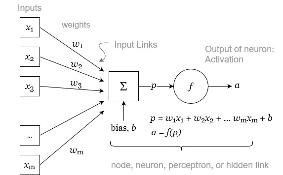
Each of the variables \(x\) from 1 to m are scalars real numbers (\(x \in \mathbb{R}\)). The neuron has a set of weights, \(w\). The number of weights corresponds to the number of inputs. The values for these weights are assigned during training. The weights are used to calculate a linear combination of the inputs, essentially a weighted average of the inputs. The output of this average then has an offset added to it, referred to as a bias, \(b\). The offset may be a positive or negative real number. The result of this calculation is p, a linear combination of the inputs plus a bias:
\[\label{eq:neuron} \begin{aligned} p &= x_1 w_{1} + x_2 w_{2} + \ldots + x_m wx_{m} + b \\ &= \sum_{i=1}^{m}x_i w_{i} + b \\ &= \mathbf{x} \mathbf{w} + b \end{aligned}\]
In Equation \ref{eq:neuron}, we suppose that the inputs \(x_1\) to \(x_m\) have been combined into a column vector, and the weights \(w_1\) to \(w_m\) are a row vector. Equation \ref{eq:neuron} is equivalent to:
\[p = \begin{bmatrix} x_1 \\ x_2 \\ \vdots \\ x_m \end{bmatrix} \cdot \begin{bmatrix} w_1 & w_2 & \cdots & w_m \end{bmatrix} + b\]
The value p, which is a linear combination of the inputs plus a constant, is then fed to the activation function, \(g(p)\). The output of the neuron, sometimes called its “activation,” is given as:
\[a = f(p)\]
A variety of different activation functions \(g\) can be used. Previously, sigmoid-shaped activation functions were favored (G. James et al. 2013), such as the logarithmic sigmoid:
\[g(z) = \frac{e^p}{1+e^p} = \frac{1}{1-e^{-p}}\]
The logarithmic sigmoid takes inputs from \(-\inf\) to \(+\inf\) and converts them to values between 0 and +1. Another common sigmoid function is the hyperbolic tangent function, \(tanh\):
\[g(z) = \frac{e^p-e^{-p}}{e^p+e^{-p}}\]
Today, many deep learning practitioners favor the rectified linear unit (ReLU) activation function. Because it is fast to compute and easy to store, it is well-suited to training very large NN models. It is calculated as follows:
\[g(z)=(z)_{+}= \begin{cases}0 & \text { if } z<0 \\ z & \text { otherwise }\end{cases}\]
Some other common activation functions available in Matlab are shown in Figure 4.12.
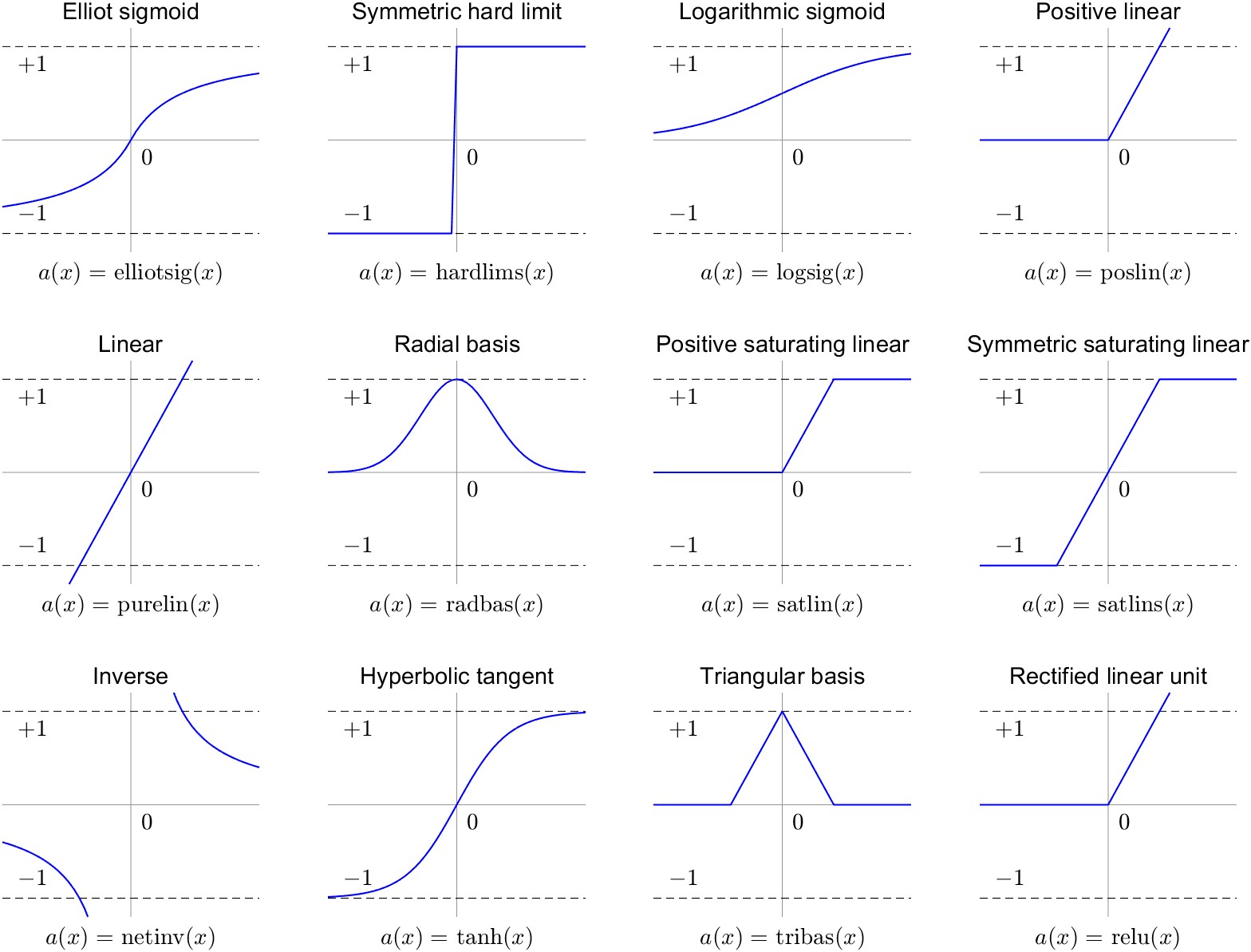
Typically, a single neuron is not enough to model most relationships. Thus, neurons are made to operate in parallel, in a “layer.” In NN jargon, the inputs and outputs are also layers, while layers of neurons that are internal to the model are called hidden layers. A network with a single hidden layer of neurons is shown in Figure 4.13. Like the previous diagram, we have a set of inputs \(x\). Here, we are using \(n\) neurons to transform the inputs, and we have \(n\) activation ouputs, \(a_1 \ldots a_n\). Each neuron has a weight for its connection to each input, thus we have a total of \(m \times n\) weights. (This example would be called fully connected, as every input is connected to every neuron.) Each neuron also has its own bias, \(b\). For convenience, we can assemble these into the rectangular \(m \times n\) matrix \(\mathbf{\mathrm{W}}\). The output of this hidden layer is \(n\) activations, each of which is a scalar value.
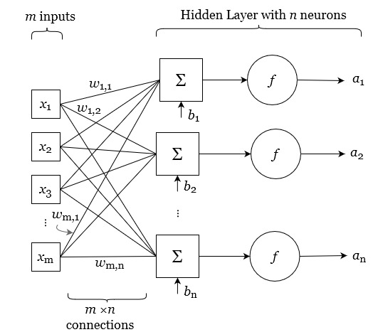
The final portion of the NN architecture takes the activations output by the hidden layer and converts it to the output or prediction. The output of the NN comes from the output layer. In a simple case, we have a single target, and the NN model is predicting a single output variable, \(y\). Similar to the way we treated the input layer, the output is a linear combination of the activations, plus a bias term. So the output layer can be expressed as follows:
\[y = a_1 h_1 + a_2 h_2 + \ldots + a_n h_n + \beta\]
Where \(h\) is the output layer weight and \(\beta\) is the output layer bias. The output layer does not use a non-linear activation function, unlike the hidden layer. The output is not normally scaled between 0 and 1, but should be a real number in the range of the target variable that we are trying to predict. So the final model is linear in the derived variables A that are output by the hidden layer. It is often the case where we wish for our NN model to output more than one variable. In such a case, the output layer should contain a node for each desired output. Figure 4.14 shows such a network.
Note that it is not necessary for there to be any correspondence between the number of inputs, the number of neurons, and the number of outputs. For example, we may construct a model with many inputs and a single output. For example, suppose the input is a square image, with 256 × 256 pixels. If we use each pixel as an input to an NN model, we have 256 × 256 = 65,536 inputs. In this case, we have 1 input layer, which contains 65,536 input variables.
Suppose the purpose of the model is to predict whether the image is of a cat. In this case, we can create a model with one output layer, containing one output variable. Typically, the output is a value from 0 to 1, indicating the probability that the image is a cat (according to the model). Now suppose we create a new version of the model to guess between cat, dog, and horse. In this case, the model will still have a single output layer, but with 3 outputs: \(P(\text{cat})\), \(P(\text{dog})\), and \(P(\text{horse})\). So we see that the number of inputs and outputs is determined by the problem statement and the available training data.
How does one decide how many hidden layers to include, and the size (number of neurons) in each? There is no formula for determining the best network size and architecture. Indeed, this is an active area of research. The best number of hidden layers and neurons could be determined by trial and error, by reviewing the relevant literature, or by consulting with an experienced NN modeler. Indeed, certain patterns have emerged, where it seems that certain model configurations are well-suited to different problem domains, such as image and video classification, speech and text modeling, and so on
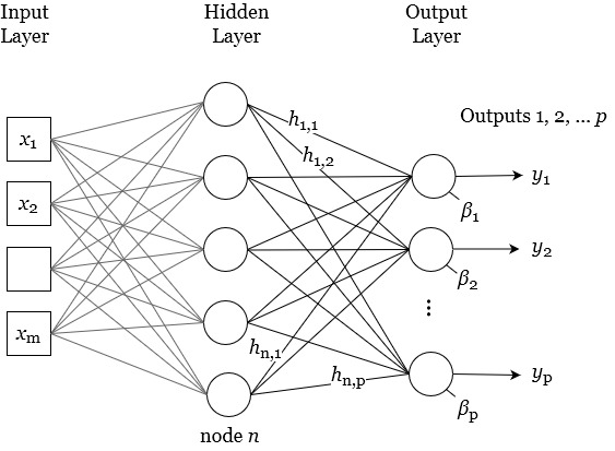
In the example in Figure 4.14, there are p outputs, so we have p output nodes. In general, NN architecture is fully connected, meaning that every neuron in a layer has a connection with every neuron in the preceding layer. Therefore, we have \(n \times p\) weights connecting the hidden layer to the output layer. Further, each node in the output layer has a bias, \(\beta\).
These weights and biases are adjusted during the learning process, so that the network can learn to recognize patterns in the input data and make accurate predictions. The original developers of neural networks were trying to simulate the way neurons in an organism function, with the nodes conceptually similar to nerve cells and the connections analogous to synapses, the connections between nerve cells. When the activation function \(a = g(x)\) approaches one, they are firing, while activations near zero are silent or inactive.
As we add more neurons to the hidden layer, we can simulate more complex behavior, including non-linear responses and interactions. In theory, one can recreate any continuous function given enough neurons and sufficient training (G. James et al. 2013). A pair of landmark papers demonstrated and proved this to be the case. Cybenko (1989) showed that linear combinations of sigmoidal (S-shaped) can approximate any continuous function of \(n\) variables. This paper, “Approximation by superpositions of a sigmoidal function,” specifically used continuous and bounded sigmoid activation functions. In a related paper by Hornik, Stinchcombe, and White (1989), “Multilayer feedforward networks are universal approximators,” the authors show proof that one can approximate any continuous function with arbitrary precision using a single-layer neural network. This makes NNs a class of “universal approximators.” For functions that are discontinuous (not defined for all \(x\)), more than one layer is required to approximate. In practice, it has been found that, to simulate complex relationships, it is usually more efficient to add additional hidden layers to the NN. The resulting models tend to have fewer overall parameters and take less time to train, according to Hagan and Demuth (2002)
According to Hagan and Demuth (2002), it took around 30 years between the invention of neural networks and the addition of an extra hidden layer to the single-layer neural network. Practically speaking, this had to do with the difficulty in training such networks – “a proper learning rule for the multi-layer neural network took quite some time to develop.” This problem was solved with the popularization of the back-propagation algorithm. A paper published in Nature in 1986 experimentally demonstrated the usefulness of the back-propagation method for training neural networks (Rumelhart, Hinton, and Williams 1986). The back-propagation algorithm provided a systematic way to adjust the weights of hidden nodes to reduce the model error. However, the ideas behind back-propagation had been developed earlier. Schmidhuber (2015) provides a readable account of the history of neural networks, tracing the invention of back-propagation to a Finnish Master’s student Seppo Linnainmaa in 1970, whose FORTRAN code implements backpropagation, although not for an NN. Important contributions related to backpropagation in NNs were made in the early 1980s by Paul J. Werbos, D.B. Parker, and Yann LeCun.
Another important consideration is the optimization method that seeks to minimize the errors by modifying model parameters. These methods are based on the concepts of gradient descent, which have an esteemed history in mathematics, being first described by , and applied to systems of Euler-LaGrange equations in the Calculus of Variations (Fraser 2005). For this research, I used Matlab’s implementation of the back-propagation with the Levenberg-Marquardt optimization algorithm. The algorithm dynamically adjusts a damping factor to balance between gradient descent (steepest descent) and the Gauss-Newton method (approximating the Hessian matrix), allowing it to efficiently converge to a local minimum of the objective function while avoiding convergence issues such as divergence or slow convergence (Hagan and Demuth 2002, 12–19).
Hagan and Demuth (2002) state that a two-layer network with a sigmoid first layer and a linear second layer can be trained to approximate most functions. Contemporary transformer-based architectures used for language processing can have many more hidden layers. It is not uncommon to see networks with dozens, hundreds, or even thousands of layers in the most advanced and specialized architectures.
Fitting a neural network requires estimating the weights and biases in the hidden layers and output layer in order to minimize prediction errors, which we calculate with a given loss function. When the model is estimating a quantitative response (rather than categorical, as in classification problems), analysts typically choose a squared-error loss function, i.e. the sum of squared errors (Equation \ref{eq:mse}). The parameters are chosen to minimize the total overall error through the process of training.
What about model architecture? How does one decide the number of hidden layers, how many neurons to place in each, and what type of activation function to use? These are sometimes called a model’s hyperparameters. Hyperparameters describe the overall structure of the model, and are chosen by the analyst. Deciding on a model’s structure, and how it will be trained, are decisions that must be made in the planning stages. By contrast, the model’s parameters are the weights and biases associated with the hidden layers, which are determined automatically during the training. Indeed, these connections are made by the computer using automated methods, making neural networks an example of machine learning. Choosing the best type and size of model for a particular problem is the subject of a great deal of ongoing research.
As G. James et al. (2013) note, careful tuning of networks can often result in performance improvements, “but the tinkering process can be tedious, and can result in overfitting if done carelessly.” Indeed, we must be constantly aware of the risk of overfitting a model. In Section 4.2, I discussed the bias-variance tradeoff. It is common for a model to perform well with training data – such a model is said to have low bias. However, the model may perform poorly when asked to make predictions based on data it has not seen during training – this is referred to as having a high variance.
Certain aspects of the NN architecture will be determined by the specification of the problem. We set the number of inputs based on the number of input variables we wish to include in our model. The number of outputs, and hence the number of nodes in the input layer, is based on how many variables we are trying to predict. For example, the NN models in this thesis usually have four outputs representing the four major fluxes of the hydrologic cycle: precipitation, evapotranspiration, runoff, and total water storage change (P, E, R, ΔS).
There are many variants of the fairly simple NN models I have described above. These include recurrent neural network (RNN) models, useful for modeling time series and other datasets with auto-correlation. One type of RNN, the Long short-term memory (LSTM) has recently shown good performance in modeling runoff, outperforming conventional rainfall-runoff models (Kratzert et al. 2019). Another type of model, convolutional neural networks (CNNs) have recently enjoyed great success in image classification tasks.
A variety of methods have been developed to prevent overfitting of NN models. One method involves selectively dropping certain network connections during training or “pruning” the network. Another strategy involves early stopping of the training process. Typically, the training algorithm continues iterating over an unlimited number of “epochs” until a given criteria is met, i.e. the gradient of the error function is less than a threshold value. Another approach involves limiting the training to a fixed number of epochs. Constraining the number of training epochs can be roughly equivalent to choosing a less complex model (Heberger 2012).
Training algorithms use random seeds to initialize a set of weights and biases for the network. In some circumstances, training may not produce an optimal outcome. This is due to the possibility of reaching a local minimum of the performance surface. Hagan and Demuth (2002) recommend restarting the training at several different initial conditions and selecting the network that produces the best performance. The authors point to research showing that five to ten restarts will “almost always produce a global optimum.”
Above, I described how machine learning practitioners divide or “partition” training data into sets for training, testing, and validation. Resampling methods like k-fold validation allow us to create multiple models based on different subsets of our data. The purpose of this is to better understand how the model performs with new, unseen data. Typically, after such experiments, the results are saved and the models themselves are discarded. Another approach involves performing multiple training runs and making use of all of the trained networks, for example by averaging the result. This has been referred to as a “committee of networks.” (Hagan and Demuth 2002) write that “the performance of the committee will usually be better than even the best of the individual networks.” In general, ensemble methods use multiple model predictions, combined in some way (e.g., averaging) to make final predictions. Such methods are widely used in machine learning and are considered among the most effective techniques for improving the performance and robustness of predictive models (Alber et al. 2019).
Common methods for combining information from multiple model runs include bagging and boosting. Bagging, short for “bootstrap aggregating” involves training multiple instances of the same model on different subsets of the training data (bootstrapped samples) and averaging their predictions (Hastie, Tibshirani, and Friedman 2008). Boosting is an iterative technique that was originally designed for classification problems, but can be applied to regression problems as well. With this method, models are trained in sequence, and each subsequent model focuses on examples that models before it had difficulty classifying.
I analyzed the input data for the NN modeling, and found that most variables were not normally distributed. For one set of experiments, I first normalized all the inputs, using Box-Cox transformations (described in Section 4.3.5) to transform and rescale the input variables. Figure 4.15 shows the empirical probability distribution of the EO variables before and after transformation. In the top set of plots in Figure 4.15(a), we can see that most of the variables have a skewed distribution, with many more low values compared to higher values. This is typical of many environmental observations. For runoff, the most frequent observation, or the mode, is zero. This is because we have many ephemeral rivers in our database, where there is no measurable runoff at certain times of the year. The exception is with ΔS, or total water storage change, which is roughly symmetrical about zero.
The distribution after applying a Box-Cox transformation to the data, is shown in Figure 4.15(b). I have superimposed a theoretical normal PDF over the histogram of values, with the mean and standard deviation of the transformed data. Here, the goal was to make the data more approximately normally distributed, which has been achieved. The runoff dataset appears to be the furthest from normal after transformation. This is because of the large number of zero values that affects the transformation calculations. Nevertheless, the distribution looks similar to a truncated normal distribution, albeit with an anomalously large spike at zero. It was not necessary to rigorously test for normality (however, this would be desirable in a regression analysis). In this case, one can check for normality with a probability plot correlation coefficient significance test (Vogel 1986), or with the well-known Kolmogorov–Smirnov or Shapiro-Wilk hypothesis tests.
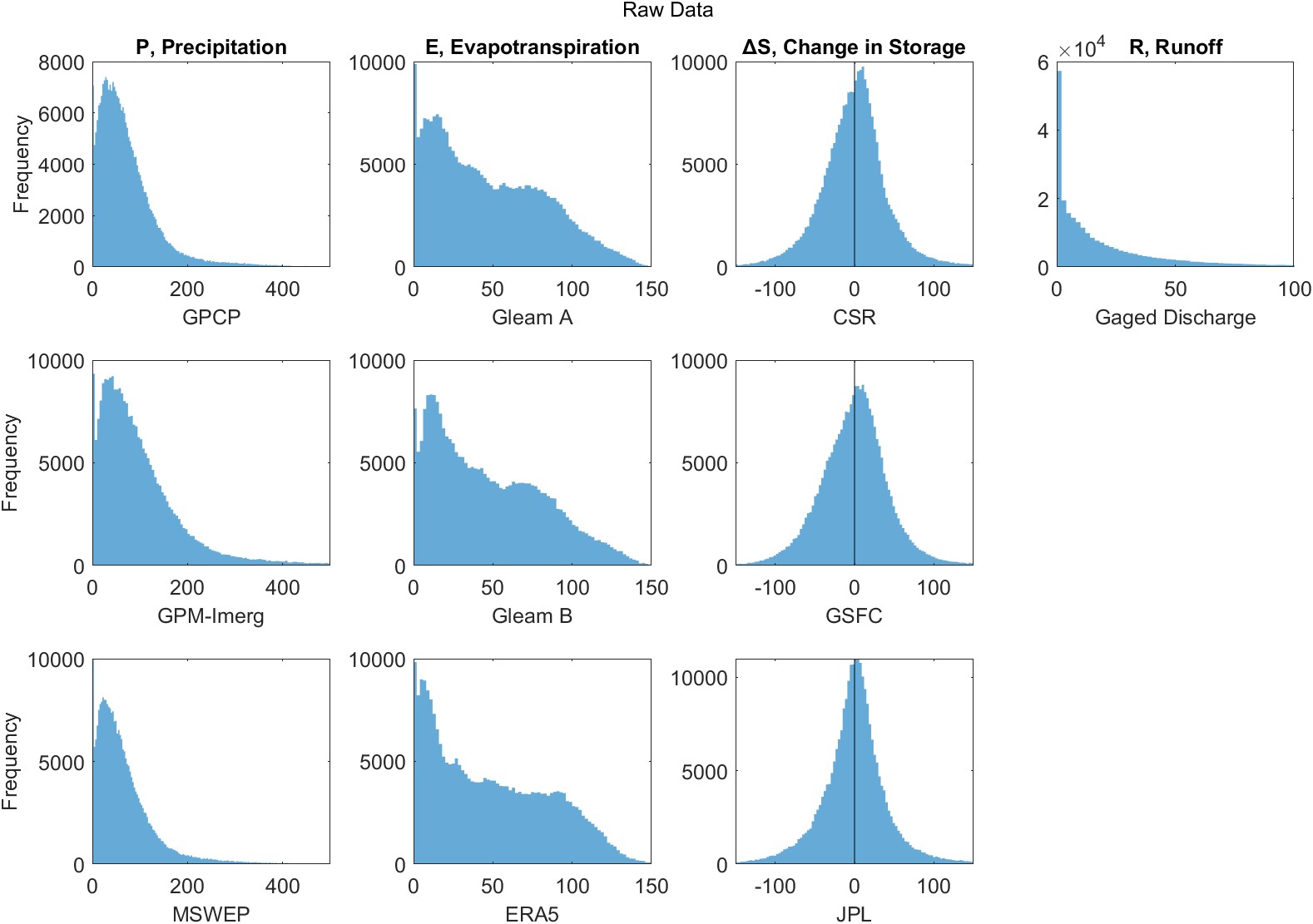
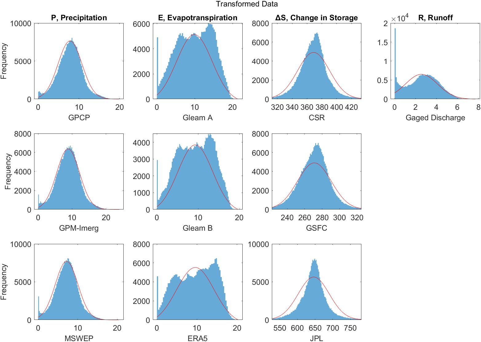
Here I describe the two main sets of NN models that I created and trained to close the water cycle. Both sets of models are at the basin scale. The first set uses runoff data from the 2,056 gaged basins, which are defined based on the drainage areas upstream of a flow measurement gage, as described in Section 2.5.1. The second set of NNs use runoff data from 1,398 synthetic river basins. For this analysis, I used a gridded runoff data product, GRUN, and thus I was free to create river basins with outlets at arbitrary locations, as described in Section 3.1.3.
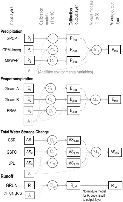
Unlike the linear models described above, the NN model is more easily able to integrate ancillary information to constrain the spatial dimension of our overall water cycle database. Previous work has shown the imbalance, or error in the water budget, varies with location and is correlated with environmental indices. Simon Munier and Aires (2018) showed that the errors are correlated with a vegetation index and an aridity index. This is evidence that feeding ancillary data to our neural network could help improve the accuracy of its predictions, a question which is explored in greater detail in Sections 5.2.2.
I experimented with a number of NN architectures. While the one shown in Figure 4.15 is among the simpler models that I tried, it performed the best. On the left are the model inputs, the uncorrected EO datasets, and on the right are the targets, the solution from OI that results in a balanced water budget. I chose a modular architecture with separate calibration and mixture steps that allows us to investigate the outputs of individual layers as we may gain useful information from each:
A database with paired input and target data is required to train and test the NN model, as well as to select the best model architecture and find the best set of model parameters. For the set of NNs shown in Figure 4.15, each of the 10 calibration networks has 13 inputs (1 EO variable and 12 ancillary environmental variables), 10 neurons in the hidden layer, and 1 neuron in the output layer. The outputs of the calibration layer are calibrated EO datasets, which are useful in their own right, as they should better balance the water budget. Further, they are inputs to the mixture model layers. These layers also have 10 neurons in the hidden layer and 1 neuron in the output layer. For example, the inputs to the precipitation mixture model are calibrated P from each of the three calibration models plus the ancillary variables. Again the target is the OI solution for P calculated previously. In the following section, we evaluate the results of the 10 calibration NNs (1 calibration per EO dataset), and the output of 4 mixture NNs (1 mixture per WC component).
The number of neurons in the hidden layers and the number of hidden layers controls the complexity of the model. I experimented with a range of network sizes and configurations, and found that the fit does not improve with more neurons. Estimation of the optimal parameters of the NN was performed during the training stage using back-propagation and the Levenberg-Marquardt algorithm (Hagan and Demuth 2002). I trained the model on a set of 1,358 basins and validated the model over a set of 340 independent basins (for an 80/20 split between training and validation).21 I corrected any physically implausible negative values for P or R by setting them zero. Finally, outputs for ΔS and R were smoothed with a 3-month moving mean filter to remove high-frequency noise from the predictions. I also performed the equivalent smoothing on validation datasets in order to ensure a fair comparison. This is a common procedure in large-sample hydrology studies (see e.g.: Lorenz et al. 2015; Pellet et al. 2021). Smoothing makes the output more realistic and visually appealing and results is slightly improved fit to observations.
The goal of the trained NN model is to optimally combine EO datasets, extracting the “best” information from each one in different environments. The NN model can then be used to make predictions, not only over the basins for which it was trained, but in other river basins for which input data is available. I validated the model by examining errors over basins that were not part of the training data, and where river discharge measurements are available. (In this case, there were 1,358 training basins, and 340 validation basins.)
I trained the NN model with two main configurations, representing the two “eras” described above. For the “contemporary” era, the 20 years from 2000–2019, the inputs are all of the EO datasets shown in Table 2.1. For the ”hindcasting” era, 40 years from 1980 to 2019, fewer EO datasets are available, for the simple reason that there were not as many satellites in orbit making observations. This model thus has a smaller number of inputs than the one shown in Figure 4.15. While the contemporary NN uses three precipitation datasets, the hindcasting model only uses two. In addition, the hindcasting model drops one ancillary variable: EVI. (The vegetation index EVI is not available from before the Aqua and Terra satellites. The Terra satellite was launched on December 18, 1999, and the first vegetation data are available for February 2000.)
Once the NN model has been calibrated (and validated) over a set of global river basins, it can be used to make predictions at the pixel scale, over all global land surfaces (excluding Greenland and area above 70° North). I was concerned that input variables assembled over the pixels would contain extreme values outside the range of inputs used to train the NN model. Recall that the training data had been averaged over basins containing tens to thousands of pixels. This averaging would tend to smooth out extreme values. Feeding the model input data outside the range of training data is an extrapolation problem, and could result in unrealistic and unreliable values in the output.
I compared the distribution and statistics of the input data compiled for basins and for pixels as a check on how large the extrapolation problem is likely to be. Figure 4.16 shows empirical probability distributions (kernel density plots) for the EO variables that are input to the NN model. In the legend of each figure, the pair of values in brackets is the minimum and maximum value observed over the domain (pixels or river basins). To a large extent, the distributions are overlapping. That is, the range of values for the EO variables in the pixels and the basins is nearly the same. It is worth noting that the high outlier values in the pixels are well outside of the range of the basin-averaged data. Because of this, the predictions in those pixels will be asking the model to make extrapolations outside of the range of the training data and will be more uncertain. However, the number of observations outside the range of training data is very small.
I did a small analysis to count the number of pixel-based observations that are outliers in this sense, and report the percentages for each variable in Table 4.4. The largest percentage is for GLEAM-B, where 0.025% of the pixels contain values for evapotranspiration higher than the maximum value in a training basin. That is, less than 3 out of 10,000 pixels will require the NN model to extrapolate outside the range contained in the training dataset. Based on this, I concluded that the extrapolation problem is minor and can be ignored.
Table 4.4: Percentage of observations among pixel-scale EO variables that are outside the range of basin-averaged training dataset.
| Dataset | < Min. Observed | > Max. Observed |
|---|---|---|
| Precipitation | ||
| GPCP | – | 0.0014% |
| GPM-IMERG | – | 0.0003% |
| MSWEP | – | 0.0001% |
| Evapotranspiration | ||
| GLEAM A | 0.002% | 0.001% |
| GLEAM B | 0.004% | 0.025% |
| ERA5 | 0.008% | 0.006% |
| Total Water Storage Change | ||
| CSR | 0.011% | 0.011% |
| GSFC | 0.001% | 0.006% |
| JPL | 0.003% | 0.001% |
| Runoff | ||
| GRUN | – | 0.018% |
Figure 4.17 shows similar information for the ancillary environmental data. Here, we can see that the distributions for these variables are largely overlapping. The notable exception is surface area, in square kilometers. The area of the pixels is much smaller than that of the basins. In fact, the range of areas is non-overlapping. For this reason, I dropped the variable area from the NN model inputs.
