
This chapter presents the results of the modeling analyses, whose goal is to calibrate earth observation (EO) datasets so that they may be combined to create a balanced water budget. The research described here focused on two distinct modeling methods. Both methods seek to emulate or recreate the results of optimal interpolation (OI). The OI analytical method is powerful and effective at balancing water budgets, but it can only be applied over river basins where data are available for all four of the major water cycle components: P, E, ΔS, and R. Previously, Chapter 3 described the OI method in detail. Chapter 4 described the methods for developing models to recreate the OI solution. A key advantage of the models described here is their ability to calibrate the variables individually. In other words, the calibration does not need all 4 of the water cycle components, as was necessary with the OI method.
The two classes of models described here use different methods but share a common objective: to take a set EO data as inputs and output a new, calibrated version of the EO dataset. The first modeling method involved fitting linear regression models for each variable over a set of global river basins. I describe the methods for this analysis in Section 4.3. Results of the regression analyses over individual river basins are then generalized for application at the pixel scale. This is done by creating surfaces of the fitted regression parameters that can be used for spatial interpolation. Spatial interpolation methods are described in Section 4.3.6. I refer to this suite of analyses (regression + parameter regionalization) as “the regression method.” I also use the abbreviation Regr. in tables and figures.
The second method is referred to in this chapter as neural network modeling, and with the abbreviation NN. Strictly speaking, the NN model is also a kind of regression, as it involves modeling the relationship between dependent variables and one or more independent variables. Nevertheless, the form and structure of the NN model differs from the conventional linear regression models described above. Furthermore, the NN model also includes a wider range of input variables, as I have included several environmental variables such as elevation, slope, and vegetation.
My goal was to first train models at the basin scale, then use the trained models to make predictions in (1) ungaged basins and (2) at the pixel scale over global land surfaces. In this chapter, I begin with a discussion of how the models were trained. As is the case for both types of models described here, the models are not calibrated to fit environmental observations. Rather, they are trained to fit the OI solution for the water cycle components that was obtained earlier and that results in a balanced water budget. Section 5.1 focuses on the results of the regression modeling method. This section includes a discussion of outlier detection and removal, the results of nonparametric Theil-Sen regression and an alternative 3-parameter model. I present the results for each regression model and explain how the final regression model was chosen. The last subsection, 5.1.4, describes the process of parameter regionalization, or using surface-fitting algorithms to spatially interpolate model parameters to new locations outside of the location of original training basins. I methodically tested several surface-fitting techniques and found that kriging, among the more detailed and complex methods, produced the best results with my data.
The following section, 5.2 discusses calibration and training of NN models to fit the OI data. Over the course of my research, I created hundreds of models over varying configurations and sizes. I limit the discussion here to the final phase of model selection. At this point, I had found an NN model architecture that worked well, and focused on the final selection of input variables and setting the network hyperparameters (e.g.: number of layers and neurons). The remainder of this chapter focuses on the model results and compares the results of the two modeling methods. I explore the models’ performance in a series of plots and maps. Further, I examine how the models make changes to the input data, and how well the results fit the target OI solution.
Both models can be extended to the pixel scale quite successfully. I explore the geography of the imbalance with a set of maps, to see whether the models perform better in some locations than others. Finally, I analyze how well the EO data fits in situ observations, comparing the fit before and after calibration. This analysis helps to verify that the calibration of EO variables has not degraded the signal too much.
Overall, both modeling methods result in substantial improvements to EO datasets, making them more coherent and helping to close the water cycle. Overall, the NN model outperforms the regression method in terms of overall reduction in the water budget residual. Nevertheless, the regression method enjoys the advantage of being relatively simple, requiring less input data, and is perhaps more readily explainable.
I explored the relationship between the EO variables and their respective OI solutions with various forms of linear regression described in Section 5.3. I found that ordinary-least squares (OLS) regression with two parameters, slope and intercept, performed well. Removing a small number of outliers prior to fitting the regression lines further enhanced the fit. The results of OLS regression were similar to results obtained with nonparametric Theil-Sen regression.
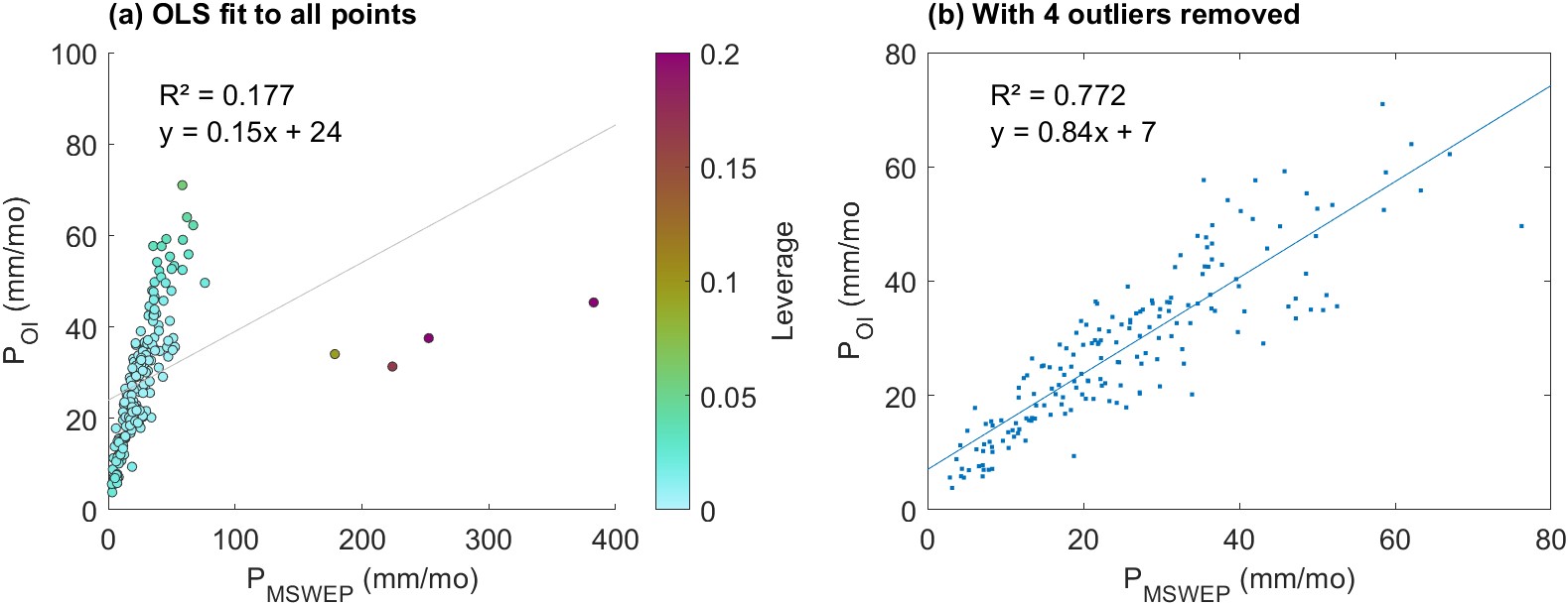
Figure 5.1 is an example of the regression for a single parameter over 3 randomly selected river basins. In the first plot, we can see the influence of high outliers on the OLS regression. The nonparametric Theil-Sen regression is more resistant to outliers and has a more realistic slope. Next we will explore the effect of removing outliers before fitting the regression line.
As can be seen in the left-most plot in Figure 5.1, there are occasional outliers in the EO datasets that interfere with fitting an OLS regression line. When one or a few points have a large influence on the fit of the line, it can result in a poor fit to the majority of the data, as discussed in Section 4.3.2. In order to detect and remove outliers, I calculated two indicators, univariate leverage and Cook’s d, for each paired set of predictor and explanatory variables. That is, for each EO dataset (10) and each training basin (1,358). Figure 5.1 shows an example regression where we have removed the outliers which exert strong leverage on the fit of the regression line. The plots show the same data from the left plot in Figure 5.1 above. In (a), each point has been color-coded according to its leverage \(h\), calculated by Equation 4.30. In this case, we have \(n=184\) points, and so we use an outlier threshold of \(h = 16/n = 0.087\). In Figure 5.1(b), we have the same data, but with the four high outliers removed. The OLS regression line is a much better fit to the remaining data, with \(R^2 = 0.77\). The slope of the regression line \(a = 0.84\) much closer to 1. Because the fitted relationship will be used to calibrate the EO variable, an extreme high or low value is undesirable as it would make large changes to the input.
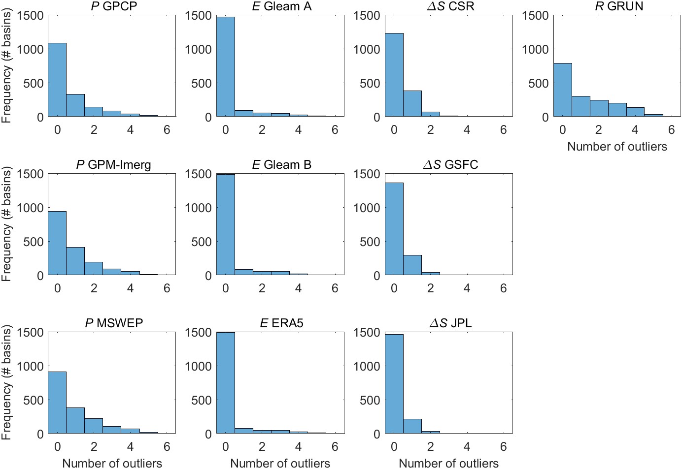
The number of outliers varied by EO variable. The number of outliers also varied based on the method used for outlier detection. Figure 5.2 shows the distribution in the number of outliers over 1,358 training basins for each of the 10 EO variables. The mode, or most common value, for the number of outliers is 0, for all 10 EO variables. Runoff has the most outliers, with an average of 1.24 outliers in each basin. There tend to be more outliers among the variables for P, and fewer outliers among the E and ΔS variables. This is expected as the datasets for P and R tend to be more highly skewed to the right, with many observations close to zero, and occasional observations that are much higher. Within each class of variable, the shape of the distribution is similar. Again, this is expected, as the variables are correlated with one another, and tend to exhibit similar behavior.
I calculated the regression parameters relating EO data to the OI solution for each of the 1,358 training basins and for each of the 10 EO variables using the various methods described in Section 4.3. These methods included:
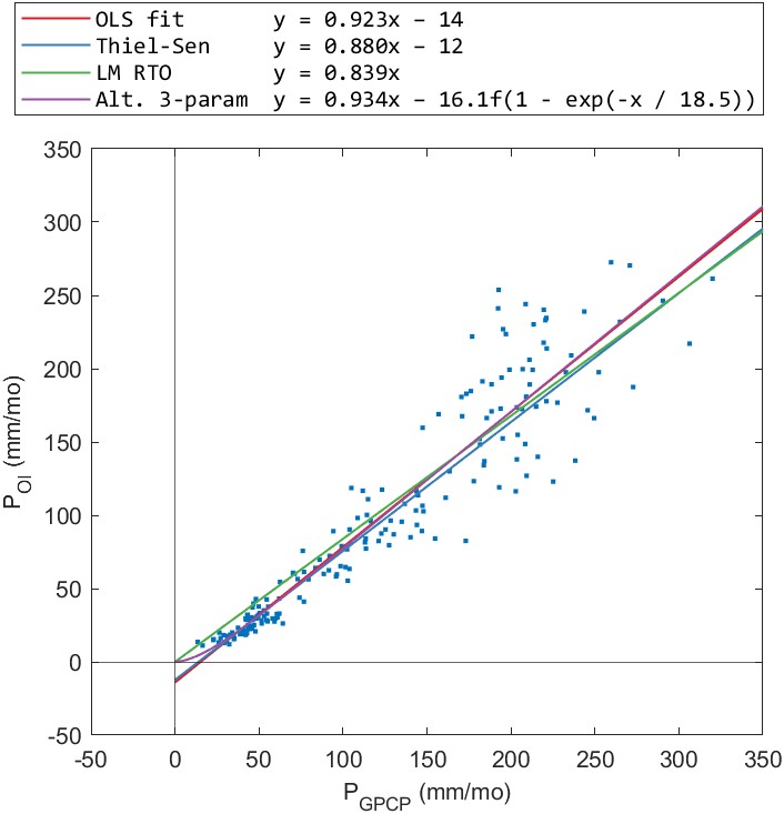
The results for the alternative 3-parameter regression appeared to be acceptable when we examine the fits in individual basins. An example is shown for one basin in Figure 5.4. In this basin, the fitted regression lines for each of the 3 methods look similar. However, when we zoom into the lower values (at right), we see that both the OLS and Theil-Sen regression lines have an intercept below zero. Consequently, the fitted relationship predicts negative values for precipitation values less than about 15 mm/month. The alternative 3-parameter regression has the desirable quality of passing through the origin and never predicting negative values for precipitation. The one-parameter RTO regression also passes through the origin, and never predicts negative P, however, it appears to consistently overestimate low values of P.
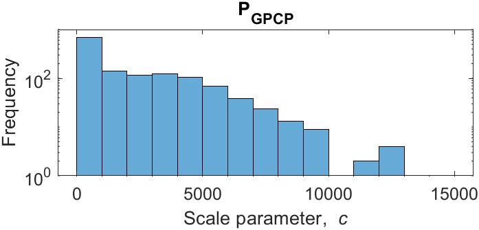
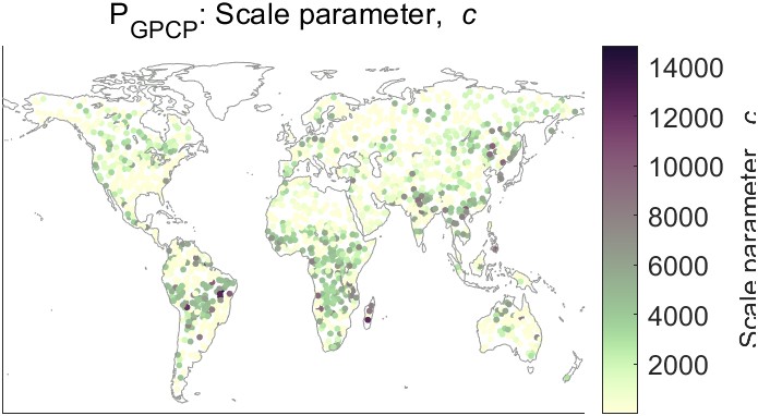
Despite the desirable qualities of the 3-parameter regression, maps of the parameters show there is a lot of variability. The fitted values vary over multiple orders of magnitude. They also lack a consistent geographic pattern needed to fit a surface and extrapolate parameter values to new locations. Figure 5.5 shows a map of the parameter \(c\) and the distribution of its values over the training basins. Note that the vertical axis of the histogram is on a log scale. Most of the values of the parameter \(c\) are relatively low, but the distribution is highly skewed to the right, with several high outliers where \(c > 14,000\). Because of this large variability, it is not possible to create a smooth interpolated surface. Therefore, I did not consider the results of the alternative 3-parameter regression method in further analyses. It is also worth noting that fitting the 3-parameter equation is much slower and less efficient than either OLS or Theil-Sen regression. Fitting this equation over 1,358 training basins and 10 variables using Matlab’s fit function took about an hour on a laptop computer, versus a few seconds for the other forms of regression. This makes it slightly less practical for testing and running experiments like resampling and cross-validation. However, this is a relatively minor concern. The main problem with this method is the variability in fitted parameter values and the lack of a consistent geographic pattern.
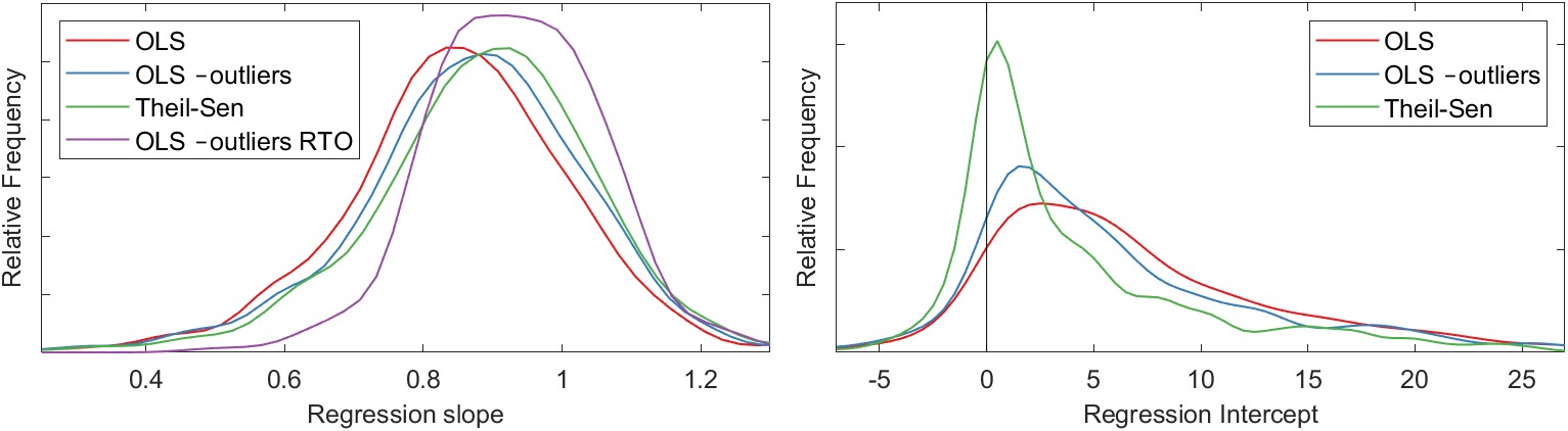
We saw in Section 4.3.3 that the nonparametric Theil-Sen regression method is more robust in the face of outliers and skewed data. For our dataset, the results of Theil-Sen regression are similar to those of OLS regression performed after outliers have been removed. Figure 5.6 shows the distribution of the regression parameters (slope and intercept) for the different methods under consideration. In Figure 5.6(a), we can see that the distribution of slopes among the various methods is similar. The first type, OLS regression, tends to have slightly lower slopes on average. The distribution of slopes for OLS regression after outlier removal and Theil-Sen regression are similar. For the one-parameter RTO (with no intercept term), the slopes tend to be somewhat higher on average. Figure 5.6(b) shows the distribution of the intercept terms. It is also worth noting that the Theil-Sen method also has the greatest density of intercepts close to zero. One of the effects of outliers on this dataset is to make the intercept move further from the intercept.
The regression analysis gives us a simple, straightforward method for adjusting EO datasets such that they are closer to the OI solution for water cycle components which satisfy the water cycle closure constraint. For example, estimates of precipitation from the datasets GPCP, GPM-IMERG, and MSWEP are made to more closely approximate OI precipitation. Next, we turn to the problem of extrapolating the results of the regressions so that we may perform the calibrations outside of our training basins. To do so, we use spatial interpolation methods described above in Section 4.3.6. This method of spatial interpolation can be considered an example of parameter regionalization, a method often used in the hydrologic sciences.
Several techniques exist for conducting spatial interpolation. These methods vary in terms of complexity and flexibility. I experimented with seven different methods. Figure 5.3 demonstrates the effect of different spatial interpolation methods. The maps show the spatial interpolation of the OLS regression slope parameter for one of our three precipitation variables, GPCP. The interpolated surfaces cover the global land surface, but Figure 5.3 is zoomed in on Asia to show more detail.
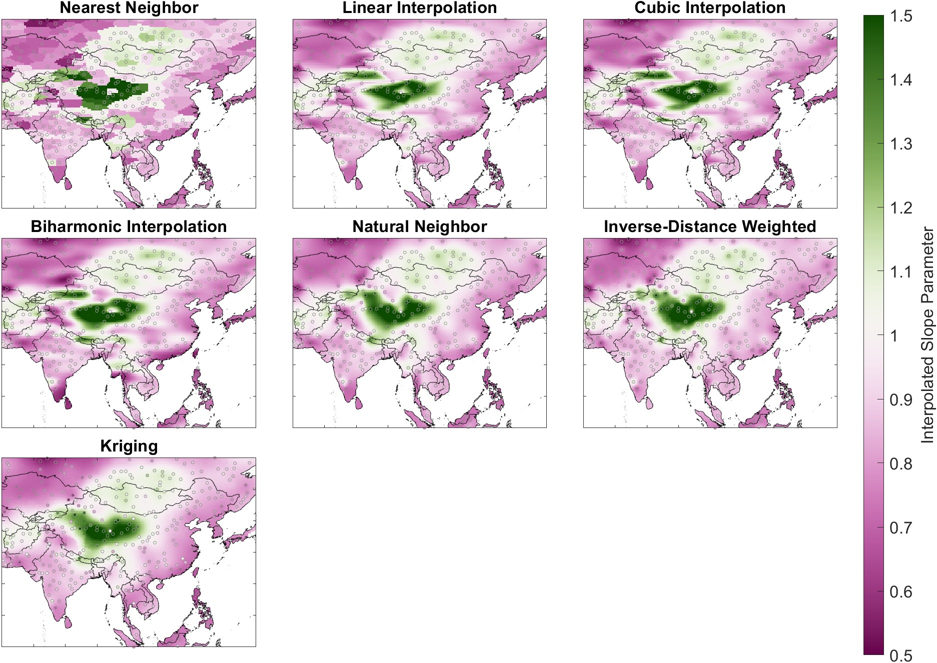
The fitted surfaces vary in terms of their smoothness, shape, and level of fine-grained detail. It is not readily apparent which of these surfaces is the best fit to our data. I believe that many scientists and engineers simply choose a surface-fitting algorithm that is customary within their discipline or within their organization. For example, nearest-neighbor methods are commonly used by hydrologic modelers for spatial interpolation of rainfall data, while kriging is common in geology and mining. I used a more thorough and analytical approach to method selection based on resampling and cross-validation. My method searched for the method that is best at predicting the correct value at locations that were not used to fit the surface.
For the cross-validation experiment, I created 20 different partitions, separating the 1,698 synthetic river basins into training and validation sets. I used an 80/20 split, with 1,358 training basins and 340 validation basins. Basins were assigned at random in each set. As such, my resampling method is not a strict k-fold cross validation, which divides the samples into \(k\) contiguous blocks.
I fit the regression model for all 10 variables in each of the 1,698 basins in my training dataset. Then, I fit surfaces for the regression slope parameter. For each of the 20 surface-fitting experiments, the surface was fit using a training set consisting of 80% of the basins, \(n_{train} = 1,358\). I evaluated the quality of the fit on the other 20% of basins (\(n_{validation} = 340\)) by calculating the root mean square error (RMSE). I repeated this experiment 20 times, for each experimental partition. The result is a set of fit statistics for each method and each variable.
Table 5.1 summarizes the results of the cross-validation, showing the average bias error for each method and for each. The table reports the average RMSE (out of 20 trials) for each variable and each surface-fitting method. In Table 5.1, the best RMSE (i.e., the lowest average value) for each variable is in bold. I also calculated the average RMSE across all 10 EO variables and the rank for each method from 1 to 7.
Table 5.1: Summary of the cross-validation experiment to determine which surface fitting method best predicts regression model parameters for calibrating EO variables. Table entries are the root mean square error in mm/month for 340 validation basins.
| Regression Model Parameters | Avg. RMSE | Avg. Rank | ||||||||||
|---|---|---|---|---|---|---|---|---|---|---|---|---|
| P GPCP | P GPM-IMERG | P MSWEP | E Gleam A | E Gleam B | E ERA5 | ΔS CSR | ΔS GSFC | ΔS JPL | R GRUN | |||
| Nearest Neighbor | 0.118 | 0.082 | 0.140 | 0.210 | 0.113 | 0.140 | 0.086 | 0.088 | 0.141 | 0.316 | 0.143 | 7 |
| Natural Neighbor | 0.105 | 0.075 | 0.126 | 0.137 | 0.088 | 0.126 | 0.078 | 0.072 | 0.115 | 0.257 | 0.118 | 5 |
| Linear | 0.096 | 0.066 | 0.122 | 0.155 | 0.095 | 0.113 | 0.065 | 0.065 | 0.115 | 0.270 | 0.116 | 2 |
| Cubic Spline | 0.098 | 0.068 | 0.123 | 0.161 | 0.096 | 0.113 | 0.064 | 0.064 | 0.117 | 0.277 | 0.118 | 6 |
| Biharmonic | 0.101 | 0.070 | 0.123 | 0.156 | 0.095 | 0.112 | 0.061 | 0.062 | 0.118 | 0.272 | 0.117 | 3 |
| IDW | 0.101 | 0.069 | 0.129 | 0.140 | 0.093 | 0.118 | 0.074 | 0.074 | 0.115 | 0.264 | 0.118 | 4 |
| Kriging | 0.097 | 0.067 | 0.122 | 0.137 | 0.088 | 0.112 | 0.065 | 0.065 | 0.110 | 0.266 | 0.113 | 1 |
The performance of the various spatial interpolation methods is relatively similar, with values for the RMSE that are similar to within a few percent. The exception is the nearest neighbor method, whose performance is poor compared to the six other methods. Interestingly, the natural neighbor method, which adds some smoothing between stations, significantly outperforms nearest neighbor. The relatively simple linear interpolation method is the second best, slightly outperforming more complex methods such as the cubic spline and biharmonic interpolation. Kriging is the most complex method and can fit the most flexible surface. It is the clear winner, outperforming the other six methods on average. Nevertheless, it is not always the best. For some variables, another interpolation method performs better. For example, for ΔS CSR, the biharmonic interpolation method returns the lowest validation RMSE. Yet, across the 10 EO variables, kriging gives the least error overall. I would note that the kriging method has many parameters, and could perhaps be improved even further through extensive trial and error.
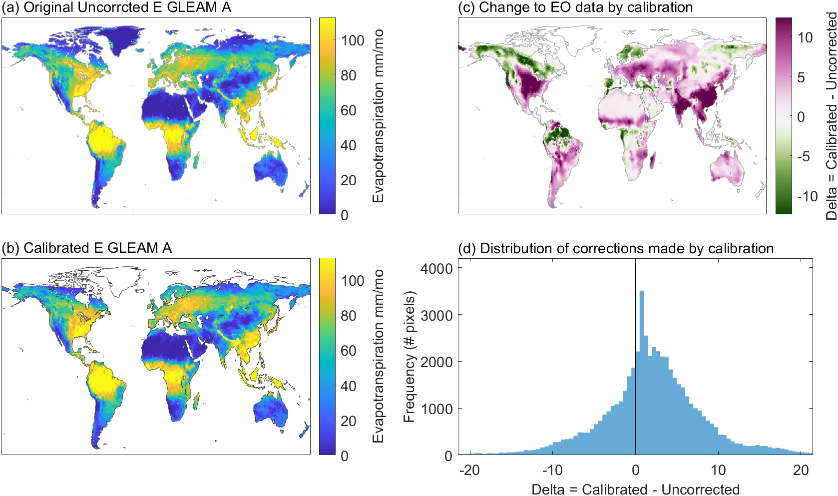
We now have a relatively straightforward model for calibrating EO variables in ungaged basins or at the pixel scale. Spatial interpolation gives us the regression parameters at the pixel scale. We can use the fitted surface to look up the best value for the regression equation at any location over continental land surfaces. Figure 5.4 shows an example of performing the calibration, for a single month and a single variable. Here, we are using the 2-parameter OLS model to calibrate E from Gleam-A, where the parameters for each pixel over land are determined by the surface fit described above. In Figure 5.4(a), we have the original, uncorrected estimates of E from Gleam-A. This is the input data, prior to calibration by the models. The second map (b) shows the calibrated E. A third map, Figure 5.4(c) shows the magnitude of the adjustment. Finally, the histogram in (d) shows the distribution of the changes made in all pixels for this month. Positive values indicate that calibrated E is higher than the input data. The distribution of adjustments made to E for this variable in this month is asymmetrical; pixels where the method is increasing E outnumber those where E is being decreased.
The example shown in Figure 5.4 shows just 1 of 10 variables, and 1 out of 240 months in our temporal domain from 2000 to 2019. Nevertheless, it is interesting to look into the particularities of the changes made to the EO dataset, as this is the main purpose of this research project. However, this pattern of corrections depends on the variable, as each has a different set of calibration parameters. In this case, for Gleam-A, calibration is making the largest increases in E over the central United States and eastern Asia, while the largest decreases are over the northern arctic region in Canada, Alaska, and the European Nordic countries. The changes are typically relatively small compared to the magnitude of observed E, usually less than 10% of the uncorrected observation. Below, we will assess the results of this method in terms of how much it reduces the water cycle imbalance, and compare it to a different modeling method based on neural networks.
The NN model whose architecture was shown in Figure 4.15 has two sets of outputs. First, the calibration layer calibrates each of the 10 EO variables individually. Next, the mixture models combine information from individual members of each class of the calibrated EO datasets (P, E, ΔS, and R). The output of each of the 4 mixture models is a calibrated water cycle component in units of mm/month. Recall that the target for the NN models is the OI solution, a set of water cycle components (P, E, ΔS, and R), which satisfy the water cycle closure constraint, or which result in a closed water budget over the training river basins.
In the course of my research, I tested many different configurations and architectures. After converging on an NN model architecture that yielded good results, I tested a number of minor variants, summarized in Table 5.2. This table reports the mean and standard deviation of the water cycle imbalance across the 340 validation basins, and all available monthly observations from 2000 to 2019. I looked at other fit indicators, such as mean square error, in assessing model fit. However, the imbalance gives a good high-level view of our main objective, which is to close the water cycle. (The numbering of the models is arbitrary and refers to my naming system for Matlab scripts and data files.)
Among the variants I tested, some models included larger or smaller networks. For example, NN 12-4 decreased the number of neurons from 40 to 10. As a result, the model fit and imbalance were degraded. I also tried larger networks, such as 12-6a with three hidden layers. This did significantly improve the fit or lower the imbalance, but the larger model takes longer to train and to run. So we see that increasing the complexity of the model, in terms of the number of neurson, improves the model fit, but only up to a certain point. At a certain point, the model fit stops improving. There are a few possible explanations for this. The relationships we are modeling may not be extremely complex, and our data may not require the additional complexity required by adding additional neurons. Alternatively, it may have to do with data quality. Noise in the data may be preventing us from achieving a better fit. Adding neurons and hidden layers can make the network too flexible and prone to fitting noise, resulting in poor generalization.
I also experimented with different activation functions in the hidden layer (see Figure 4.12). Changing from the tansig function to the rectified linear (ReLu) function or a pure linear function made the fit and the imbalance slightly worse.
I chose NN 12-5 as the best model from among those described in Table 5.2. Overall, the performance of the networks in Table 5.2 varies somewhat, but not dramatically. The models all shared a similar architecture (Figure 4.15, and only vary in terms of the details. It is worth noting that the values in the table represent a single training run, and these values vary somewhat when the training is repeated. With each training run, Matlab’s training algorithm chooses a different set of initial parameters using a random number seed. Therefore, small differences in the outputs shown in Table 5.2 are not likely to be meaningful.
Table 5.2: Experimental neural network configuration trials. Shows experiments with different model configurations, and the resulting water cycle imbalance over the 340 validation basins. The best results have a mean imbalance near zero and a lower standard deviation.
| Model | Description | mean | std. dev. |
|---|---|---|---|
| NN 12-1 | Calibration + Mixture, with 5 ancillary variables. Small networks: 1 hidden layer, 20 neurons | −0.9 | 31 |
| NN 12-2 | Ancillary variables are normalized via Box-Cox transformation | −0.8 | 31 |
| NN 12-3 | Adds longitude to ancillaries | −0.5 | 31 |
| NN 12-4 | As NN3, but with smaller network (10 neurons) | 2.4 | 33 |
| NN 12-5 | Added additional 7 ancillary variables: irrigated area, longitude, burned area, snow cover, solar radiation, temperature, vegetation growth/senescence (dV/dt) | -0.4 | 27 |
| NN 12-5b | changes activation function in the hidden layer from tansig to ReLu | −1.2 | 27 |
| NN 12-5c | changes activation function in the hidden layer to pure linear | −0.3 | 36 |
| NN 12-6 | 4 mixture networks only; no intermediate calibration step | −0.6 | 30 |
| NN 12-6a | Same as NN 6, but bigger network: 3 hidden layers with 30, 10, and 3 neurons in each layer, respectively | -0.7 | 27 |
| NN 12-7 | same as 6, but the ancillaries are normalized | −1.0 | 27 |
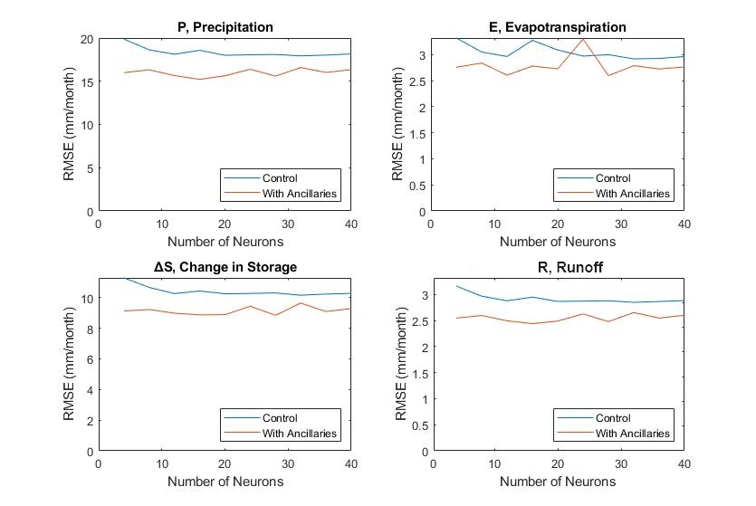
The final NN model architecture (Figure 4.15) contains individual networks each with 1 hidden layer and 20 neurons. I experimented with different numbers of layers and neurons, and determined that this configuration minimizes the cost function (mean squared error) in the training and testing sets. Figure 5.5 shows the results of an experiment in training a network with a single layer and a varying number of neurons between 5 and 40. The lines show the root mean square error (RMSE) for each of the water cycle components over the validation set. There is a slight decline in the error as we increase the number of neurons from 5 to 20, although the trend is not strong.
Adding more layers and neurons beyond 20 does not result in lower error. However, larger models with more parameters were not necessarily worse – I did not see any evidence of over-training. This is largely due to the smart training algorithms in Matlab, which stops training when validation errors begin to increase. However, we also do not see evidence that the larger models with more neurons perform any better. Therefore, it was more parsimonious to choose the smaller model with fewer parameters. Furthermore, smaller models are faster to train and to run.
The plots in Figure 5.5 also show the effect of including the ancillary environmental variables on the quality of the output of the NN model. Models that include environmental information consistently had lower overall error and greater ability to reduce the water cycle imbalance. The model with 12 ancillary variables outperformed a similar model with only 5 ancillaries. However, there is evidence that not all of the 11 variables are significant. Below, I describe a more thorough set of experiments to determine which of the ancillary variables are the most important in terms of improved the fit of the NN model and thereby better closing the water budget.
In the following sections, I describe a set of two experiments I performed to determine which of the 12 ancillary environmental variables are most useful for improving the calibration of EO variables. In the previous section, we saw that an NN model with 5 ancillary variables performs better than a model with none. Further, a model with 12 ancillaries outperforms the 5-variable model. However, it is not clear which of the variables is most responsible for this improvement, or whether all 12 variables contribute to the improved fit.
For the first experiment, I used conventional statistical methods – linear regression and analysis of residuals – to determine which of the ancillary variables can help calibrate the EO variables. Recall that our goal is to fit a model that can calibrate EO variables, making them closer to the OI solution. For example, we calibrate GPCP precipitation so that it is closer to \(P_{OI}\), the optimal interpolation solution for precipitation that we obtained previously (see Sections 3.8 and 3.9).
For this approach, first I fit a linear model between each EO variable and its OI solution. For example the independent variable \(x = P_{GPCP}\) and the dependent variable \(y = P_{OI}\). Then, I made plots of the model errors, or residuals, versus the ancillary variables. Analyzing residual plots is an important step in a regression analysis. Ideally, residuals should be normally distributed around zero without a clear pattern. If there is some structure to the residuals plots, it means that there is still variance in the response variable that could potentially be explained using other observations. In multivariate regression, when the analyst can no longer find any structure in the residuals, the remaining error is unexplainable, i.e., it may be due to random variations.
Figure 5.6 shows a set of residuals plots for 1 of the 10 EO variables, evapotranspiration from ERA5. One can see patterns in certain plots in this figure. For example, there is a distinct shape to the plot of residuals versus the aridity index – it is not just a random cloud of points. There is also a slight upward trend; as the value of the aridity index increases, so does the average residual.
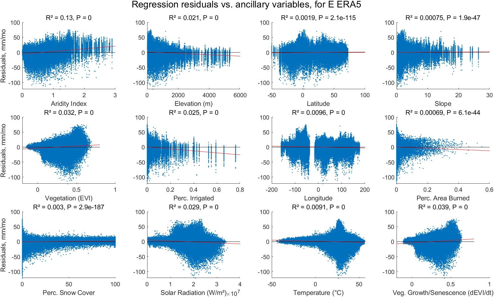
I repeated the experiment for all 10 of the EO variables, plotting the residuals versus all 12 environmental variables. In every case, the p-values of the slope on the ancillary variable vs. the residuals are all extremely small, meaning that the slope is statistically significant. However, the effect size for most of the relationships is small. For example, in Figure 5.6, the relationship with latitude is very weak, as indicated by a slope that is near zero. Here, the elevation explains a small amount of the variance in the residuals. This is evidenced by a small coefficient of determination, \(R^2 = 0.0019\). The interpretation is that the variable latitude can explain less than 0.19% of the residual variance.
The results of this experiment are summarized in Table 5.3. Table entries are the coefficients of determination (\(R^2\)) from the residual plots. The interpretation for each entry is, "the percentage of the residual variance can be explained by this ancillary variable." The highest \(R^2\) value that we see in the table is for ERA5 evapotranspiration residuals and the aridity index. Here, the aridity index can explain 12.8% of the residual variance. However, for many of the other variables, \(R^2\) is very small. So while the relationship may be statistically significant, it is also very weak. Bold entries in Table 5.3 show where \(R^2\) is greater than 0.5%. This was an arbitrary threshold I created to determine whether the variable has a meaningful (albeit often small) effect.
Table 5.3: Potential utility of the ancillary environmental variables: percentage of the EO single linear regression calibration error that can be explained by the ancillary environmental variables.
| arid | elev | lat | slope | veg | irrig | lng | burned | snow | solar | temp | veg delta | |
|---|---|---|---|---|---|---|---|---|---|---|---|---|
| P GPCP | 2.7% | 2.9% | 2.9% | 0.3% | 0.5% | <0.1% | 0.8% | 0.1% | 0.1% | 0.4% | 0.1% | <0.1% |
| P GPM-IMERG | 2.6% | 3.5% | 3.6% | 0.4% | 0.7% | <0.1% | 1.2% | 0.2% | 0.4% | 0.4% | 0.3% | 0.1% |
| P MSWEP | 1.9% | 2.9% | 2.9% | <0.1% | 0.4% | 0.1% | 0.7% | 0.1% | 0.5% | <0.1% | <0.1% | 0.1% |
| E GLEAM-A | 0.1% | 1.5% | 1.5% | 0.1% | 0.6% | 1.6% | 0.3% | <0.1% | 2.4% | 1.3% | <0.1% | <0.1% |
| E GLEAM-B | 0.1% | 1.2% | 1.1% | 0.3% | 0.9% | 2.9% | <0.1% | 1.5% | 0.4% | 1.9% | 1.4% | 0.3% |
| E ERA5 | 12.8% | 3.9% | 3.2% | 2.9% | 0.2% | 0.9% | 1.0% | 2.1% | 2.5% | 0.3% | 0.1% | 0.1% |
| ΔS CSR | 0.7% | 0.5% | 0.5% | 2.2% | 0.2% | 0.4% | <0.1% | 0.3% | <0.1% | 0.4% | <0.1% | 0.4% |
| ΔS GSFC | 0.8% | 0.7% | 0.7% | 1.0% | 0.1% | 0.1% | <0.1% | 0.3% | <0.1% | 0.1% | <0.1% | 0.2% |
| ΔS JPL | 0.7% | 0.4% | 0.3% | 2.7% | 0.2% | 0.6% | <0.1% | 0.3% | <0.1% | 0.5% | <0.1% | 0.3% |
| R GRUN | 0.8% | 0.4% | 0.2% | 1.0% | 0.7% | 0.3% | 0.3% | 0.8% | 0.1% | 0.2% | 0.3% | <0.1% |
| Count of EO vars. where \(R^2 >\) 0.5% | 8 | 8 | 7 | 5 | 4 | 4 | 4 | 3 | 3 | 2 | 1 | 0 |
My conclusion based on this experiment, summarized in Table 5.3, is that the environmental variables are likely to be useful in a multivariate calibration model. The experiment suggests that 8 to 10 (out of 12) variables have utility. I came to this conclusion when an ancillary variable can explain at least 0.5% of the residual variance in 2 or more of our 10 EO variables. Recall that our goal is to recalibrate each EO variable to emulate the OI solution. Despite the fact that the effect size is rather small, adding environmental information to a linear model improves the fit to the OI solution. Adding additional variables does not greatly increase the complexity of the model, or the time required to run it. Next I will show more directly how incorporating ancillary variables in a neural network calibration model affects its fit.
The experiment described above showed that the ancillary variables can help explain some of the residual variance in a simple linear regression model for calibrating EO variables. For the next experiment, I trained a set of NN calibration models. The base case had just one input variable, e.g.: \(P_{cal} = f(P_{GPCP})\). Next, I added the ancillary variables one at a time, for example, \(P_{cal} = f(P_{GPCP}, aridity)\). The purpose was to determine whether adding an ancillary variable improves the fit of the NN model.
Since the results of individual NN trainings in Matlab have a random element to them, and the results come out a bit different each time, I repeated each training 20 times, with a 70:15:15 split between the training, testing, and validation sets. I did the split carefully and methodically so that data from a single basin stays in the same partition (I did not use the default Matlab algorithm which performs the split at random).
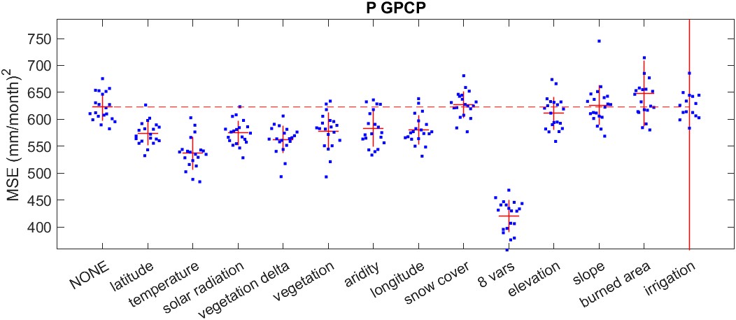
An example of the output of this experiment is shown in Figure 5.7. This plot shows the validation mean square error (MSE) for an NN model to calibrate GPCP precipitation, with different ancillary variables included. Each of the blue dots (\(n=20\)) is the output from one round of training. The red lines are the mean and standard deviation for each set. The left-most set is the base case, where no ancillary variables were included.
We can see that adding certain variables to the model improves the fit, and lowers the validation set error. In the case of GPCP precipitation, shown in Figure 5.7, the first 7 variables improve the fit on average, in terms of a lower average validation MSE. The next few variables do not appear to have much impact. In fact, the variable burned area seems to make the model fit slightly worse. This effect may not be significant and may just represent model instability when dealing with this particular variable. With the variable irrigation (which represents the percentage of a pixel that was irrigated in the year 2005), there is also large variance in the validation error among the 20 iterations, with 2 outliers contributing to a large standard deviation.
Table 5.4 summarizes the results of this experiment. To determine whether an ancillary variable improves the fit, we ask whether there is a statistically significant difference among the errors compared to the control, where the model does not include ancillary information. So I did a t-test, comparing the set of 20 validation MSEs for each ancillary variable to the control (the model with no ancillary variables included).
Table 5.4: Statistical significance for the effect of the ancillary variables on the NN calibration model. Table entries are p-values from a two-tailed t-test for the difference in means for the validation error of NN models trained with and without ancillary variables. Table entries where p lt; 0.05 are in bold text.
| EO variable | lat | temp | solar | Δveg | veg | arid | long | snow | \(\leftarrow\) 8 vars | elev | slope | burn | irrig |
|---|---|---|---|---|---|---|---|---|---|---|---|---|---|
| P GPCP | <0.01 | <0.01 | <0.01 | <0.01 | <0.01 | <0.01 | <0.01 | 0.62 | <0.01 | 0.21 | 0.76 | 0.11 | 0.15 |
| P GPM-IMERG | 0.02 | <0.01 | 0.01 | <0.01 | 0.10 | <0.01 | <0.01 | 0.16 | <0.01 | 0.05 | 0.52 | 0.78 | 0.14 |
| P MSWEP | <0.01 | <0.01 | 0.04 | <0.01 | <0.01 | 0.04 | <0.01 | 0.04 | <0.01 | 0.04 | 0.53 | 0.54 | 0.82 |
| E GLEAM-A | <0.01 | <0.01 | <0.01 | <0.01 | <0.01 | 0.68 | <0.01 | <0.01 | <0.01 | 0.23 | 0.06 | 0.14 | 0.98 |
| E GLEAM-B | <0.01 | <0.01 | <0.01 | <0.01 | <0.01 | 0.67 | <0.01 | <0.01 | <0.01 | 0.02 | 0.89 | <0.01 | 0.09 |
| E ERA5 | <0.01 | <0.01 | <0.01 | <0.01 | <0.01 | <0.01 | <0.01 | 0.14 | <0.01 | <0.01 | 0.16 | 0.84 | 0.34 |
| ΔS CSR | <0.01 | <0.01 | <0.01 | <0.01 | <0.01 | <0.01 | 0.12 | <0.01 | <0.01 | 0.34 | 0.27 | 0.53 | 0.08 |
| ΔS GSFC | <0.01 | <0.01 | <0.01 | <0.01 | <0.01 | <0.01 | <0.01 | <0.01 | <0.01 | 0.02 | 0.69 | 0.02 | 0.02 |
| ΔS JPL | 0.01 | <0.01 | <0.01 | <0.01 | <0.01 | <0.01 | 0.02 | 0.02 | <0.01 | 0.07 | 0.35 | 0.71 | 0.28 |
| R GRUN | <0.01 | <0.01 | <0.01 | <0.01 | <0.01 | 0.04 | 0.86 | <0.01 | <0.01 | 0.98 | 0.05 | 0.98 | 0.27 |
| Rows where p<0.05 | 10 | 10 | 10 | 10 | 9 | 8 | 8 | 7 | 10 | 5 | 1 | 2 | 1 |
Table 5.4 shows the P-value for a 2-tailed t-test. For the t-test, I used the pooled variance. This is the appropriate algorithm when you can not assume that the sample variances are the same for the two groups you are comparing. In Table 5.4, statistically significant differences p < 0.05 are in bold.22
The impact of ancillary variables varies for each of our 10 EO variables. For example, with GPCP precipitation, the ancillary variable aridity has a gainful impact, however it does not improve the calibration of GLEAM-A evapotranspiration.
The variables burned area and irrigation are among the least effective predictors. These two variables have one thing in common – the mode, or most frequent value, is zero. That is, for most land pixels, it is most common that 0% of the area was burned, or that 0% was irrigated. Overall, 62% of pixels over the project area23 contain zero, meaning that the majority of pixels have no irrigation. Even among those pixels which have some irrigation, most contain very little. Only 3.6% of land pixels have a value above 0.01. This means that only 3.6% of the pixels have more than 1% of the area irrigated.
We see a similar situation with the burned area dataset. Most of the pixels over land (97.6%) contain zero. Further, 99.3% of pixels contain a value less than 0.01, meaning that less than 1% of the surface area of the pixel was burned. This is perhaps not surprising, as our 0.5° pixels are large (3,000 km²), and most fires are more localized and large fires are more rare.
In this experiment, we saw that latitude and longitude had significant predictive power (i.e. they increased the fit of the NN model.) Previously, in the regression experiment described above, both latitude and longitude had a weak effect. This suggests that the relationship between these variables and the OI solution is non-linear. The NN excels at finding non-linear relationships which would not be good predictors in an ordinary linear regression model.
The results of this experiment led me to several insights about the importance of the ancillary variables:
In addition to using 8 variables, I tried models with 10 and 12 variables (i.e. I added back the 4 variables that were not important when testing them individually). The results for these trials are shown in Figure 5.8. Some of these new NNs have a slightly lower error than the 8-variable model. For the 10- and 12- variable models, the validation error is slightly lower than for an 8-variable model, but this difference is not statistically significant (with a 2-tailed t-test for sample mean with p = 0.05).
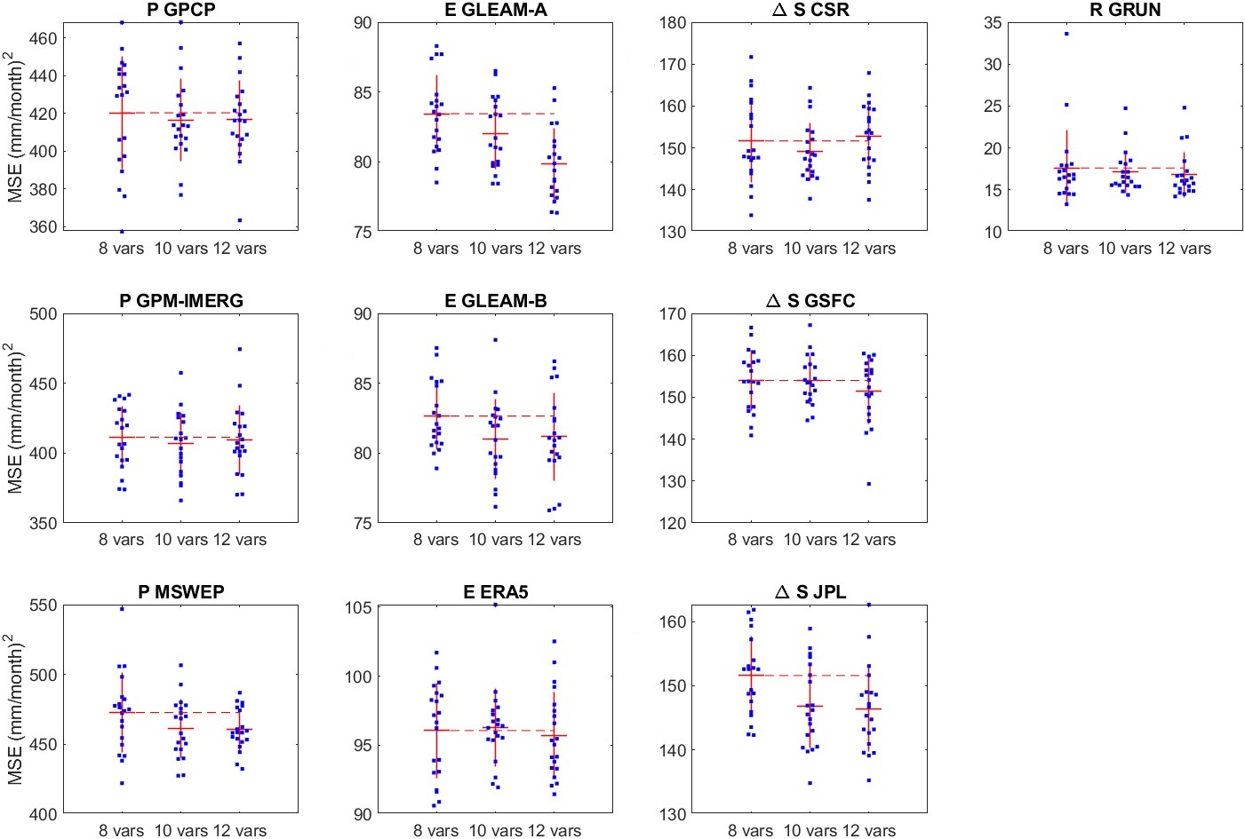
Therefore, I conclude that 8 of the 12 ancillary variables are highly effective, and with the other 4, they may help slightly improve the fit. At least, they seem to do no harm.
A stated goal of this research has been to create a model capable of making good predictions at the pixel scale. In other words, the model should be transferable from the basin-scale data to similar data compiled at the pixel scale, and still be capable of calibrating EO datasets in a way that is realistic and helps close the water cycle. For the regression-based model, making pixel-scale predictions is straightforward. For each pixel over continental land surfaces, we have a simple linear relationship with two parameters, a slope and an intercept. The parameters are stored in 360 × 720 matrices for the 0.5° global grid. Thus, we have a total of 20 such matrices: 10 EO variables × 2 parameters for each. The matrices contain values for grid cells over land surfaces only. Grid cells contain NaN (not a number) for oceans and high northern latitudes outside of our model’s domain.) The calculation involves simple matrix multiplication and addition, and is fast and efficient. Applying the NN model is more computationally intensive, but not burdensome, and can be calculated in a few seconds on a laptop computer. While the models were calibrated over the time period from 2002–2019, they can be readily applied to time periods before or after this. In the following chapter, Section 6.2, I test the ability of our model to “hindcast” GRACE-like total water storage prior to the satellites’ launch in 2002.
The full set of pixel-scale results covers 10 EO variables, monthly over a 20 year period. While this is too much information to display on the page, I show an example for a single variable in a single month in Figure 5.13. The maps show the calibrated E from GLEAM-B, via the regression method in Figure 5.13(a), and the NN method in (b). The maps in Figure 5.13(c) show E calibrated by the NN mixture model, which combines information from three different calibrated EO datasets. To the right of each figure is the percent difference between the uncorrected data and the calibration. All units displayed in the maps are in mm/month.
Based on the maps in Figure 5.13, the global pattern of evapotranspiration looks somewhat similar for all three calibrations. However, there are small differences that are more readily visible in the maps on the right side of Figure 5.13, which show the difference between the uncorrected GLEAM-B dataset and the calibrated version. The geographic pattern of differences based on the regression-based model appear to be smoother, a result of the spatial interpolation of model parameters used to make adjustments to the EO dataset. There is more fine-grained spatial detail in the NN-based model results. This is also not surprising, as the NN model includes a wider range of inputs that includes environmental variables that vary spatially over short distances, such as slope, elevation, and vegetative cover.
We can also see some differences among the modeling methods when we focus on a particular region. In North America, the regression-based calibration appears somewhat different from the NN models, particularly in the northwest (Canada and Alaska). There also appear to be some differences in the sign of the change across northern Asia and Australia.
The one-month snapshot of a single variable in Figure 5.13 is not enough to describe the effect of the calibration as a whole. In the following section, I explore how much the calibration changes the original EO datasets and how close the calibrated EO variables are to the OI solution. I also look at the overall impact of the calibration closing the water cycle, at both the basin scale and pixel scale.
Thus far, we have applied two different modeling approaches for calibrating earth observation (EO) data of the four main water cycle components. The first method was based on linear regression and spatial interpolation of regression model coefficients, and the second method uses neural network NN modeling. Both of the methods seek to recreate the optimal interpolation solution, which can only be used over river basins where runoff data is available. Both methods were trained on basin-scale data. After the models have been trained, they can be used to calibrate EO data at the pixel scale. The goal of both methods was to make EO datasets more coherent, resulting in a lower overall water cycle imbalance. However, which method performs best? In this section, we compare the performance of the regression and neural network models, based on several criteria.
To visualize the results, let us begin with a set of time series plots over selected river basins. This is a simple and intuitive way to review the results, letting us quickly visualize the inputs and outputs of the model. However, because the models were trained and validated over thousands of basins, it is not practical to view all the results in this way. The remainder of the figures present the results more globally, integrating information from all the modeled basins. The results shown here are focused on the set of 340 validation basins, as we are interested in how well the model performs with data that were not a part of its training.
Figure 5.9 is an example showing the inputs and outputs of the analyses over one river basin, the White River in the United States. Here, the river basin coincides closely with the drainage area for the gage at St. Petersburg, Indiana (GRDC gage 4123202, or USGS gage 03374000), with an area of 29,000 km². While there is no “typical” river basin, this location has a long record of river discharge, and so it does a good job demonstrating the output from our calculations. Further, over this region of the United States, remote sensing datasets tend to be more reliable and well-calibrated, due to the density and availability of in situ calibration data. One generally expects EO data to be more accurate compared to areas of sparse in situ data, for example parts of Africa, Asia, and Latin America.
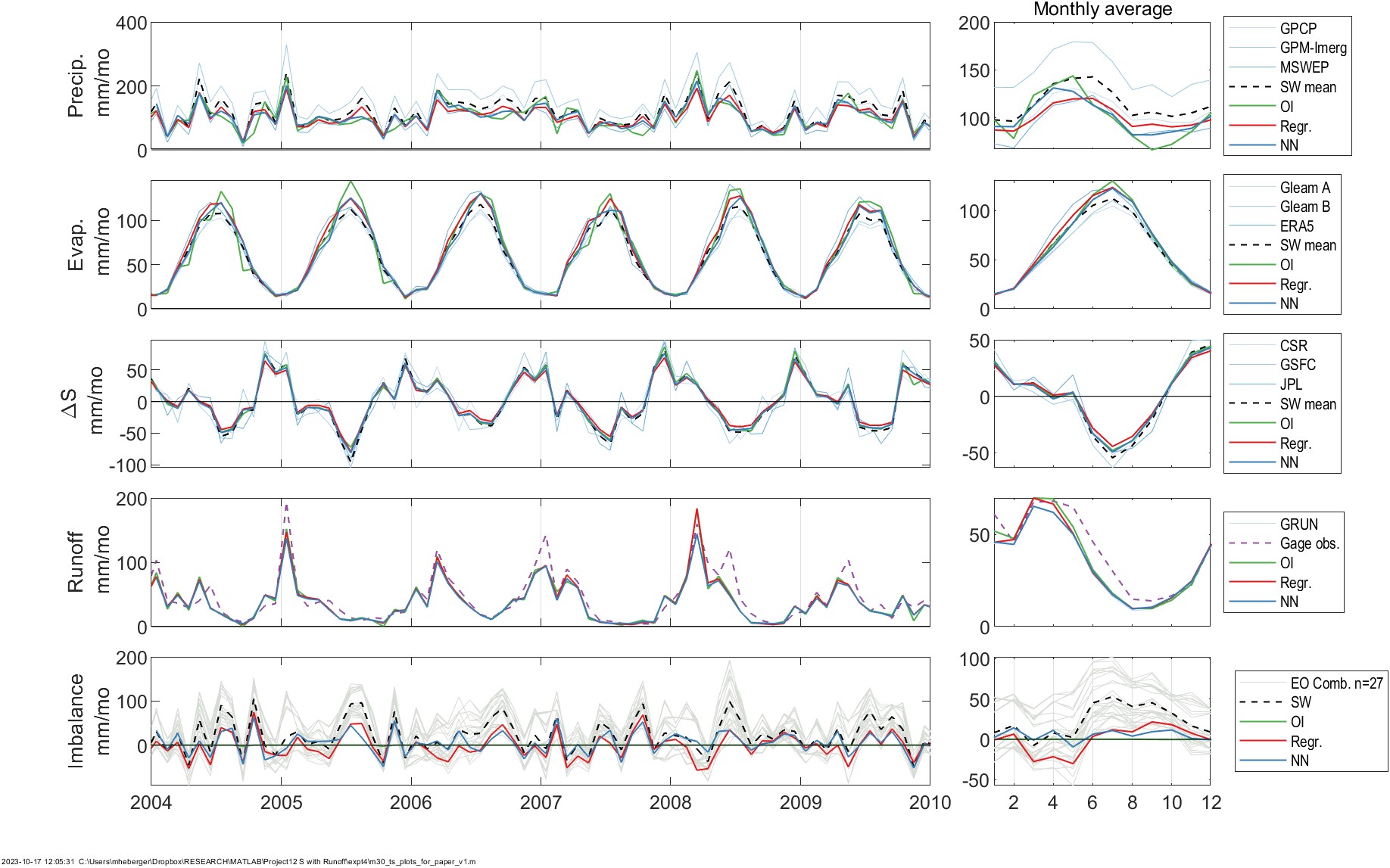
Figure 5.9 shows time series plots of the inputs (observed hydrologic fluxes, in gray) and the outputs of optimal interpolation (green), the regression-based model (red) the NN model (blue). Times series are presented, from top to bottom, for: P, E, ΔS, R, and the water budget Imbalance, \(I = P - E - R - \Delta S\). The seasonality of each dataset is shown in monthly average plots on the right. These full time series cover 2000 to 2019, but here I have zoomed in on the 6-year period from January 2004 to December 2009 in order to show more detail. Despite this, there is a lot of data, and it is not possible to clearly distinguish the datasets, as they are frequently overlapping. However, with careful inspection, certain patterns begin to emerge. For example, there is significant disagreement among the 3 precipitation datasets. In particular, GPM-IMERG tends to show higher values than the other two datasets. In contrast, the evaporation datasets are more consensual, at least at this location. The three GRACE datasets for TWSC are also highly correlated with one another. This is expected as each of the datasets is calculated from the same satellite data using different methods.
In Figure 5.9, the bottom time series for the water cycle residual or imbalance, I: The gray lines show each of the 27 possible combinations of the datasets (\(3 P \times 3 E \times 3 \Delta S \times 1 R\)). The imbalance of the various combinations of EO datasets is large: the seasonal I can reach ±50 mm/month depending on the combination of datasets. It is the objective of the integration technique to reduce this imbalance as much as possible. The imbalance from the OI solution (in green) is equal to zero by definition. This is why this solution is chosen as a target for the NN integration. The regression and NN optimizations both result in a significant improvement of the imbalance.
In this one example, we can see that the original EO datasets are not modified too much by the models, which is an important feature. In the following sections, we will look into this in more detail, examining (a) how much the NN model has changed the input data, and (b) how closely the output matches the OI solution. Next, we will look at how well the results close the water cycle by examining the remaining imbalance. Finally, we will examine the results of applying the models for making predictions at the pixel scale.
We are interested in seeing how much the NN model has changed the EO data. Recall that the goal was to reduce the water cycle imbalance by making changes to the EO data, thus making them more coherent with one another, i.e., resulting in a balanced water budget. However, we would like these changes to be as small as possible, while still achieving the objective of a balanced water budget. If there are certain locations where large changes are necessary, it indicates that one or more of the components has a large bias. Our approach uses data fusion and statistical modeling to reconcile errors. However, the old adage “garbage in, garbage out” applies here. These methods do not have the discernment to treat very large errors. Figure 5.15 shows the relationship between the inputs to our models and the output for each of the four major fluxes predicted by the NN mixture model. On the horizontal or \(x\) axis we have the uncorrected EO dataset, and on the vertical or \(y\) axis, we have the calibrated version, after being processed by (a) the regression model or (b) the neural network model.
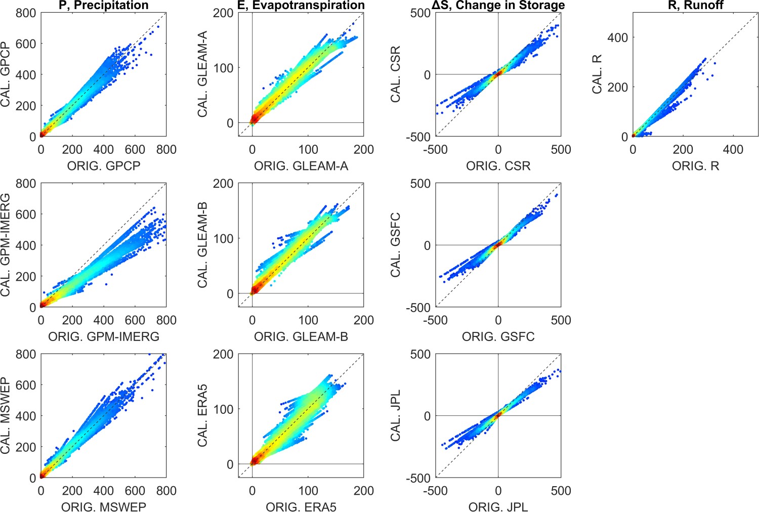
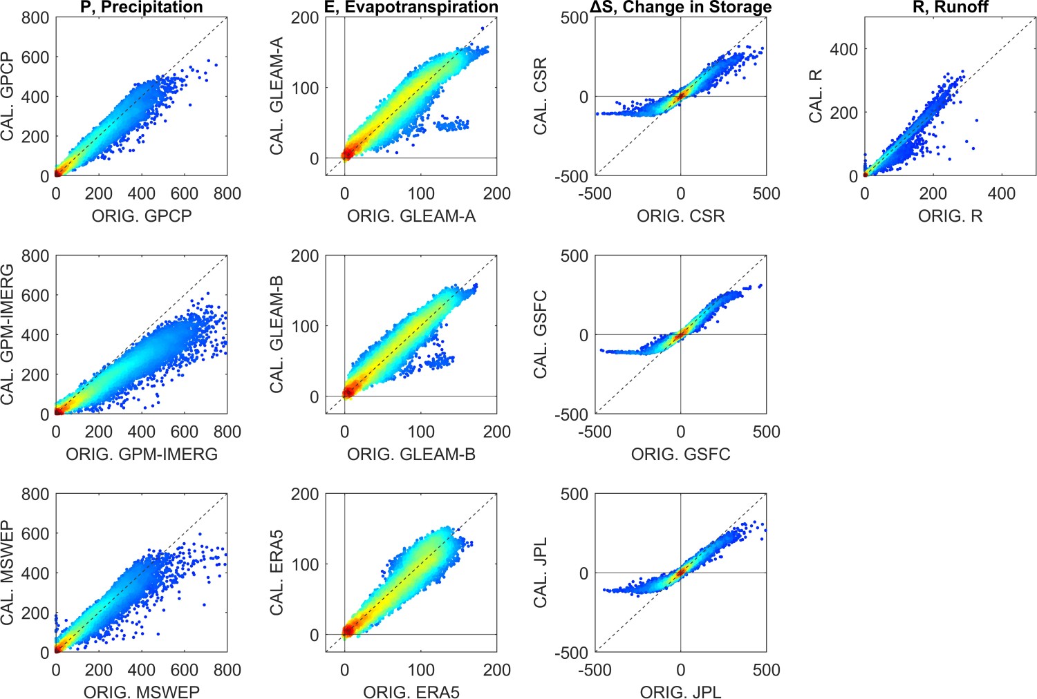
The scatter plots in Figure 5.15 show all monthly observations and predictions over the 340 validation basins between 2000 and 2019. Each of the 75,000 data points is an observation for one month and one river basin, with darker colors indicating greater density of points. (Note that there is some missing data where one or more input variables was missing.) Reviewing these graphs, several noticeable patterns emerge, offering some insights to the changes our model makes to the input data.
For the precipitation datasets, the input/output relationship appears to be mostly linear, while the cloud of points has somewhat of a cone shape, meaning that the model is making bigger changes to higher values of P. For GPCP and MSWEP, the points are mostly clustered around the 1:1 line. In contrast, the slope for GPM-IMERG is less than 1; here the NN model is consistently reducing the values. This is evidence that the GPM-IMERG dataset may have a positive bias, i.e., it is over-predicting P in some regions.
With respect to the changes made to ΔS, the changes made by the NN model have a distinct sigmoid shape, which commonly occurs with NN models like ours which use a non-linear sigmoid function \(tansig\). Both the regression and NN models appear to be dampening the signal: extreme high and low values are being squeezed into a smaller range. However, the relationship appears to be more linear in the lower range of values. Very high and low values of (ΔS > 100 mm/month) are unusual, representing less than 2% of observations, and tend to occur in cold climates where snow and ice accumulate and melt.
For runoff, there is only one input dataset. On the scatterplots for R in Figure 5.15, there are several faint lines. It seems that there are multiple relationships, represented by the different lines on the plot of uncorrected versus calibrated R. This is a result of distinct changes being made to the inputs in different locations and environments, and is evidence that the NN is performing as intended.
The role of both the classes of models is to calibrate EO variables so that they are closer to the OI solution. Training the models involves determining the set of model parameters or coefficients such that the model output is the best fit to this target. Therefore, it is important to evaluate how well the models are able to recreate the OI solution. I evaluated the goodness of fit between the model output and OI over the 340 validation basins, which were not used in the training of the model. Estimating the basin mean calibrated EO variables over the validation basins is a two-step process. First, the models are run to create output at the pixel scale, then the gridded data is spatially averaged over the validation basins. This step was repeated for all 340 validation basins and the 240 months from 2000 to 2019. I used the fast algorithm for calculating basin means described in Section 3.4. I then compared the computed time series for each of the basins to the OI solution, computing several goodness-of-fit indicators, and repeated this for all 10 variables.
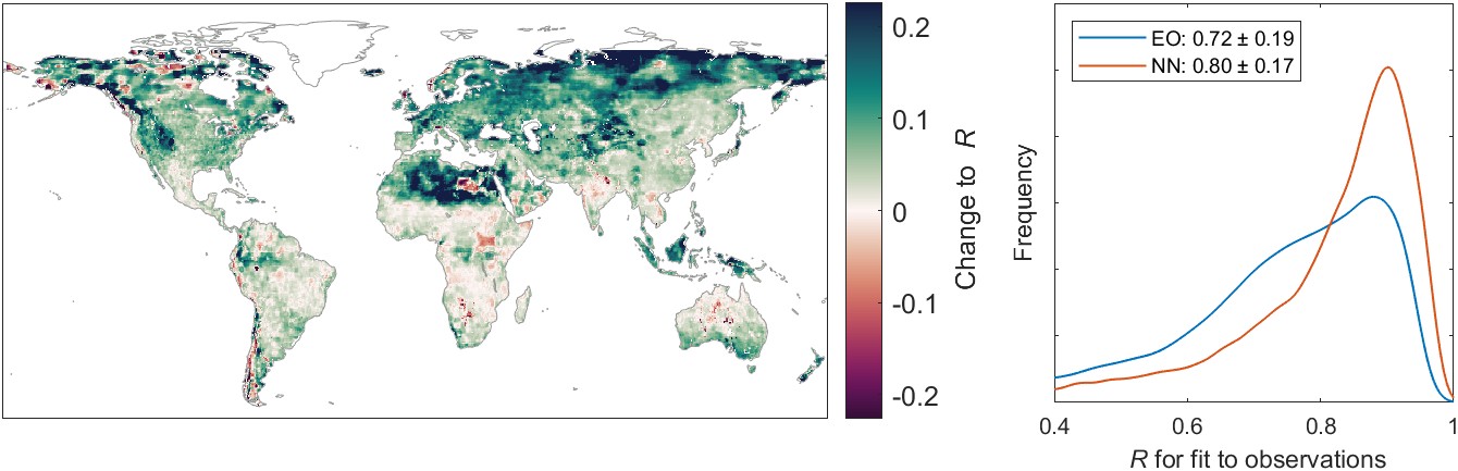
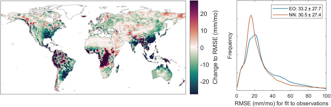
Figures 5.16(a) shows the distribution of correlation coefficients, R, for each of the 10 EO variables. Figure 5.16(b) shows similar information, but here the fit indicator is the root mean square error, RMSE. The legends in each individual plot show the mean and standard deviation for the fit indicator across the 340 validation basins. For example, for the precipitation dataset GPCP, the correlation coefficient, R, has an average of 0.90 and a standard deviation of 0.09. Careful inspection of each of the plots shows that the NN model outperforms the regression model most of the time. For the ERA5 evapotranspiration, R is equivalent for both models. However, the NN model has a lower RMSE than the regression model. The NN model also has a smaller error variance, as indicated by the standard deviation of the RMSE over the 340 validation basins.
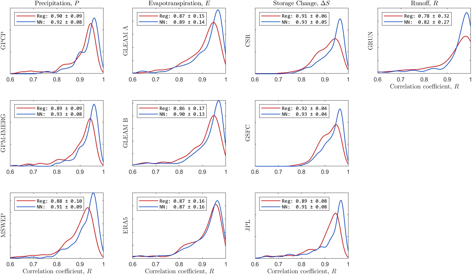
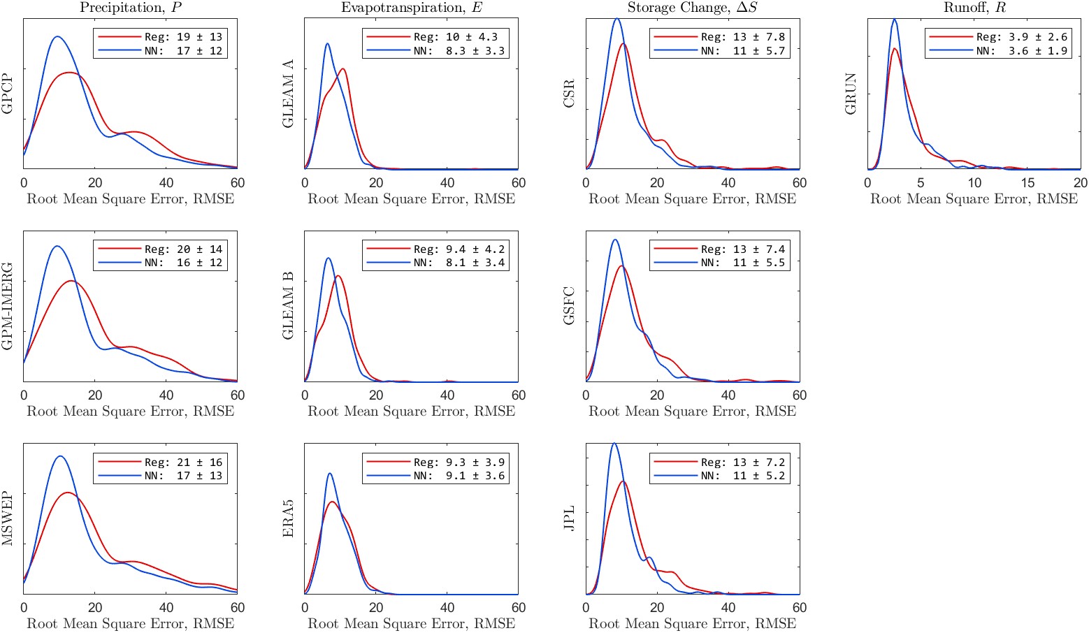
Information on the fit is also summarized in Table 5.5, showing the median correlation coefficient, R and the mean root mean square error for the fits across the 340 validation basins. The values in the table make it clear that the NN model outperforms the regression model in terms of fit to the OI solution.
Table 5.5:Summary of the fit of calibrated EO data to the OI solution. Table entries are the medians for the fit statistic across 340 validation basins.
| Corr., R | RMSE, mm/month | ||||
|---|---|---|---|---|---|
| Regr. | NN | Regr. | NN | ||
| P GPCP | 0.93 | 0.95 | 16.0 | 12.8 | |
| P GPM-IMERG | 0.92 | 0.95 | 16.1 | 12.6 | |
| P MSWEP | 0.91 | 0.94 | 16.2 | 12.9 | |
| E GLEAM A | 0.92 | 0.94 | 9.5 | 7.7 | |
| E GLEAM B | 0.93 | 0.95 | 9.2 | 7.6 | |
| E ERA5 | 0.93 | 0.94 | 8.9 | 8.5 | |
| ΔS CSR | 0.92 | 0.95 | 11.3 | 9.8 | |
| ΔS GSFC | 0.92 | 0.95 | 11.0 | 9.4 | |
| ΔS JPL | 0.92 | 0.95 | 11.2 | 9.6 | |
| R GRUN | 0.93 | 0.96 | 3.2 | 2.9 | |
The purpose of our modeling has been to calibrate EO variables so that they are more coherent and result in a balanced water budget. Therefore, the water cycle imbalance (\(I = P - E - \Delta S - R\)) is one of the most important indicators. Imbalance that is near zero is the best. A good model is one that makes the imbalance significantly closer to zero. The more the imbalance is reduced, the better the model is performing. Recall that the target for our model is the OI solution for the four water cycle components, which sum to a balanced water budget. Therefore, a model that is able to perfectly recreate the OI solution, will also perfectly close the water cycle.
Figure 5.17 shows the distribution of the water cycle imbalance over the 340 validation basins calculated by uncorrected EO data and by the two modeling methods. The basin mean imbalance is plotted as a kernel density. Here, the mean was calculated over each basin with all available monthly observations over the period from 2000 to 2019. The light gray lines represent the 27 possible combinations using the uncorrected EO datasets (\(3 P \times 3 E \times 3 \Delta S \times 1 R\)). The three gray lines that are to the right of the others are all calculated with the GPCP precipitation dataset. As we have seen previously, GPCP tends to report higher precipitation than the two other precipitation datasets used in this study.
The regression-based method produces calibrated versions of each of the 10 variables (\(P_1, P_2, \ldots R\)). The light pink lines in Figure 5.17 (a) are the imbalances from the 27 possible combinations of the calibrated variables. Unlike the NN models, there is no standalone “mixture model.” However, it is logical to combine the information output by the regression model by taking a simple average. I calculated the mean across each variable class, for example \(\bar{P} = \text{mean}(P_1, P_2, P_3)\) = mean the average of P(GPCP), P(GPM-IMERG), and P(MSWEP). In Figure 5.17(a), the darker red line is the imbalance calculated with such averages, i.e.: \(I = \bar{P} - \bar{E} - \bar{\Delta S} - \bar{R}\). The regression-calibrated mean significantly outperforms any of the individual combinations. Compared to the uncalibrated EO datasets, the calibrated datasets result in a significantly lower imbalance, on average. On the right side, Figure 5.17(b) shows the variability of the imbalance across, again across the 340 validation basins. Specifically, the plot shows the distribution of values of the standard deviation of the imbalance in the basins. The regression modeling has moved the central tendency of the imbalance closer to zero. In addition, the model has also reduced the variance of the imbalance in most basins. In other words, after calibration, the imbalance is closer to zero more frequently.

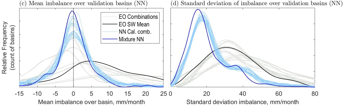
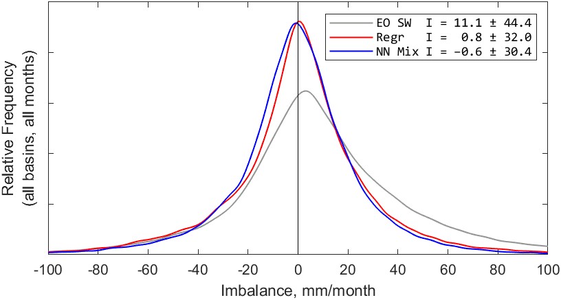
The kernel density plots in Figure 5.18 are calculated with all available monthly observations from 2000 to 2019 over the 340 validation basins. As above, we see that both methods significantly reduce the imbalance. The imbalance calculated with the simple-weighted average of uncorrected EO datasets has an average of 11.1 mm/month. The distribution is wide and has “heavy tails,” with around 3% of monthly observations having an imbalance of over 100 mm/month.
Compared to the imbalance calculated with uncorrected EO datasets, both the regression and NN methods result in an average imbalance much closer to zero, and with a lower variance. From the plot in Figure 5.18, it is hard to say which method is better, as the mean imbalance is similar, with \(\bar{I} = 0.8\) for regression and \(\bar{I} = -0.6\) for the NN model. They are both quite close to zero, but on opposite sides of the origin.
Both methods reduce the variance in the imbalance, as indicated on the plot by the standard deviation. The variance of the imbalance is slightly lower with the NN model. While the difference is relatively small, it has strong statistical significance. Because of the large number of samples (>56,000), the results of a statistical hypothesis test are strongly conclusive. A two sample F-test for difference in sample variance rejects the null hypothesis of no difference between sample means with \(p<1\times10^{-33}\). This allows us to conclude that this is a small but real difference between the two methods. Therefore, we may conclude that the NN method results in water cycle imbalance closer to zero more frequently than the regression-based method.
Because we have access to all four water cycle components at the pixel scale, it allows us to calculate the imbalance over all land pixels. Calculating water budgets at the pixel scale requires us to assume that the horizontal fluxes into and out of grid cells (via surface water and groundwater flow) are so small that they can be ignored. It is common in the large-scale hydrologic literature to assume that these horizontal fluxes are small compared to the four major WC components, but this assumption is poorly documented, and probably does not hold at all times and in all environments. Thus, this can be considered a key weakness in this approach, and adds to the uncertainty in pixel-scale predictions.
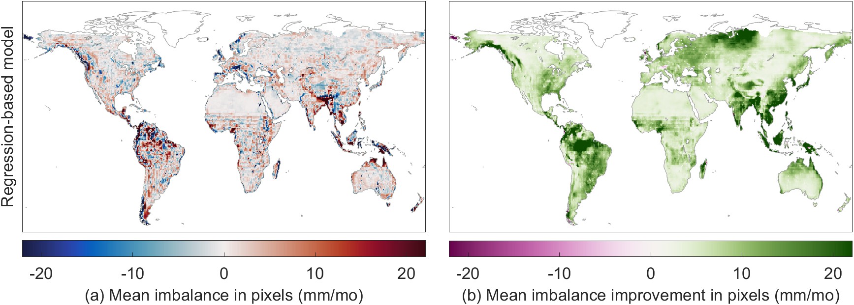
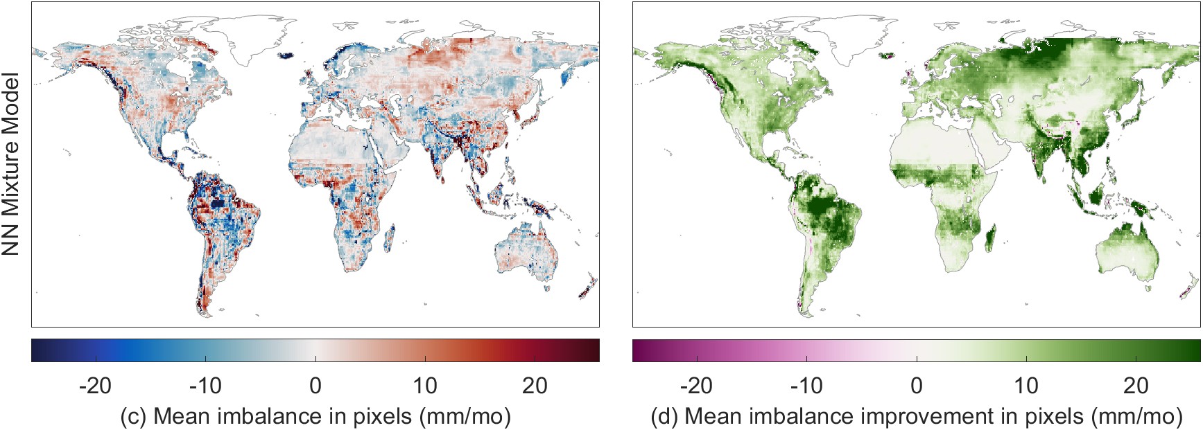
Figure 5.19 shows the change in the water cycle imbalance calculated from fluxes calibrated by the regression-based model (a) and the NN mixture model (c). The maps in Figure 5.19(b) and (d) show the difference in the imbalance compared to the imbalance with the simple weighted EO datasets. The NN model results in a lower water budget residual in many locations, with particularly large improvements over parts of the Amazon and southeast Asia. The imbalance is made worse in a few small locations, notably near the western coasts of Canada, Chile, England, and Norway.
Which of the modeling methods reduces the imbalance the most at the pixel scale? To answer this question, I compared the imbalance before and after calibration. I defined a “closure improvement factor,” comparing \(I_{cal}\), the imbalance with calibrated datasets, to \(I_{obs}\), the imbalance based on the SW mean of EO datasets. The closure improvement factor and is calculated as:
\[F = \left| I_{obs} \right| - \left| I_{cal} \right| \label{eq:closure_improvement}\]
The closure improvements factor, \(F\), is a “convergence metric” that measures how much closer I is to zero after calibration. It uses the absolute value because it is the distance from zero that we care about here, not the sign of the difference from zero. The plot in Figure 5.11 summarizes the improvement in closure over all land pixels in our study domain (excluding Greenland and latitudes above 73° North). Positive values indicate that the imbalance is closer to zero (lesser in magnitude, the desired result), while a negative value means that the imbalance is further from zero (greater in magnitude, an undesirable result).
The NN model has a higher improvement factor, on average, which means that it results in a reduction in the imbalance over a larger number of pixels. We can conclude, therefore, that the imbalance reduction is greater on average with the neural network. The regression model reduces the water cycle imbalance by an average of 8.7 mm/month over global land pixels, while the NN model reduces the imbalance by 10.3 mm/month.
In the maps in Figure 5.19(b) and (d), we noted that the calibration very occasionally makes the imbalance worse on average. These are grid cells where \(F < 0\). Fortunately, this is a rare occurrence. The imbalance is made better (\(F > 0\)) by the regression method over 99.1% of pixels, and in 98.3% of pixels for the NN model. One of the largest problematic areas, where the closure is degraded, is the Chukotka Peninsula in Russia’s far east. This is largely due to the peculiarity of where this region is located on our modeling grid. The standard global grid used widely in climate studies is centered on 0° longitude – the Prime Meridian passing through Greenwich, England. As a result, the left side of our map, at −180°, cuts off the eastern part of the Asian mainland. As a result, the far eastern portion of Russia appears as an island at the extreme northwest of our map. It is separated from the remainder of its physiographic province, which is on the far east or right side of our map. The regression + surface fitting model struggles to make accurate predictions for this region, as the model parameters are spatially extrapolated from across the Bering Strait from the US state of Alaska to the east. As a result, the calibration results are poor over the portion of the Russian Far East that is between the longitudes of \(-180\) and \(-170\).
Other areas where the NN model’s calibration of EO data results in a degradation of the imbalance, rather than an improvement, include the southwest coast of South America in Chile, portions of China’s Tarim Basin. These regions have unique climate conditions due to their geography, which the model appears to have limited capability to accurately represent. The model also fails to improve the imbalance in portions of Scotland, Iceland, and New Zealand. With the smaller island regions, the model has encountered a problem of extrapolation. I did not identify any river basins in our target size range (20,000 to 50,000 km²) to use as training data. Thus, the model has not been trained to represent the conditions on these islands, and is extrapolating based on continental climates, sometimes thousands of kilometers away. Nevertheless, the areas where the imbalance is made worse is less than 2% of continental land surfaces.
As an additional assessment of the calibration of EO variables, I compared the model output to in situ observations at ground-based stations. I performed this comparison to available data for 3 of the 4 water cycle components – precipitation, evapotranspiration, and runoff. In situ observations of the fourth component, ΔS, or total water storage change, are not directly measurable. In lieu of direct measurements, investigators have validated GRACE total water storage (TWS) by comparison with groundwater well levels (see e.g. Rodell et al. 2007) and land surface model simulations of soil moisture storage (see e.g.: S. Munier et al. 2012).
It is important to remember that the main purpose of the modeling was not to calibrate EO variables to improve the fit to observations. Data providers have already extensively calibrated data products to in situ observations. Indeed, some of these products have been continuously improved over decades. Thus, I do not expect that my “recalibration” will necessarily improve upon the original calibration, at least in terms of the fit to available ground-based observations. In fact, the goal is to make the datasets more coherent with one another, so that the water budget is balanced. Thus, comparing the datasets to in situ observations is simply an additional check. I performed this comparison both before and after. Ideally, the calibration will not introduce unacceptably large errors. I allow for the possibility that the modeling may degrade individual water cycle components somewhat. Nevertheless, the model-based calibration should make the EO datasets more coherent with one another.
Table 5.6: Evaluation of the NN model predictions for P, E, and R, showing the impact of the regression and neural network model calibration on the goodness of fit to observations.]{Evaluation of the NN model predictions for P, E, and R, showing the impact of the regression and neural network model calibration on the goodness of fit to observations. Table values are the median over n samples.
| Dataset | NSE | RMSE, mm/mo |
Percent Bias |
|---|---|---|---|
| Precipitation | |||
| GPCP (EO) | 0.70 | 31.9 | 8.3% |
| GPCP (Regr. cal) | 0.70 | 31.7 | 7.1% |
| GPCP (NN cal) | 0.69 | 32.8 | 3.9% |
| GPM-IMERG (EO) | 0.56 | 45.6 | 33.6% |
| GPM-IMERG (Reg. cal) | 0.76 | 27.2 | 8.2% |
| GPM-IMERG (NN cal) | 0.74 | 29.3 | 6.4% |
| MSWEP (EO) | 0.85 | 20.1 | 0.0% |
| MSWEP (Regr. cal) | 0.82 | 22.7 | 8.0% |
| MSWEP (NN cal) | 0.77 | 25.9 | 4.3% |
| EO SW Mean | 0.63 | 37.1 | 13.7% |
| Regr. cal. avg. | 0.78 | 25.9 | 7.9% |
| NN mix. | 0.75 | 28.0 | 4.5% |
| Evapotranspiration | |||
| GLEAM-A | 0.65 | 21.4 | 3.6% |
| GLEAM-A (Regr. cal) | 0.70 | 19.2 | 7.8% |
| GLEAM-A (NN cal) | 0.69 | 19.0 | 3.3% |
| GLEAM-B | 0.69 | 20.1 | 5.4% |
| GLEAM-B (Regr. cal) | 0.67 | 19.9 | 4.9% |
| GLEAM-B (NN cal) | 0.69 | 18.5 | 6.1% |
| ERA5 | 0.70 | 19.9 | 7.6% |
| ERA5 (Regr. cal) | 0.68 | 20.9 | 7.8% |
| ERA5 (NN cal) | 0.70 | 19.4 | 6.0% |
| EO SW mean | 0.70 | 19.5 | 3.9% |
| Regr. cal. avg. | 0.70 | 20.1 | 4.9% |
| NN Mixture Model | 0.69 | 19.4 | 4.1% |
| Runoff | |||
| GRUN | 0.52 | 12.7 | −1.7% |
| GRUN (Regr. cal) | 0.53 | 12.4 | −0.1% |
| GRUN (NN cal) | 0.50 | 12.7 | −0.7% |
The results of the comparison to in situ observations are summarized in Table 5.6. For assessing the fit to observation, correlation (R or \(R^2\)) would not be informative. The regression model applies a linear transformation to EO data, and the correlation with observations is the same before and after calibration. Therefore, it is more informative to look at alternative indicators such as the Nash-Sutcliffe Efficiency, NSE, described in Section 4.1.12. Percent bias (PBIAS, see Section 4.17) is also an informative indicator, as it tells us how far the data are from the observed mean.
For the analysis of precipitation, I compared uncorrected EO estimates of P to observed precipitation at 21,880 stations in the Global Historical Climatology Network (GHCN, see Section 2.2.5). Then I compared the outputs of the calibration and mixture NN models to these same observations. I repeated the same procedure for E at 117 global flux towers, and for R, comparing NN predictions to discharge measured at gages (Section 2.5.1). I calculated fit statistics comparing the observed and predicted time series at each measurement location. Table 5.6 reports the median of the fit statistic. For example, for E, I calculated 117 values of the correlation coefficient, R. For Gleam-A, the first row in the table, these values ranged from \(-0.11\) to 0.98, with a median of 0.91. The models denoted by Regr. cal. have undergone calibration using the regression model, and rows labeled NN cal. have been calibrated by the NN model. Entries in bold text highlight the best value of each indicator for the variable.
Figure 5.12 shows the distribution of one fit statistic, for the three datasets and for the two modeling methods. We can see from this plot that both calibration methods have a slight positive impact on GPCP precipitation, decreasing the median RMSE. There is a stronger positive impact on GPM-IMERG precipitation, where both modeling methods reduce both the median and interquartile range of the RMSE. The only variable which is not positively impacted is MSWEP. This dataset, which combines information from remote sensing and reanalysis models, has already undergone extensive debiasing (Beck et al. 2019). Notably, the creators of MSWEP used the GHCN, among other sources, to debias the estimates of precipitation. This is the same dataset I am using here for validation. Therefore, it is likely that any modification to this dataset will make it depart further from the station data. With regards to the results that come from mixing multiple EO datasets, the NN mixture model and the mean of the 3 regression-calibrated results, both offer a significant improvement over the simple-weighted mean of the uncorrected EO datasets.

For E, the NN models appear to have generally improved the fit to observations collected at flux towers. The improvements are not large, and may not be important considering the caveats related to comparing point estimates to grid cell values. Nevertheless, it is a positive sign that our model does not degrade the signal, and in fact may be improving it.
The situation with discharge is largely reversed, and it appears that NN calibration is degrading the signal somewhat, albeit only slightly. Here, I calculated fit statistics against a set of gages with a strong runoff signal. From my original dataset of 2,506 gages, I excluded gages in arid regions where runoff is often at or near zero, leaving 1,781 gages. Geographically, the changes made to runoff data by the calibration, and fits to observations are not evenly distributed. Based on the change in RMSE, there is an improved fit to observations in 47% of basins, and a slight degradation of the fit in 53% of basins.
In the preceding section, I compared the EO datasets to in situ observations of P, E, and R. As an alternative to the comparison to station data (point locations), we may compare the results to gridded datasets, where a continuous coverage has been created based on interpolating station data. For precipitation, well-known datasets are WorldClim (see Appendix A) and CPC, described in Section 2.2.4. The data producers have relied on various algorithms and assumptions to interpolate station data across space and time. Using gridded data overcomes two problems with using the station data. First, it allows us to fill in empty places on the map. Second, it overcomes the sampling problem, i.e., where we have thousands of stations in Finland and Germany, and almost none in Africa. These datasets have been carefully compiled and are highly cited. Nevertheless, they are one step away from in situ observations and therefore have higher uncertainty. However, comparing the calibration model output to gridded precipitation data is an additional validation step for assessing the performance of the EO calibration model over global land surfaces.
Here, I focus on the CPC data, produced by the US NOAA Climate Prediction Center. The CPC dataset is usable right away, as it is in the same projection and spatial resolution as our calibrated EO datasets – geographic coordinates at 0.5° resolution. The results of the comparison to CPC precipitation are shown in Figure 5.22. This figure shows two fit indicators, R and RMSE. The kernel density plots at right show the distribution of fits across 54,509 pixels over land. Overall, the NN calibration results in a higher average correlation and lower RMSE at the pixel scale. The pixel-wise “delta” or change in the fit indicator is shown in the maps at the left in Figure 5.22, with green indicating an improvement, and red for a worsening of the fit. The NN calibration results in an increase in R over 90% of the pixels, and a decrease in RMSE in 66% of pixels.
We saw previously that the calibration of EO variables results in a lower water cycle imbalance. However, there was concern that in revising these variables to increase their coherency, it would have the undesirable side effect of degrading the signal. In other words, the model could force a trade-off, exchanging coherency for lower accuracy. However, as the above analyses have shown, the model-based calibration does not strongly degrade the fit to observations. In fact, in many circumstances, the fit to observations is actually improved.
This chapter presented the results of two methods for the calibration of EO variables of the terrestrial water cycle. Both methods seek to recreate the solution from optimal interpolation over a set of over global river basins, and can be applied to make predictions at the pixel scale. In general, the NN model outperformed the regression-based model in terms of ability to recreate the OI solution and to close the water cycle. Table 5.7 summarizes the main points comparing the two main methods for water cycle closure explored in this thesis.
Table 5.7: Advantages and disadvantages of the two main methods for water cycle closure explored in this thesis.
| Model Type | Advantages | Disadvantages |
|---|---|---|
| Regression + Parameter Regionalization |
|
|
| NN modeling |
|
|
The approach for optimizing water cycle variables used here contains certain innovative aspects. The regression method is paired with spatial interpolation for parameter regionalization. This is a useful method that is commonly used in hydrologic modeling, and I show here that it is effective for water cycle analyses with remote sensing data. Another advantage to the models used here is their modular structure – they can be used to calibrate one variable at a time. This is an advantage when confronted with with missing or incomplete data.
Optimized EO data that satisfies the closure constraint can also be used to develop more accurate water budgets. This has relevance “to the fields of agriculture, atmospheric studies, meteorology, climatology, ecology, limnology, mining, water supply, flood control, reservoir management, wetland studies, pollution control, and other areas of science, society, and industry” (Healy et al. 2007). Water-budget based methods can be used to estimate missing water cycle components. For example, we may estimate river discharge indirectly by rearranging Equation 1.1 as \(R = P - E - \Delta S\). This indirect way of estimating water cycle components is also called the water budget method; I explore this in more detail in Chapter 6.