In this chapter, I describe the database of remote sensing-derived data, or Earth Observations (EO), assembled for analysis of the global water cycle. The first type of data are for the water cycle (WC) components. These data describe fluxes, the movement of water, over the earth’s land surfaces, or changes in total water storage. Since the focus of this research is terrestrial hydrology, oceans are not considered. The second type of data describe environmental conditions, and include variables such as elevation, slope, and vegetative cover. Some of these datasets are derived entirely from satellite remote sensing data, while others are blended with in situ data or information from models.
This chapter begins with a discussion of the format and conventions for the datasets. To compare or merge EO datasets, they must have the same spatial and temporal resolution. Next, I describe the EO data sources for the four main WC components. Table 2.1 summarizes the EO datasets used in this study. Following this, I introduce a variety of environmental variables that serve to characterize local conditions and are used as input variables for neural network modeling described in Chapter 4.
The last section of this chapter presents a preliminary analysis of the EO datasets. I evaluated the quality and completeness of each dataset using the tools of exploratory data analysis – maps, time series plots, summary statistics. This helped to find and discard anomalous observations in some datasets and to verify that data had been imported and processed correctly.
Earth observation refers to the gathering of information about Earth’s physical, chemical and biological systems via remote sensing. Broadly, remote sensing involves monitoring and detecting the physical attributes of a region through the measurement of its reflected and emitted radiation, typically done from satellites or aircraft. In this thesis, I primarily use data collected from earth-orbiting satellites, although some of the datasets I drew upon also include information from in situ observations, models, and other sources.
Here, we are concerned with what EO can tell us about the movement of water above, on, and below the earth’s surface. The movement of water is expressed as a flow, or a flux. In the sciences, a flux is the flow of a substance into or out of a system. As described in Section 1.1.1, the water budget for any land area can be described with four main WC components: (1) Precipitation, P, (2) Evapotranspiration, E, (3) Total Water Storage Change (TWSC), or ΔS, and (4) Runoff, R. With measurements of these four variables, one can quantify the mass or volume of water flowing into and out of any arbitrary geographic region, such as a river basin or a grid cell.
In this thesis, the four water cycle components are expressed as an area-normalized flux density, in units of depth of water per time. Units are in millimeters per month, or mm/mo. GRACE TWSC is not a flux per se, but can be expressed in the same units.
In principle, a variety of units can be used. According to the US Geological Survey, “water-budget equations can be written in terms of volumes (for a fixed time interval), fluxes (volume per time, such as cubic meters per day or acre-feet per year), or flux densities (volume per unit area of land surface per time, such as millimeters per day)” (Healy et al. 2007).
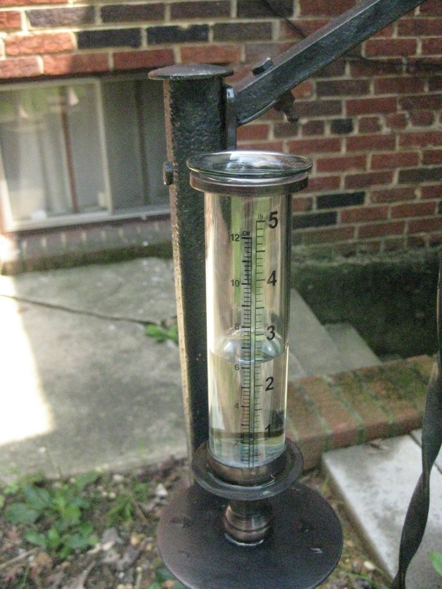
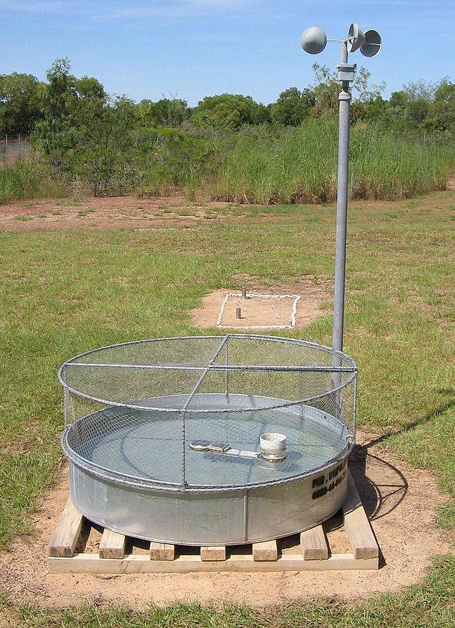
Using a flux density, in units of depth/time, is both a practical and mathematical convenience. It not only simplifies calculations, but it also allows us to directly compare fluxes over regions with different surface areas. The concept of depth per time is perhaps most intuitive with variables such as rainfall and evaporation, as we are accustomed to thinking of the vertical movement of water. Rain gages, or pluviometers, are simple devices that measure the depth of water captured in a given time period. An example is shown in Figure 2.1(a). Similarly, evaporation is most often measured as the change in the depth of water in an evaporation pan, shown in Figure 2.1(b).
In the case of discharge or river flow, it is somewhat less intuitive to think of this as a flux density, in units of depth per time. In this case, the discharge, Q measured at a given location in m³/s is converted to runoff, R a flux density in mm/month by dividing by its basin area (and converting the units):
\[R \left( \frac{\text{length}}{\text{time}}\right) = Q \left( \frac{\text{length}^3}{\text{time}}\right) \times \frac{1} {A \left( \text{length}^2 \right)} \label{eq:runoff}\]
The units for runoff, R are depth per time, just like P or E. We can think of the depth as a thin layer of water that is uniformly distributed over the basin. Unless care is taken to convert Q and A to compatible units, the results of Equation \ref{eq:runoff} will not be easy to interpret. Runoff in mm/month can be calculated from a conventional volumetric flow rate in m³/s by dividing by the land surface area in km², multiplying by the number of days in the month, and an appropriate conversion factor, as follows:
\[ \begin{aligned} R \left( \frac{\text{mm}}{\text{month}} \right) &= Q \frac{\text{m}^3}{\mathrm{s}} \times \frac{1}{A {\text{, km}^2}} \times \frac{d \text{, days}}{\text { month }} \times \frac{\text{km}^2}{10^6 \text{ m}^2} \times \frac{1,000 \text{ mm}}{\text{m}} \ldots \notag \\ & \hspace{0.5cm} \times \frac{60 \text{ s}}{\text{minutes} } \times \frac{60 \text{ minutes}}{\text{hour}} \times \frac{24 \text{ hours}}{\text { day }} = 86.4 \frac{Q \cdot d}{A} \end{aligned} \]
where d is the number of days in the month, a whole number between 28 and 31. Rearranging this equation allows us to calculate basin discharge, Q in m³/s as a function of the runoff, R, in mm/month:
\[\label{eq:discharge} Q \left( \frac{\text{m}^3}{\text{s}}\right)= \frac{R \cdot A}{86.4 \; d}\]
where R is in units of mm/month and A is the basin area in km², and d is the number of days in the month. These are simple operations, but it helps to have them clearly documented, as all of the following calculations depend on having accurate input data.
All analyses described in this thesis were done with monthly data. Many remote sensing data products are available at higher temporal resolution (for example, hourly, daily, weekly). And in theory, water budget calculations can be performed at any time scale. However, there were practical and scientific reasons why I chose a monthly time scale. In practice, our ability to produce more frequent updates is limited by the GRACE data for water storage change, which are calculated monthly with a significant time lag (Rodell et al. 2018).
I chose to perform most analyses for the 20-year time period from January 2000 to December 2019, for a total of 240 months. The GRACE satellites were launched in 2002, and the first observations are available for April 2002. Nevertheless, I chose to begin the analysis in January 2000, as it is simple and memorable. Consequently, there are missing records at the beginning of time series in several of the datasets, but this has no effect on the analysis.
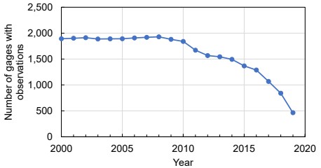
When I began my doctoral research in 2021, I would have liked to include more recent data, but I chose to end the analysis in 2019. There is a time lag associated with the publication of many of the datasets. In particular, there was little runoff data available for 2020 and thereafter, as we will see in Section 2.5.1.
For experiments in record extension (predictions of past conditions), I created a 40 year long database of observations from January 1980 to December 2019. Because there were fewer satellites in orbit in the 1980s and 1990s, the data for the first two decades is more sparse.
I used a common spatial projection and resolution for all gridded geospatial data. It is based a common equirectangular projection, or plain geographic latitude and longitude projection (sometimes called plate carrée). This projection is commonly used in the Earth sciences due to its simplicity, although it has certain tradeoffs, i.e., distortion of areas near the poles. One set of experiments was done with data at a spatial resolution of 0.25 degrees. The global grid consists of 720 rows and 1440 columns. Another set of experiments was done with data at a resolution of 0.5 degrees. This format is similar to the “climate modeling grid” (CMG) used by many climate researchers (MODIS Land Team 2021), although it is at a coarser resolution and thus less detailed. In this thesis, I refer to grid cells and pixels interchangeably, and these should be understood as referring to the same concept: a set of regular rectangular areas on the earth’s surface.
The size of grid cells varies with latitude. Near the equator, each 0.25° grid cell is about 27 km on a side and has an area of about 770 km². As one moves north or south away from the equator and toward the poles, grid cells get smaller. At Rome’s latitude of 42° N, grid cells are about 21 km wide (the height is unchanged) and have a surface area of about 576 km². The northernmost basins considered in our study (in Canada, Alaska, Norway, Finland, and Russia), extend to latitudes above 70° N, where a grid cell is less than 10 km wide and has an area of less than 270 km², only 35% of the size of a grid cell near the equator.
Some of the datasets I used were published at a higher spatial resolution, for example 0.05°. In such cases, I upscaled the data to decrease its spatial resolution and to make it consistent with the other datasets. Water storage data from the GRACE satellites are the limiting factor, with data products published at 0.25°. Methods are available to “downscale” these data to a higher spatial resolution, but scientifically, there is little to be gained from doing so, and any additional accuracy would be illusory.
Strictly speaking, the project database is not a single electronic file, but a collection of electronic data stored in an organized file structure with appropriate metadata, or descriptive details. Data were stored as floating-point numbers with double precision in Matlab .mat files. This is not necessarily the most efficient data format in terms of file size or storage space on disk, however, it eliminates the overhead of converting data or changing units. Matlab binary data files (.mat) can be read by Python, R, or other scientific software, often with the use of a library or plugin.
Note that I do not have the rights to republish all the data that I have collected. For example, with regards to river discharge data, the user agreement from the GRDC does not allow one to redistribute the data. However, my understanding is that one may share and distribute derivative works. This includes versions of the data that have been transformed or processed, such as monthly averages. I have created a public repository containing the database used in the modeling described herein. This should be useful to other researchers who wish to verify or replicate these results or conduct related research on the global water cycle. It is freely available at:
https://doi.org/10.5281/zenodo.8101659
Table 2.1: Datasets compiled for the four major components of the water cycle.
| Data Set | Begin | End | Temporal resolution | Spatial resolution | Citation | Website |
|---|---|---|---|---|---|---|
| Evapotranspiration | ||||||
| GLEAM v3.5A | 1980 | present | daily | 0.25º | Martens et al. 2017; Miralles et al. 2011. | https://www.gleam.eu/ |
| GLEAM v3.5B | 2003 | present | daily | 0.25º | idem. | https://www.gleam.eu/ |
| ERA5 | 1950 | present | 3-hour, daily, monthly | 0.25º | Hersbach, et al. 2018. | https://www.ecmwf.int/en/forecasts/datasets/reanalysis-datasets/era5 |
| Precipitation | ||||||
| GPCP v2.3 | 1979 | present | daily, monthly | 2.5° | Adler et al. 2018. | https://www.ncei.noaa.gov/access/metadata/landing-page/bin/iso?id=gov.noaa.ncdc:C00979 |
| GPM-IMERG | 2000-Jun-01 | present | daily | 0.10º | Huffman et al. 2019 | https://disc.gsfc.nasa.gov/datasets/GPM_3IMERGDF_06/summary |
| MSWEP | 1979 | present | daily, monthly | 0.10° | Beck et al. 2019 | http://www.gloh2o.org/mswep/ |
| Total Water Storage Anomaly | ||||||
| GRACE-CSR | 2002-Apr-05 | present | quasi-monthly* | 0.25° | Save, Bettadpur, and Tapley, 2016 | http://www2.csr.utexas.edu/grace/RL06_mascons.html |
| GRACE-JPL | 2002-Apr-05 | present | quasi-monthly* | 0.5° | Landerer 2021 | https://grace.jpl.nasa.gov/ |
| GRACE-GSFC | 2002-Apr-05 | present | quasi-monthly* | 0.5º | Loomis, Luthcke, and Sabaka, 2019. | https://earth.gsfc.nasa.gov/geo/data/grace-mascons |
| Runoff - Synthetic | ||||||
| GRUN | 1902 | 2019 | monthly | 0.5° | Ghiggi et al. 2021 | doi.org/10.6084/m9.figshare.12794075 |
| River Discharge - Observed | ||||||
| GRDC | varies | varies | daily, monthly | BfG 2020. | https://www.bafg.de/GRDC | |
| Australia BOM | 1970 | 2020 | daily, monthly | Australia BOM 2020. | http://www.bom.gov.au/water/hrs/index.shtml | |
| GSIM | varies | 2016 | monthly | Do et al. 2018; Gudmundsson et al. 2018. | https://doi.pangaea.de/10.1594/PANGAEA.887470 | |
The Appendix contains a list and brief descriptions of dozens of EO datasets. There are many datasets in the literature that I chose not to use in my analysis. This includes well-known remote sensing datasets, including some that are considered state of the art, and which are widely used and highly cited within the earth science community. In some cases, I excluded a dataset because it had inadequate temporal coverage, i.e., it was not available over the period from 2000 to 2019. For example, the SM2RAIN precipitation dataset (Massari et al. 2020) begins in 2004, while my goal was to maximize the overlap with GRACE observations, which began in April 2002. I excluded some datasets for insufficient geographic coverage. For example, CMORPH precipitation (P. Xie et al. 2019) covers latitudes 60°S to 60°N, yet many of our study’s river basins are above 60°N and therefore outside of its coverage. In other cases, I excluded a dataset for insufficient temporal coverage.
It is worth briefly discussing what can be gained from adding more data to the analysis. Oftentimes, more data is better. This attitude is especially prevalent in the machine learning community, where large models are fed with massive amounts of data. However, the research described in this thesis focuses on method development. Indeed, it is possible to use the methods described here to create optimized water cycle components using the largest possible amount of available data, perhaps even customizing the inputs by region based on data availability.
Below, I describe the precipitation datasets I included in my analysis of the water cycle. A description of datasets that I considered but did not include in the analysis can be found in the Appendix.
The Global Precipitation Climatology Project (GPCP) is a global gridded dataset produced by an international consortium of researchers. It is based on multiple satellite observations that have been merged to estimate precipitation at the global scale (Adler et al. 2018). It has a long record, beginning in 1979. However, it also has a coarse spatial resolution, at 2.5°. GPCP is a well-known dataset that has been used for many studies and referenced in thousands of journal articles (Adler et al. 2018).
GPCP combines both passive microwave and infrared satellite data, as well as in situ data. Each class of data brings certain advantages. For instance, passive microwave data can penetrate clouds and provide precipitation estimates even in cloudy regions, while infrared data offers high spatial resolution and frequent updates due to geostationary positioning, albeit at a lower resolution. The authors also corrected for systematic wind-induced undercatch and wetting losses from rain gauges, as well as for orographic effects. I used version 2.3 of this dataset, which was updated in 2018.
GPM-IMERG is the current multi-satellite precipitation product from NASA (Huffman et al. 2019). It stands for “Integrated Multi-satellitE Retrievals from the Global Precipitation Monitoring (GPM) satellite. GPM-IMERG offers several advancements and improvements over its predecessor TMPA (see Appendix Section A.1.9). GPM-IMERG combines measurements in passive microwave and infrared from over a dozen different satellites, using morphing techniques and a Kalman filter, to provide accurate satellite-based precipitation estimates, supplemented by precipitation gauge analyses. It ingests data from the GPM core observatory satellite, which contains a dual-frequency precipitation radar and the GPM microwave imager. The dual-band precipitation radar provides better estimates of precipitation particle sizes and covers a wider range of precipitation rates compared to the single-band radar on the TRMM satellite (Y. Wang and Wu 2022).
The Multi-Source Weighted-Ensemble Precipitation (MSWEP) dataset is not a pure remote sensing product but an “optimal merging” of gage observations, satellite observations, and reanalysis model output (Beck et al. 2019). This dataset offers high spatial resolution of 0.1° and a maximum temporal resolution of 3 hours, which allows for a detailed analysis of precipitation patterns. MSWEP has been shown by the authors to exhibit more realistic spatial patterns in mean, magnitude, and frequency compared to other precipitation datasets (Beck et al., 2019). They also state that it provides more accurate precipitation estimates in mountainous regions, where other datasets tend to underestimate precipitation amounts. Because of its good spatial and temporal coverage, I chose MSWEP as an input in the analysis.
The CPC Global Unified Gauge-Based Analysis of Daily Precipitation is a dataset of rain gage measurements (not remote sensing observations) published by NOAA’s Climate Prediction Center (CPC). I include a brief description here, as it is a gridded dataset that is widely used in large-sample hydrology. This dataset covers 1979 to present at 0.5° resolution, with global coverage of land surfaces (not oceans). The goal of the project was to create a suite of unified precipitation products with consistent quantity and improved quality. This was achieved by combining all information sources available at CPC and using an optimal interpolation technique. The authors state that the dataset was more accurate than existing gage-based datasets available at the time, but that key uncertainties remain. In particular, there may be inconsistencies over regions where station networks changed, and less accuracy in places with high spatial variability in precipitation, such as in mountainous regions.
The methods behind this dataset are documented in a set of three articles:
I used the CPC dataset as an an additional source of data for evaluating the results of this reasearch, to be described in Section 5.4.5.
This section describes a dataset of station observations which I used as an additional source of data to evaluate my results. Unlike the other datasets described here, it is not in grid format, nor is it based on remote sensing.
The Global Historical Climatology Network (GHCN) is a dataset reporting weather and climate variables at over 120,000 stations worldwide (Menne et al. 2012). Many stations only report precipitation, but many others report other variables such as temperature, pressure, humidity, cloud cover, etc. The dataset is maintained by the United States National Oceanic and Atmospheric Administration, National Centers for Environmental Information (NOAA NCEI).
The publisher provides a data inventory, containing the start and end dates for stations. I used this to select candidate stations with data from 2002 to 2019. This still left over 21,000 stations. I used Python scripts to download and process these data, calculate monthly averages, and to create a more detailed inventory of stations with precipitation data over the period of my analysis. The data provider has performed extensive and well-documented quality control on these data (Durre, Menne, and Vose 2008; Durre et al. 2010). Nevertheless, there are several subtleties and complications to dealing with precipitation observations. Examples include how to handle quality flags, what to do with precipitation logged as “trace,”, and how to deal with missing daily data.
I used the following rules when compiling monthly precipitation for stations in the GHCN catalog. First, I only included stations where there are at least 60 months (5 years) of data. I only calculated the monthly average P where there are at least 25 days of data. I chose not to throw out months simply because there were a few missing daily observations. I handled missing daily data by assuming the rainfall on that day was the same as the average of other days in the same month. For example, if station data for January had 25 days of valid data, and 6 missing daily observations, the monthly precipitation is: \(P_{\text{month}} = \sum{P_{\text{daily}}} \times \frac{31}{25}\).
There are more complex and sophisticated ways of filling in missing data (also referred to as imputation), but these were not considered here. The GHCN station data will be used for a secondary analysis, to verify that our modeling methods have not degraded the signal in EO datasets too much related to observations. The check against GHCN station data is just one of several evaluations of this kind. Therefore, it was not worth spending a great deal of time performing sophisticated analyses with these data.
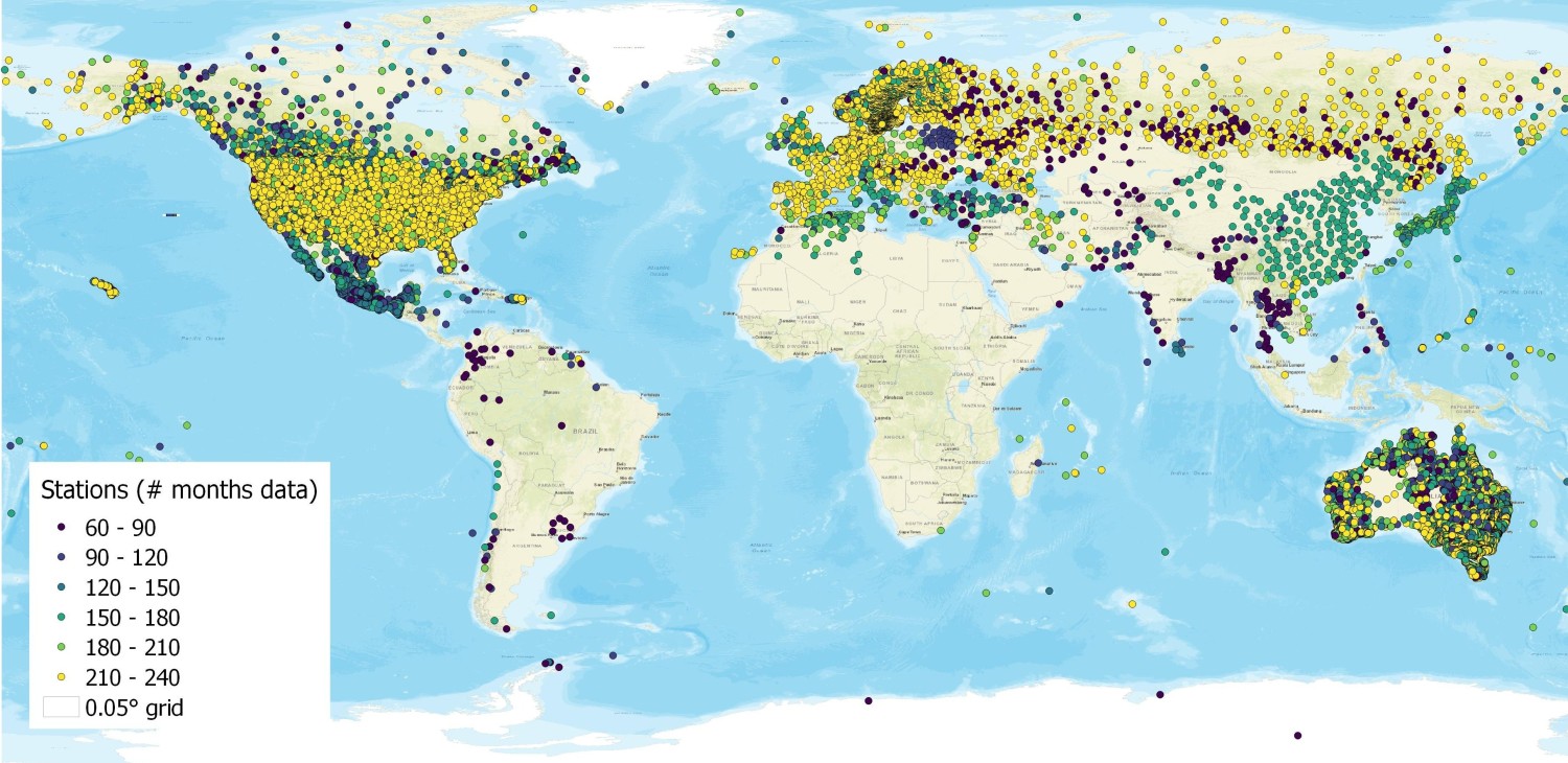
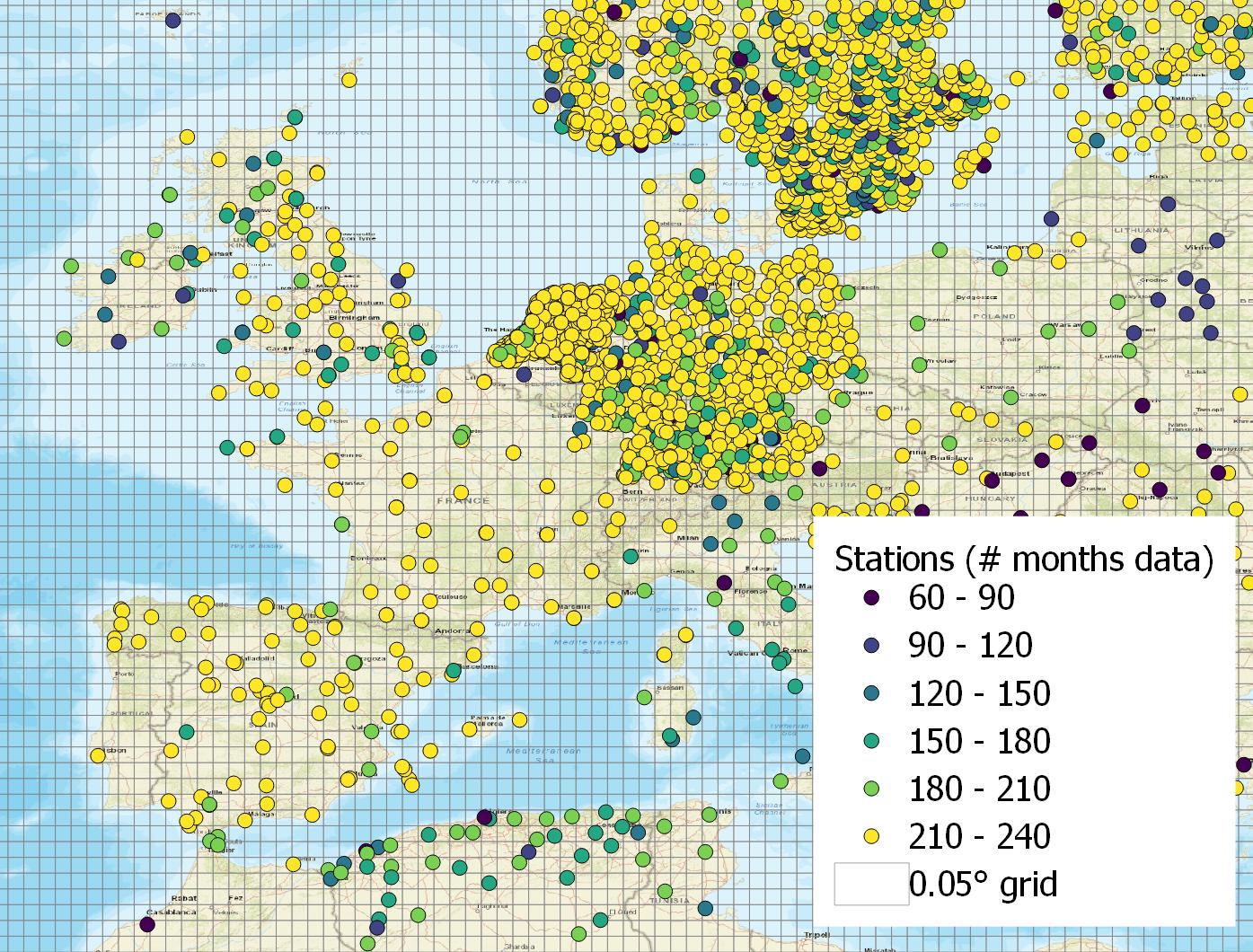
The final set of GHCN station data for precipitation encompasses 21,880 stations. The distribution is highly uneven (Figure 2.2(a)). In Africa, South America, there are large blank spaces on the map. In Section 5.4.5 of this thesis, I compare calibrated P at the pixel scale to GHCN observed P. However, the geographic coverage of observations is extremely uneven. As shown in the Figure 2.2(b), there are many 0.5° grid cells where there are no stations at all, and others there are many pixels where there are a dozen or more stations, particularly in Germany, the Netherlands and other northern European countries and the United States (not shown).
As shown in Table 2.1, I used 3 EO datasets of evapotranspiration for the data integration, and observations from flux towers for comparison and evaluation of my results. Each data source is listed in Table 2.1 and described in more detail below.
I also included a dataset that is not a purely remote-sensing based product, but based on the assimilation model ERA5, from the European Centre for Medium-Range Weather Forecasts (ECMWF). The model combines historical estimates (from both remote sensing and in situ observations) using an advanced modeling and assimilation system. ERA5 produces many variables describing the atmosphere, land, and ocean, at a resolution of up to a 30 km grid (Guillory 2022). ERA5 estimates of E have been used in many recent hydroclimatic studies (see e.g., Tarek, Brissette, and Arsenault 2020; Singer et al. 2021; Lu et al. 2021). ERA5 hydrological outputs are in units of “m of water per day” and so I multiplied by 1000 to convert to \(\text{kg} \cdot \text{m}^{-2} \cdot \text{day}^{-1}\) or mm/day, and then multiplied by the number of days in each month to obtain units of mm/month.
The Global Land Evaporation Amsterdam Model (GLEAM) is a set of algorithms that estimates the various components that contribute to total evapotranspiration (Martens et al. 2017; Miralles et al. 2011; Hersbach et al. 2018). The authors used an empirical relationship, the Priestley-Taylor equation, to calculate potential ET based on satellite observations of surface net radiation and near-surface air temperature. GLEAM version 3.5a used reanalysis rather than satellite observations and covers 1980 to present. The updated version 3.5b relies more on remote sensing data and has a more limited temporal coverage of 2003 to present. GLEAM has global coverage of land surfaces at 0.25° resolution and a daily time step. Note: the latest version, GLEAM v3.6 was published in September 2022, after I completed much of the analysis described here.
GLEAM includes 10 components:
I used in situ data for validating the results of certain analyses. Several methods have been developed to measure evapotranspiration over land surfaces. The two main methods for measuring evapotranspiration rates at specific locations are with devices called lysimeters or via micrometeorological techniques (Healy et al. 2007). Micrometeorological techniques include eddy correlation, Bowen ratio/energy budget, and aerodynamic profile methods, which involves measuring the vertical flux of water vapor from the land surface to the atmosphere. While such methods are accurate, they are also expensive and require frequent maintenance.
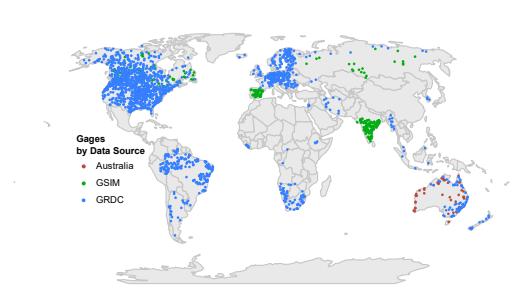
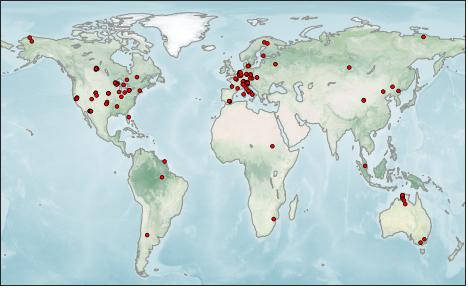
I obtained in situ measurements of ET from flux towers, which belong to a class of micrometeorological measurement devices. Flux towers are outfitted with sensors and instruments mounted at various heights for measuring the vertical flux of water vapor from the land surface to the atmosphere. I selected data for 117 towers from the FluxNet2015 dataset, which compiles data from 212 global towers (Pastorello et al. 2020). Of the 212 stations, 34 did not contain data for latent heat flux, required for inferring evapotranspiration. After quality checking these data, I eliminated another 61 stations, either because the time record did not overlap our period of interest (2002 - 2019), was too short (less than 2 years), or there were other quality issues. This left us with 117 stations, with an average time series length of 5 years. The majority of selected towers are in Europe (51 towers) or North America (46), with fewer in Africa (2), Asia (6), Australia (9), and South America (3). Figure 2.3 shows the location of the selected flux towers.
The FluxNet database reports latent heat flux, in units of W/m². This can be converted to evapotranspiration for inclusion in the water balance model. The latent heat of vaporization of water is the energy required for water molecules to transition from liquid to gas, and varies according to water temperature as given by Shuttleworth (1993):
\[\lambda = 2501 - 2.361 \: T_s \quad\left(\mathrm{~J}\cdot\mathrm{~kg}^{-1}\right)\]
As a simplification, a value of 2,450 J/g is commonly used, and has an error less than 2% over temperatures from 0° to 35°C. Therefore, the latent heat flux in W/m² can be converted to monthly average evapotranspiration as follows:
\[\begin{split} \frac{\mathrm{W}}{\mathrm{m^2}} = \frac{\mathrm{J}}{\mathrm{s} \cdot \mathrm{m^2}} \times \frac{\mathrm{g}}{2,450 \, \mathrm{J}} \times \frac{\mathrm{cm}^3}{1 \, \mathrm{g}} \times \left(\frac{1 \, \mathrm{m}}{100 \, \mathrm{cm}}\right)^3 \times \frac{1,000 \, \mathrm{mm}}{\mathrm{m}} \times \frac{86,400 \, \mathrm{s}}{\mathrm{day}} \\ = 0.0353 \frac{\mathrm{mm}}{\mathrm{day}} \end{split}\]
Care must be taken in comparing E observed at flux towers to gridded hydroclimatic data. The challenge is in resolving the difference in scale differences between in situ data and grid cells. Flux tower observations are point estimates, taken at a single geographic location. One may easily find the pixel that intersects this point on a map to compare gridded data to the tower observations. Yet, the value in a pixel represents an average over an area, over which conditions may vary widely. At the scale of our model grid, a single 0.5° pixel has an area of about 3,000 km² near the equator. The land cover, vegetation, and topography over a grid cell may be substantially different from that of the flux tower site, making it challenging to generalize, and reducing the accuracy of comparisons between modeled fluxes and observations from flux towers. Nevertheless, such comparisons are still useful, and it is encouraging when a model recreates the observed temporal dynamics, even when the magnitudes of observed and modeled fluxes are not comparable.
Information on total water storage (TWS) for this research comes from the GRACE satellites. The first pair of satellites were in operation from 2002 to 2017, and a follow-on mission began in 2018.
It is convenient to refer to the change in water storage as equivalent to a flux, and it can be expressed in the same units as any other flow. GRACE provides the monthly TWS anomaly, expressed as liquid water equivalent (LWE) thickness surface mass anomaly, in units of cm or mm. GRACE does not estimate the total volume or mass of water in a region, but rather its change with respect to a historical baseline average. Nevertheless, the observations encompass water in all its forms and “represent the full magnitude of land hydrology and land ice” (Landerer 2021).
Compared to precipitation and the other hydrologic variables, GRACE observations have a lower spatial and temporal resolution, limiting our analysis to a monthly time step.
Scientists at various institutions have developed different algorithms and sets of parameters for converting the measurements of the gravity field measured by GRACE into estimates of TWSC. I obtained four GRACE data products, described in Table 2.2, and ultimately selected three of them for the analysis (from CSR, GSFC, and JPL). Each of these are Level 3 solutions6 for LWE as measured by GRACE satellites. All the available datasets of TWS are nearly global (–89.5º to +89.5º), land surface only.
Table 2.2. GRACE datasets available for total water storage
| Data Set | GRACE-CSR | GRACE-GFZ | GRACE-GSFC | GRACE-JPL |
|---|---|---|---|---|
| Units | m | m | m | m |
| Publisher | Univ. of Texas at Austin, Center for Space Research | Geoforschungs-Zentrum, Potsdam, Germany | NASA Goddard Space Flight Center | NASA Jet Propulsion Laboratory |
| Begin | 2002-Apr-05 | 2002-Apr-04 | 2002-Apr-05 | 2002-Apr-05 |
| End | near present | 2017-Jun-29 | near present | near present |
| Latitudes covered | –89.5º to +89.5º | –89.5º to +89.5º | –89.5º to +89.5º | –89.5º to +89.5º |
| Temporal resolution | quasi-monthly | quasi-monthly | quasi-monthly | quasi-monthly |
| Spatial resolution | 0.25° | 1.0° | 0.5° | 0.5° |
| Notes | "The data are represented on a 1/4 degree lon-lat grid, but they represent the equal-area geodesic grid of size 1x1 degree at the equator, which is the current native resolution of CSR RL06 mascon solutions." | RETIRED. No longer in production after mid 2017. This solution was based on the the conventional spherical harmonic method only, while the newer algorithms use mass concentration grids (mascons). |
"This product is comparable to the JPL and CSR mascon products." | Data distributed at resolution of 0.5°, but the 3° mascons on which this solution is bas are evident when plotting. |
| Website | http://www2.csr.utexas.edu/grace/RL06_mascons.html | https://podaac.jpl.nasa.gov/dataset/TELLUS_GRAC_L3_GFZ_RL06_LND_v04 | https://earth.gsfc.nasa.gov/geo/data/grace-mascons | https://grace.jpl.nasa.gov/ |
| Citation | Save et al. (2016) | Landerer and Swenson (2012) | Loomis, et al. (2019) | Watkins et al. (2015) |
Among these three solutions shown in Table 2.2, there are differences in the algorithms and processing steps, which can produce slightly different results, particularly at regional scales. There are differences in the methods used to filter the data to remove noise, including atmospheric and oceanic variability. There are also differences in the methods and models used for post-processing. Such processing increases the accuracy of TWS anomalies by adjusting for changes in land surface due to seismic events or the isostatic rebound in regions formerly covered by glaciers that continue to uplift thousands of years after the glaciers have melted or receded. It is common for researchers to use multiple solutions to validate their findings and reduce the impact of any individual solution’s uncertainties. Indeed, our approach relies on a neural network to extract the best information from each dataset.
I explored using the GRACE solution produced by GFZ, the German Research Centre for Geosciences in Potsdam (GeoForschungsZentrum), described by Kusche et al. (2009). However, I determined that this solution was less suitable than the three newer solutions. Original GRACE solutions were based on spherical harmonics are mathematical functions that represent the variations in the Earth’s gravitational field. This method is useful for capturing large-scale features such as the overall distribution of mass and major geophysical phenomena. Conventional spherical harmonic solutions “typically suffered from poor observability of east-west gradients” (Watkins et al. 2015), resulting in pronounced north-south striping patterns in the data. These were usually removed by smoothing the data, which unfortunately causes some loss in signal. Further, the spherical harmonic method does not effectively account for localized variations in mass, especially in regions with strong mass anomalies.
The more recent GRACE solutions are based on calculations based on mass concentrations or mascons. Mascons are anomalies in the distribution of mass within a planet. Here, mascons refer to the regions on Earth where there are significant variations in the distribution of mass, which has a corresponding effect on the Earth’s gravitational field. Such variations complicate the analysis of GRACE data because they can distort the measurements of surface mass changes. The most recent techniques employ a gravity field basis function to separate the contributions in the signal from unequal distribution of the earth’s mass from other factors such as water storage variations.
Guidance published by the GRACE science team states that the mascon-based solutions (CSR, GSFC, JPL) are better for use in hydrology and related fields like glaciology and oceanography, as they are more accurate, especially at smaller scales. The mascon gridded data products are recommended as they “suffer less from leakage errors than harmonic solutions, and do not necessitate empirical filters to remove north-south stripes, lowering the dependence on using scale factors to gain accurate mass estimates” .
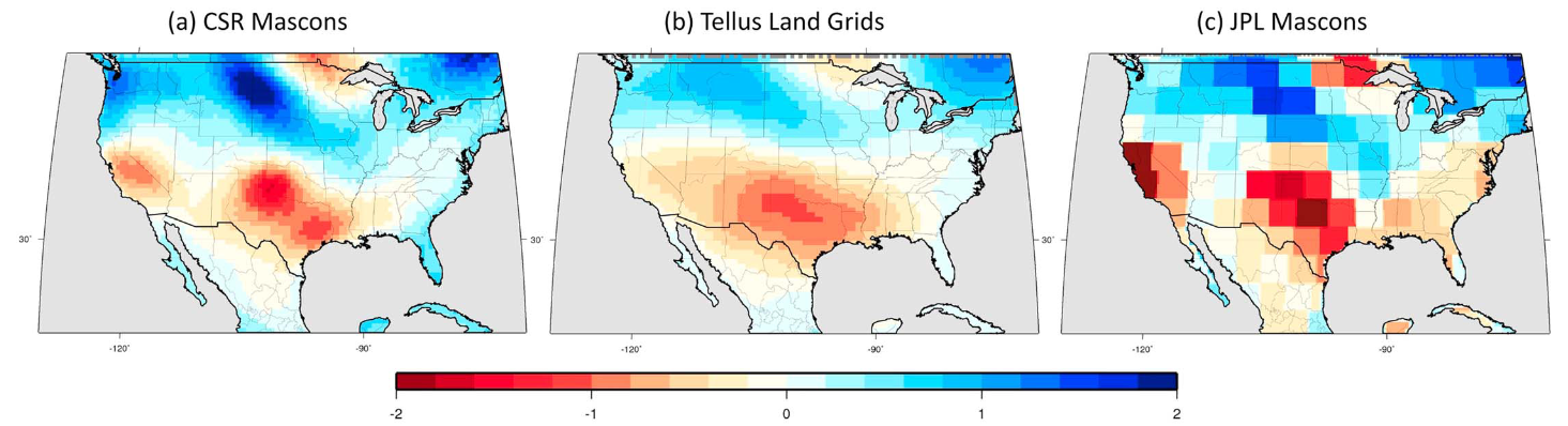
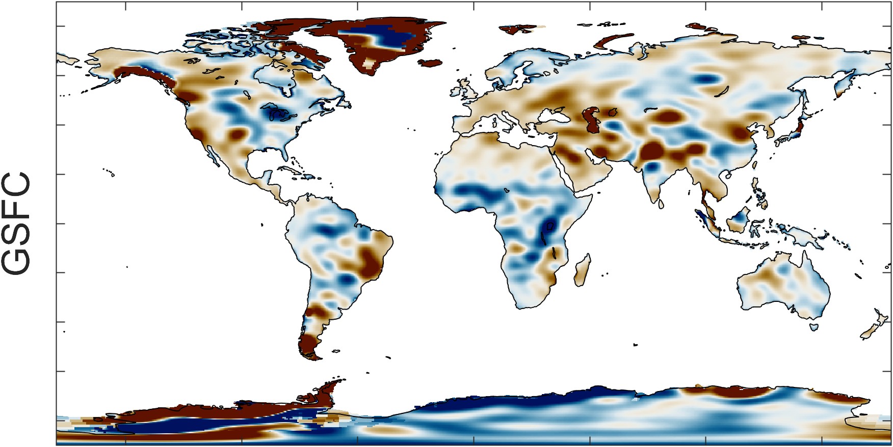
Figure 2.4 illustrates the increase in resolution that was obtained with the mascon-based solutions. Here, Save, Bettadpur, and Tapley (2016) used three different GRACE solutions to calculate the trend in total water storage. The newer mascon-based solution from CSR is shown in (a). In (b), the older GFZ solution (labeled TELLUS) is shown. Because of the post-filtering that was applied to eliminate striping, small-scale anomalies are smoothed and details are blurred. In (c), the JPL solution, one can see changes between neighboring 3° mascons.
While all three of the GRACE datasets I chose are based on the same satellite data, the solutions are based on different mascon grids. The details are complex, but interested readers are referred to detailed explanations in Loomis, Luthcke, and Sabaka (2019), Save, Bettadpur, and Tapley (2016), and Watkins et al. (2015). Official guidance from NASA has recommended that users average all three data center’s solutions (Landerer and Cooley 2021). This recommendation is backed by research that showed the ensemble mean (simple arithmetic mean of JPL, CSR, GFZ fields) led to a reduction in noise within the gravity field solutions, considering the scatter present in the available data (Sakumura, Bettadpur, and Bruinsma 2014).
And while the calculations for converting gravity field anomalies to changes in water storage have a solid basis in theory, researchers have not yet found an effective way to ground truth these observations (Kusche et al. 2009; Reager et al. 2015). GRACE observations have a relatively coarse spatial resolution compared to other EO datasets, such as precipitation. While the published datasets have a 0.25° resolution, the data have been spatially filtered to remove random errors and systematic errors (F. W. Landerer and Swenson 2012). Thus, small scale details are not likely to be meaningful, and these data are more accurate over larger regions (Tapley et al. 2004).
In the following sections, I show some exploratory data analysis of the GRACE observations.
The GRACE Level 3 data of TWS anomalies are geographically complete, with no gaps or missing pixels that are often seen in other EO datasets. However, there are gaps in the time series, where there are months with no data. In this section, I describe the causes for missing data. In Section 3.2.2, I describe a time series interpolation method to fill in missing data.
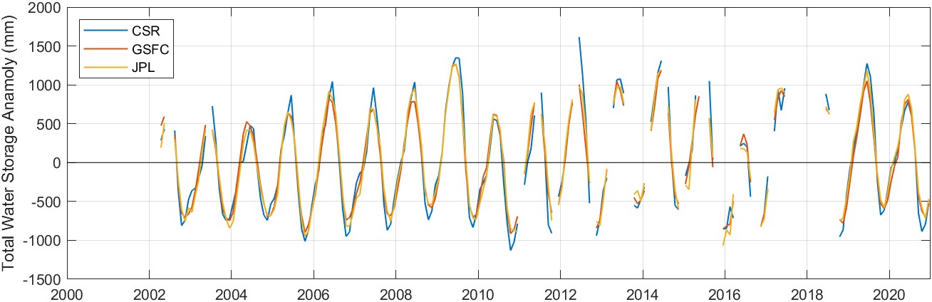
Figure 2.5 shows an example of the GRACE observations of total water storage anomaly. Here, the time series data was extracted from a single randomly-chosen pixel over the Amazon basin in Brazil. We can see at a glance that the time series begins in 2002 and extends through the present, with a number of gaps in the observations.
To understand when and why there are gaps in the GRACE dataset, it helps to know about the mission’s history and the timeline of its operations. Figure 2.9 is an overview of available GRACE data. The GRACE satellites were launched in March 2002, and were originally designed for a 5-year lifetime. The first monthly data were published for April and May 2002. “Several months of instrument testing” resulted in no reported water storage data in June and July 2002, and two missing months of data in 2003 and 2004 (Herman et al. 2012). For the next 7 years, there is a continual record with no gaps.
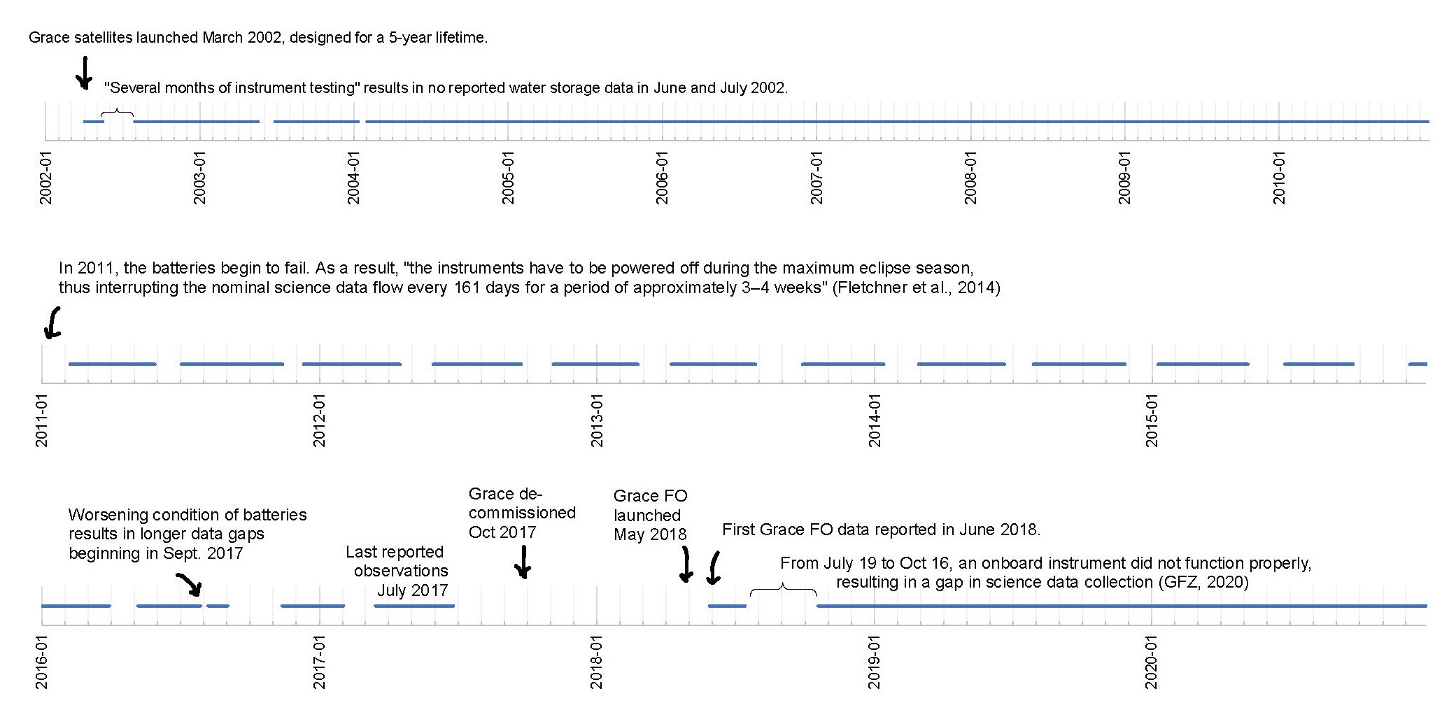
In 2011, the batteries onboard GRACE began to fail. As a result, “the instruments have to be powered off during the maximum eclipse season, thus interrupting the nominal science data flow every 161 days for a period of approximately 3–4 weeks” (Flechtner et al. 2014). As a result, there are 1 to 2 month gaps every 6 months. The worsening condition of batteries resulted in longer data gaps beginning in September 2017 (Müller et al. 2019). GRACE was decommissioned in October 2017. With no power left to correct the orbits, the low-earth orbiting satellites were left to re-enter the atmosphere.
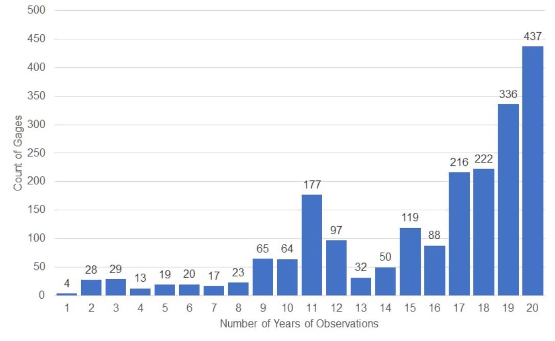
The follow-up mission, GRACE-FO, was launched in May 2018, and the first GRACE-FO data was reported for June 2018. From July 19 to October 16, 2018, an onboard instrument did not function properly, resulting in a gap in science data collection (Svarovsky 2019). Other than this 3-month gap, the record has been continuous from mid 2019 to present. The time period chosen for this thesis is 2000 to 2019, with 20 years or 240 months. In total, there are monthly GRACE data for 181 months during this time period, or 75% of months.
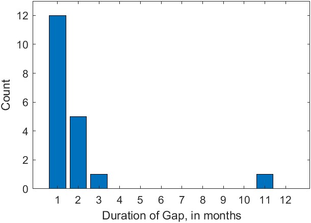
There is considerable missing data in the GRACE record, as shown in Figure 2.6. Not considering the time before GRACE observations begin in April 2002, 17% of months are missing. There are a dozen 1-month gaps, five 2-month gaps, one 3-month gap, and one 11-month gap between GRACE and GRACE-FO.
In Chapter 6, I examine the possibility of reconstructing GRACE-like TWS data for filling gaps and hindcasting for periods prior to 2002.
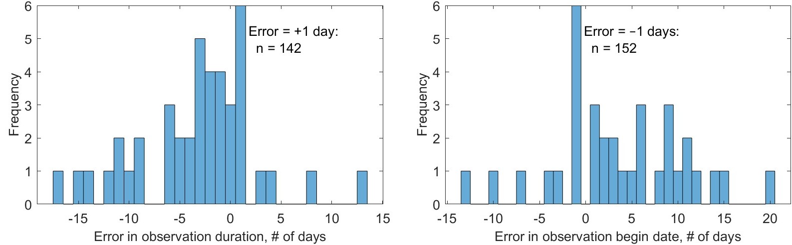
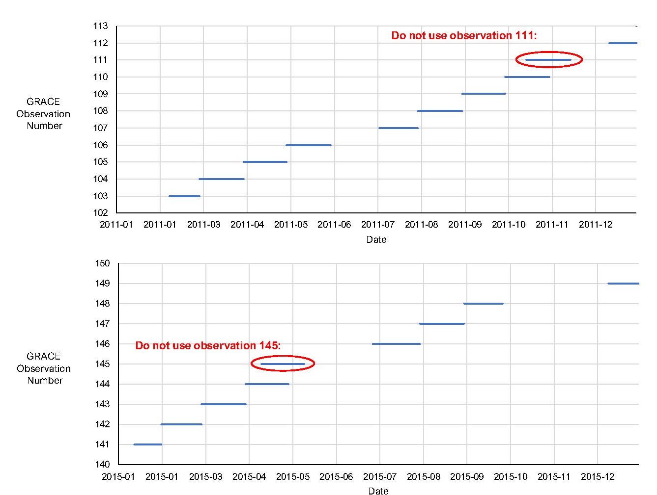
GRACE data are quasi-monthly. That is, published observations of TWS do not correspond precisely to calendar months, in terms of the effective beginning and end date of the observations. According to the data provider, NASA’s Jet Propulsion Laboratory (JPL), “the generation of high-quality monthly gravity field solutions and mass change grids requires accumulation of satellite-to-satellite tracking data for about 30 days. However, within some months, a few days of data may not be used due to instrument issues, calibration campaigns etc.” (NASA Jet Propulsion Laboratory 2023). According to JPL, data users should “carefully assess whether the underlying sub-monthly sampling needs to be matched between the data sets.” In other words, because the GRACE data are not truly monthly, this could lead to errors and uncertainties when trying to combine GRACE with other monthly datasets, as there is something of a time mismatch. Examples of the errors in GRACE observation dates is shown in Table 2.3.
Table 2.3: GRACE observations begin and end dates, showing the errors in the begin date and duration compared to calendar months.
| GRACE observation number | Calendar month | GRACE observation begin date | GRACE observation end date | Observation duration (days) | Calendar month duration (days) | Error in duration (days) | Error in begin date (days) |
|---|---|---|---|---|---|---|---|
| 1 | 2002-04 | 2002-04-04 | 2002-04-30 | 26 | 30 | −4 | 3 |
| 2 | 2002-05 | 2002-05-02 | 2002-05-17 | 15 | 31 | −16 | 1 |
| 3 | 2002-08 | 2002-07-31 | 2002-08-31 | 31 | 31 | 0 | −1 |
| 4 | 2002-09 | 2002-08-31 | 2002-09-30 | 30 | 30 | 0 | −1 |
| 5 | 2002-10 | 2002-09-30 | 2002-10-31 | 31 | 31 | 0 | −1 |
| 6 | 2002-11 | 2002-10-31 | 2002-11-30 | 30 | 30 | 0 | −1 |
| 7 | 2002-12 | 2002-11-30 | 2002-12-31 | 31 | 31 | 0 | −1 |
| 8 | 2003-01 | 2002-12-31 | 2003-01-31 | 31 | 31 | 0 | −1 |
| 9 | 2003-02 | 2003-01-31 | 2003-02-28 | 28 | 28 | 0 | −1 |
| 10 | 2003-03 | 2003-02-28 | 2003-03-31 | 31 | 31 | 0 | −1 |
| 11 | 2003-04 | 2003-03-31 | 2003-04-30 | 30 | 30 | 0 | −1 |
| 12 | 2003-05 | 2003-04-30 | 2003-05-21 | 21 | 31 | −10 | −1 |
| 13 | 2003-07 | 2003-06-30 | 2003-07-31 | 31 | 31 | 0 | −1 |
| 14 | 2003-08 | 2003-07-31 | 2003-08-31 | 31 | 31 | 0 | −1 |
| ... | ... | ||||||
| Dataset Name | Region | Year | # Gages | Reference |
|---|---|---|---|---|
| CAMELS | Continental USA | 2017 | 671 | Addor et al. (2017) |
| CAMELS-CL | Chile | 2018 | 516 | Alvarez-Garreton et al. (2018) |
| CAMELS-BR | Brazil | 2020 | 3,679 | Chagas et al. (2020) |
| CABRA | Brazil | 2021 | 735 | Almagro et al. (2021) |
| CAMELS-GB | Great Britain | 2020 | 671 | Coxon et al. (2020) |
| CAMELS-Aus | Australia | 2021 | 222 | Fowler et al. (2021) |
| LamaH-CE | Central Europe | 2021 | 859 | Fowler et al. (2021) |
| CARAVAN | multiple | 2023 | 6,830 | Kratzert et al. (2023) |
Easily-accessible datasets have led to a mini-boom in the use of machine learning in hydrology. Indeed, these data are ripe for exploration, and are ideally suited for practitioners of machine learning to explore. Artificial neural networks have been used to predict river discharge (as a form of black box rainfall-runoff model) since the early 1990s (Peel and McMahon 2020). Recent advances in Long short-term memory (LSTM) networks have been able to make remarkably accurate predictions (Kratzert et al. 2019).
In the water budget equation (Eq. 1.1), the runoff term R is meant to quantify the total flux of water leaving the watershed. Here, we use observed or modeled river discharge as a proxy for runoff. This is an imperfect measure on a number of counts. First, it does not account for subsurface flow (groundwater flow) which is not captured by gages (Fekete, Vörösmarty, and Grabs 2002). Second, it does not account for man-made interbasin transfers or other human impacts.
Yet, it is well-understood and well-documented that human alterations have large impacts on the natural water cycle (Vorosmarty et al. 2000; Hanasaki, Kanae, and Oki 2006, see e.g.,). For example, interbasin transfers can have a confounding effect on our water budget calculations. These are engineering projects consisting of pipelines or canals that transfer water from one watershed to another. Some examples of large interbasin transfers include the Tajo-Segura interbasin water transfer in Spain, the California Water Project in the US, and China’s South–North Water Transfer Project. (Note that this is just a few examples and is not at all comprehensive. Many more interbasin transfers exist.)
Our simple water balance model with four variables does not account for man-made water exports from a basin. Where water is imported into a basin, if imported water is used primarily inside homes and discharged to the ocean, it may not have any impact on our analysis. On the other hand, when imported water use is for irrigation, or to fill reservoirs, this could be a significant source of error. Studies conducted at the scale of a region or a watershed should make an effort to account for man-made fluxes into or out of the watershed. However, for this global study, this was not practical. Furthermore, such data are not always readily available, or easy to interpret.
The national hydrologic agency in the United States, the USGS, provides special flags to alert data users when a river gage is affected by diversions or withdrawals. The agency has also published a dataset on a subset of 1,659 gages that are “relatively free of confounding anthropogenic influences,” for the purposes of studying long-term variations in hydrology (Slack and Landwehr 1992). Unfortunately, the GRDC does not provide a similar flag for its discharge database.
I also collected observations of ancillary environmental data as inputs to our NN model, listed in Table 2.5. The working hypothesis in my thesis research is that errors in EO data are the consequence of certain environmental conditions. For example, precipitation estimates are often biased in mountainous regions, or in relation to snow cover. If we provide the NN model with inputs that allow it to identify mountainous regions or snow covered regions, it should be able to make suitable corrections. In a previous study, Munier and Aires (2018) used ancillary environmental data to provide local correction factors for water budget components based on vegetation index (NDVI) and an aridity index (average \(P - E\)). Our hypothesis was a NN model fed with more environmental data could perform even better at correcting these errors and closing the water budget. The relationships are likely to be complex and non-linear, which a well-trained NN model should be capable of finding.
Each of the ancillary datasets in Table 2.5 consists of gridded geographic data. Certain of the environmental datasets are static; i.e., they do not vary over time (e.g., elevation, latitude). Other datasets are time-variable, such as solar radiation or vegetation indices. In all cases, I rescaled and reprojected environmental datasets as necessary to the standard project grid and calculated spatial means for river basins as described in Section 3.4. High-resolution data (e.g., 0.05°, 3600 x 7200 pixels), were upscaled to my standard 0.25° grid. While this was not strictly necessary, it lets me use the same data and workflows for computing basin means.
Table 2.5: Ancillary environmental data compiled at the river basin and pixel scale for use as inputs to an NN model.
| # | Variable | Units | Source | Min | Median | Max |
|---|---|---|---|---|---|---|
| 1 | Aridity index | dimensionless | calculated | 0.00032 | 0.57 | 2.9 |
| 2 | Elevation, basin mean | meters | Amatulli et al. (2018) | 15 | 520 | 5300 |
| 3 | Latitude, basin centroid | decimal degrees | calculated | −50 | 27 | 75 |
| 4 | Slope, basin median | dimensionless | Amatulli et al. (2018) | 0 | 1.2 | 26 |
| 5 | Vegetation Index, EVI | dimensionless | Didan (2015) | −0.17 | 0.21 | 0.7 |
| 6 | Irrigated area (percent) | dimensionless | Siebert et al. (2015) | 0 | 0.0006 | 0.76 |
| 7 | Longitude, basin centroid | decimal degrees | calculated | −160 | 27 | 180 |
| 8 | Burned area (percent) | dimensionless | Giglio, Schroeder, and Hall (2020) | 0 | 0 | 0.55 |
| 9 | Snow cover (percent) | dimensionless | Hall and Riggs (2021) | 0 | 0 | 100 |
| 10 | Solar radiation | J/m² | Hogan (2015) | 0 | 18.1 × 10⁶ | 346 × 10⁶ |
| 11 | Temperature | °C | Wan, Hook, and Hulley (2021) | −45 | 26 | 57 |
| 12 | Vegetation growth/senescence | dimensionless | calculated | −0.15 | 0.22 | 0.66 |
The aridity index (or sometimes dryness index) is a widely used measure of the long-term hydro-climatic conditions of a region. It is variously described in the literature as a “degree of dryness” or a “degree of water deficiency.” Definitions vary, but it generally describes the ratio between available water and water demand for evaporation and water use by plants. The aridity index has been used in a wide range of studies and has been shown to be correlated with the runoff in basins (Arora 2002). Methods of calculating the aridity index also vary. Among the most well-known and widely used definitions of the aridity index is the one proposed by Budyko (1974), \(\phi = (E_0 / P)\), where P is precipitation and \(E_0\) is the reference evapotranspiration.
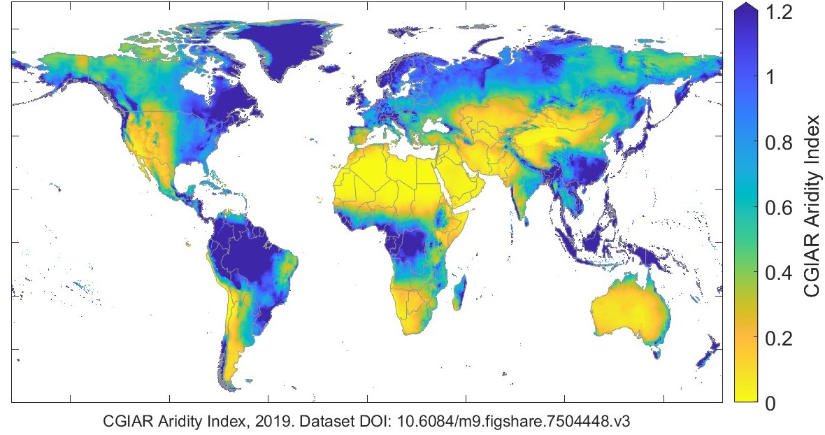
I used a contemporary global dataset from the Consultative Group on International Agricultural Research (CGIAR), which reports both annual average and monthly average aridity at the pixel scale over global land surfaces (Trabucco and Zomer 2019). The annual average aridity index is shown in Figure 2.15. The CGIAR defines the aridity index as:
\[\text{AI} = \frac{\bar{P}}{ \bar{E_\text{o}} } \]
where \(\bar{P}\) is the mean annual precipitation, and \(\bar{E_\text{o}}\) is the mean annual potential evapotranspiration for a reference crop11.
It is worth noting that some researchers call CGIAR’s AI a humidity index. The CGIAR’s definition is counterintuitive as it increases as climates get wetter. For dry environments AI \(\rightarrow 0\), while for wet, humid environments AI \(\rightarrow \infty\).
I calculated the mean basin elevation and median slope using an open-source dataset of gridded global physiographic data published by Amatulli et al. (2018). This dataset combines several terrain-related variables, intended for environmental and biodiversity modeling.
I calculated the basin latitude and longitude based on the watershed polygon shapefiles in latitude and longitude coordinates using the software QGIS. The latitude and longitude are reported at the centroid of each river basin.
Satellite data is commonly used to identify the location and extent of vegetation by combining information from visible and near infrared wavelengths. These measures take advantage of the fact that chlorophyll in plant leaves absorbs and emits radiation in particular wavelengths. The first such measurement, which is still widely used, is the Normalized Difference Vegetation Index (NDVI). The NDVI is broadly an index of “greenness” that ranges from \(-1.0\) to +1.0. While NDVI is not well correlated with photosynthesis rate or vegetation mass, it is used to “characterize the global range of vegetation states and processes” (NCAR 2023). In other words, one cannot readily compare the NDVI in different areas to determine whether one location has more vegetation or biomass. However, there are rules of thumb for interpreting NDVI. According to the USGS Remote Sensing Phenology Program (Brown 2018), here are typical NDVI values:
I obtained vegetation indices measured by the MODIS instrument onboard two different NASA satellites, Aqua and Terra. The Aqua satellite was launched in May 2002, and the first monthly data are available for July 2002. The Terra satellite was launched in December 1999, and the first monthly data are available for February 2000. Because of the better time coverage of the data from Terra, I chose to use this version for our analysis. Other remote sensing products related to vegetation are available. The most notable are the leaf area index (LAI) and fraction of absorbed photosynthetically active radiation (FAPAR).
I used the newer “enhanced” vegetation index EVI, rather than NDVI, as it “minimizes canopy-soil variations and improves sensitivity over dense vegetation conditions.” Both indices provide a measure of the “composite property of leaf area, chlorophyll and canopy structure” (NCAR 2023). The newer algorithm is thought by experts to be more accurate in areas of dense canopy . Note that I used version 6 data; a newer version 6.1 became available in 2022, but was not yet complete. The EVI takes on theoretical values from –0.2 to +1.0.
I hypothesized that not only the amount of vegetation is important to the water cycle, but also the rate of vegetation growth or senescence. Therefore, I created a new ancillary variable by calculating the monthly rate of change of EVI shown. I refer to this rate herein as “vegetation growth/senescence” and it is shown in the final row of 2.5.
Because EVI is a relatively new measurement, I did some analysis to better understand how it is different from NDVI, including creating summary statistics and maps. Figure 2.16 is a map of the correlation of NDVI vs EVI at the global scale. The map compares the correlations between the two time series in every pixel of the map. The green color means that in many places, the time series are highly correlated. However, large disagreement (as shown by orange and red colors) is seen in the Amazon and in the island region of Southeast Asia (Malaysia, Indonesia, Brunei, and Papua New Guinea).
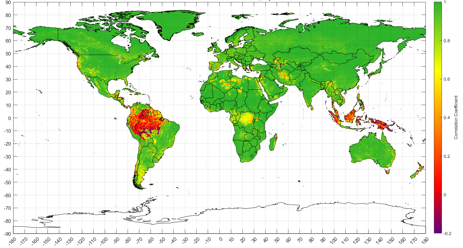
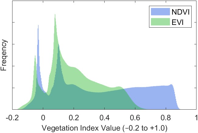
Figure 2.17 is a histogram of the two datasets comparing the average values in all pixels over the period 2000 – 2019. The distributions are dissimilar, and EVI has a lower median value than NDVI, and fewer values in the highest part of the range between 0.6 and 1.
For hindcasting applications, we wish to use an NN model to estimate TWSC prior to the launch of the first GRACE satellites in 2002 (this will be described in Section 4.4.2). I attempted to build a model with the most explanatory capability that includes a variety of environmental variables, as described here. Unfortunately, the datasets NDVI and EVI described above are from the MODIS instruments onboard the Aqua and Terra satellites, and these particular datasets are not available before 2000. Therefore, I considered using an older vegetation dataset based on the Advanced Very High Resolution Radiometer (AVHRR).
The AVHRR is an instrument onboard a series of polar-orbiting NOAA weather satellites (NOAA 7, 9, 11, 14, 16, 17, and 18). NOAA publishes data on surface reflectance and NDVI based on AVHRR data. The dataset is daily, has global coverage, and a resolution of 0.05°. The data are available from June 24, 1981 to present (Vermote 2018).
A related dataset is available from NOAA based on an instrument called the Visible Infrared Imaging Radiometer Suite (VIIRS). This instrument was meant to improve upon its predecessor AVHRR (Vermote 2022). It is among the five instruments onboard the Suomi National Polar-orbiting Partnership (SNPP) satellite launched on October 28, 2011.
Another vegetation dataset with a long record is available from the Landsat satellites, operated by the United States Geological Survey (USGS). These data are very high resolution compared to the datasets described above, with a horizontal resolution of 1 arcsecond, which is equivalent to 1/3600°, or about 30 m near the equator. Vegetation from Landsat is interesting, largely because it spans many years, but it would require a great deal of specialized data processing.
Table 2.6 summarizes available datasets of global vegetation derived from satellite observations. Among the available data, there is a wide variety in the spatial and temporal resolutions. It is not immediately clear how to obtain a long record of EO vegetation data. Creating a high-quality dataset would involve comparing the spatio-temporal patterns among datasets and carefully intercalibrating them so that they can be combined.
Table 2.6: Global remote sensing-based vegetation datasets.
| Name | Publisher | Begins | Ends | Time Res. | Spatial Res. | Source |
|---|---|---|---|---|---|---|
| NDVI | ||||||
| AVHRR | NOAA | 1981 | present | day | 0.05° | doi: 10.7289/V5ZG6QH9 |
| AVHRR composite | USGS | 1989 | 2019 | 10 day | 1/12° | doi: 10.5066/F7707ZKN |
| GIMMS NDVI3g | NASA | 1981 | 2015 | half-month | 1/12° | NASA (2019) |
| VIIRS | NOAA | 2014 | present | day | 0.05° | doi: 10.25921/GAKH-ST76 |
| Landsat | USGS | 1982 | present | 16 days | 1/3600° | USGS (2022) |
| MODIS/Terra | USGS | Jan 2000 | present | day, month | 0.05° | doi: 10.5067/MODIS/MOD13C2.006 |
| MODIS/Aqua | USGS | Jun 2002 | present | day, month | 0.05° | doi: 10.5067/MODIS/MYD13C2.006 |
| EVI | ||||||
| Landsat | USGS | 1982 | present | 16 days | 1/3600° | USGS (2022) |
| MODIS/Terra | USGS | Jan 2000 | present | day, month | 0.05° | doi: 10.5067/MODIS/MOD13C2.006 |
| MODIS/Aqua | USGS | Jun 2002 | present | day, month | 0.05° | doi: 10.5067/MODIS/MYD13C2.006 |
Chu et al. (2022) published an article where they describe how their team created an extended time series of NDVI by combining data from different sensors, including AVHRR. I unsuccessfully attempted to acquire these data. The article states that data will be made available upon request. I requested the dataset from the authors and my messages went either undelivered or ignored. This phenomenon is unfortunately common in scientific publishing. One group of scholars that has examined data sharing practices opined: “statements of data availability upon (reasonable) request are inefficient and should not be allowed by journals.” (Tedersoo et al. 2021).
Other sources of information on vegetation are available from models, but these were not considered here. Reanalysis models such as GLDAS or ERA5 include relatively simple vegetation dynamics based on assimilation of EO of leaf area index (LAI) and other observations. More detailed simulation is done in a class of models referred to as Dynamic Global Vegetation Models (DGVM). These models are designed to simulate the effects of changing climate on vegetation, and resultant changes to the hydrologic and biogeochemical cycles.
In conclusion, due to a lack of available vegetation data with a sufficiently long time record, I used EVI from MODIS/Terra as an input variable for the recent GRACE era (2002–2019), but dropped vegetation as an input variable in hindcasting experiments for 1980–1999.
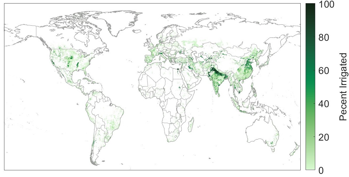
Human activities can have a profound impact on the water cycle. Diversions and abstractions for irrigation may reduce runoff, take water from groundwater storage, and increase evapotranspiration through crop water use. For this reason, I hypothesized that irrigated area may be a useful explanatory variable. I estimated the percent of land area that is irrigated based on a global dataset by Siebert et al. (2015). The authors estimated irrigated area by “combining sub-national irrigation statistics with different data sets on the historical extent of cropland and pasture,” and validated estimates with observations over the western United States. One limitation is that the data are through the year 2005. I chose to extract and use the values for this year, rather than attempting to do some kind of extrapolation of the time series through 2019. Therefore, the data represents a snapshot of one point in time, limiting its accuracy. This dataset is shown in Figure 2.18.
One could argue that land surface temperature is already indirectly included in my database, as it is among the input variables for evapotranspiration data products. Still, I chose to include this explanatory variable as an input to the neural network model as it has a strong, direct link on the hydrologic cycle. I obtained MODIS/Terra Land-Surface Temperature (Wan, Hook, and Hulley 2021). As these data are available as monthly estimates on a 0.05° grid, including this variable was relatively straightforward.
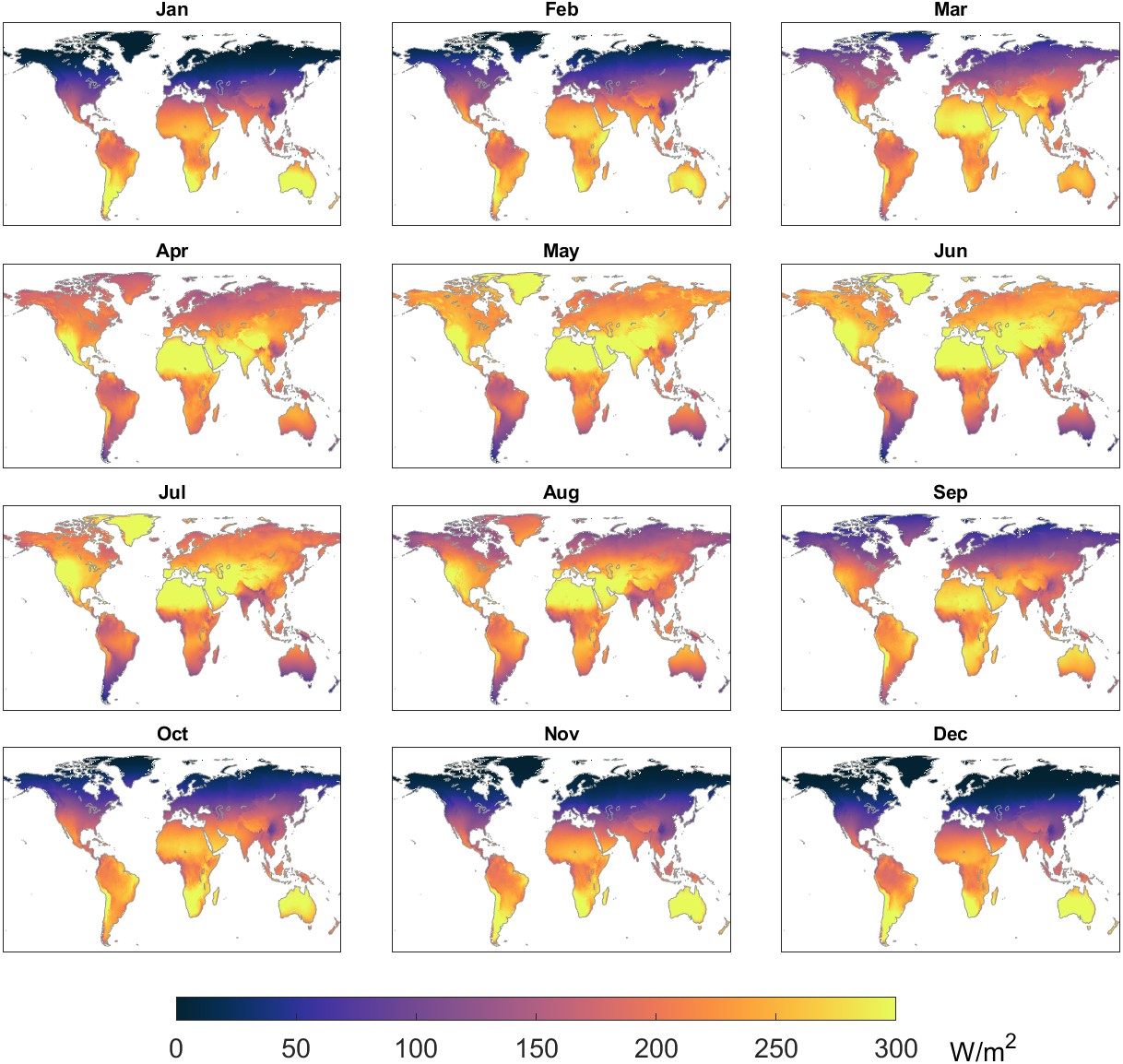
Solar radiation has a strong effect on evaporation, vegetation growth, and the terrestrial energy balance. I obtained gridded monthly data for the variable “surface short-wave (solar) radiation downwards” from the ERA5 model (Muñoz-Sabater et al. 2021). Annual monthly solar radiation in Watts per square meter is shown in Figure 2.19.
Fire plays a role in altering the hydrologic cycle – burning of biomass releases water vapor to the atmosphere, and patterns of evapotranspiration are altered by changes to vegetation. Authors of a recent study concluded that “current and historical fires significantly affect terrestrial ecosystems, which can alter hydrologic fluxes” (Fang Li and Lawrence 2017). The authors attempted to quantify these changes, concluding that fire reduced global evapotranspiration by 0.6 × 10 km³. This averages 0.003 mm/month, a seemingly insignificant amount (see Figure 2.18 for typical fluxes). Yet, fires can have a large local impact at certain places and at certain times. Therefore, I included an ancillary variable of burned area as a proxy for fire activity. I used data from the Terra and Aqua satellites’ Moderate Resolution Imaging Spectroradiometer (MODIS) instrument. The presence of fire activity is determined through measurement of thermal anomalies measured from orbit. The creators of this dataset caution that burned area estimates have high uncertainty “due to nontrivial spatial and temporal sampling issues” (Giglio, Schroeder, and Hall 2020).
The presence of snow and ice can negatively affect the accuracy of satellite observations of the water cycle (Kidd et al. 2012; Q. Cao et al. 2018). I hypothesized that including data on snow cover would allow the neural network model to make corrections in areas where fluxes are biased. I included a monthly variable on percent snow cover from the MODIS/Terra (Hall and Riggs 2021), spatially averaged and upscaled to our 0.25° project grid.
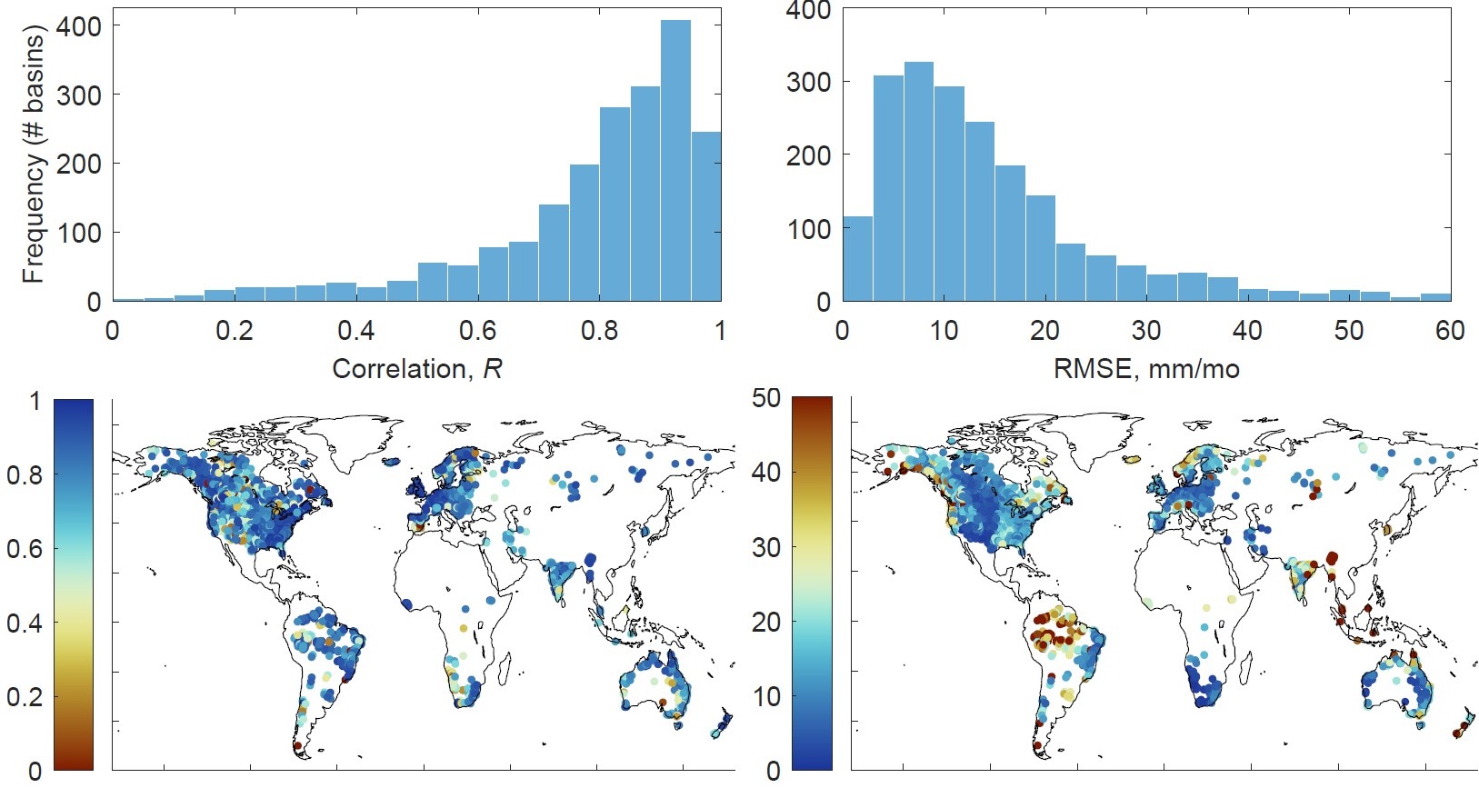
In this section, I show the results of some preliminary analysis of the EO datasets. I performed a variety of exploratory data analysis and visualization of the EO datasets by creating maps, time series plots, and statistical summaries. This is a critically important step in the process of ingesting datasets from various sources, in order to verify that the various geographic transformations and unit conversions have been done correctly. This helps to see where datasets are in agreement, and when and where there is more divergence in their estimates. Above, I listed and described many EO datasets describing different components of the hydrologic cycle. I selected datasets for my analyses based on their spatial and temporal coverage and their data quality.
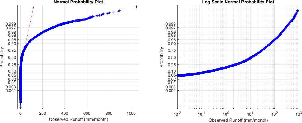
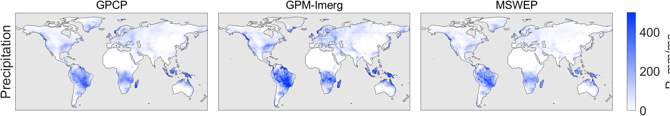
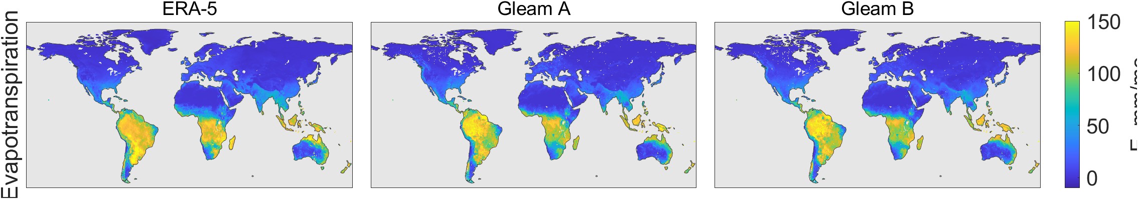
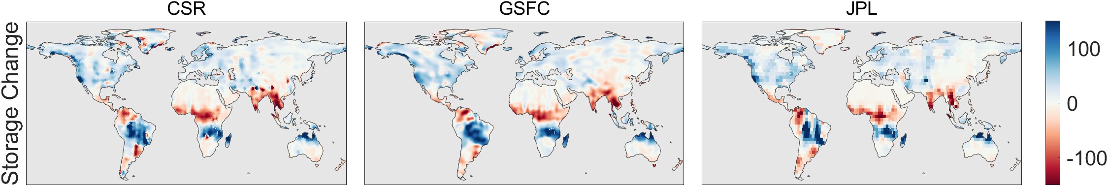
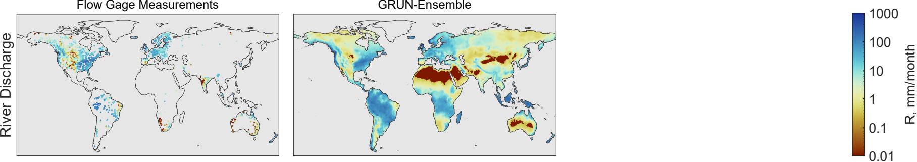
Figure 2.20 shows a snapshot of one month (January 2005) of the EO datasets used as input in our analysis. Some of the source datasets included data over both land and oceans. In these cases, I masked data over the oceans to facilitate visual comparison. Further, I excluded Antarctica from the datasets. The maps in Figure 2.20 show that the different datasets share many similarities in terms of the overall patterns, but many small differences are apparent upon close inspection. For example, precipitation according to GPCP appears smoother, while the other two datasets, which have a higher spatial resolution, show finer-grained patterns of high and low rainfall, particularly evident over the Amazon and southern Africa. Similarly, one can see differences in the spatial patterns of E and ΔS. River discharge, measured at gages, has a much sparser coverage, and the distribution of flows is highly skewed, with measured discharges covering several orders of magnitude from 0 to nearly 1,000 mm/month.
Boxplots are useful for visualizing the distributions and central tendencies among the datasets. Figure 2.18 shows the distribution of values in the EO datasets used as input in our model. The boxes show the interquartile range, and the whiskers show the 10%-ile and the 90%-ile. Outliers are not shown, nor are the minimum or maximum values. The top boxplot in each set of observations is for all pixels over land within our analysis domain, which excludes Antarctica, Greenland, and areas above 73° North. The lower box in each set shows the distribution across our 2,056 basins. I calculated the basin mean fluxes from the gridded data using an area-weighted averaging method described in the Section 3.4. The statistics in Figure 2.18 were calculated over the 20-year period from 2000 to 2019. The marked differences among EO datasets is further evidence of the need for their calibration.
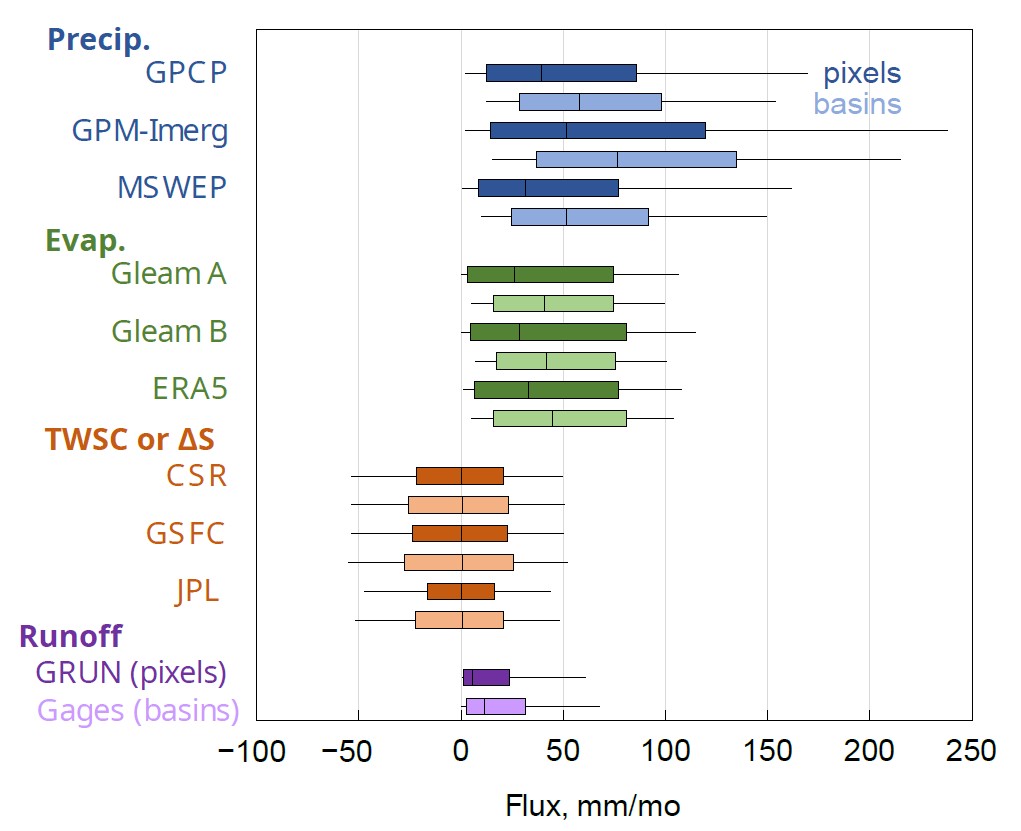
One can see in Figure 2.18 that, for most variables, the distribution of fluxes is greater over the pixels compared to the basins, with higher highs and lower lows. This is particularly the case for precipitation, but is also seen with evapotranspiration.
Calculating the mean flux over a basin tends to smooth out the extreme values and compress the distribution of observed values. (The gaged basins coverage, in terms of 0.25° pixels, is anywhere from 8 pixels to over 6,000 pixels, with a median of 19 and an average of 122 pixels in a basin.)
There are also differences in the distributions within each component of the water cycle. For example, GPM-IMERG contains higher observations of precipitation, with a higher 75- and 95-percentile than the other two datasets. The monthly water storage change, ΔS, is centered at about zero for each dataset. This is expected, as the storage in pixels and basins tends to fluctuate seasonally, and any long-term trend is small compared to the annual variations in storage. Runoff has the smallest magnitude of any of the hydrologic fluxes, with a low of 0 mm/month (no observed flow) to a 90%-ile of 68 mm/month, lower than the 90%-ile of P or E.
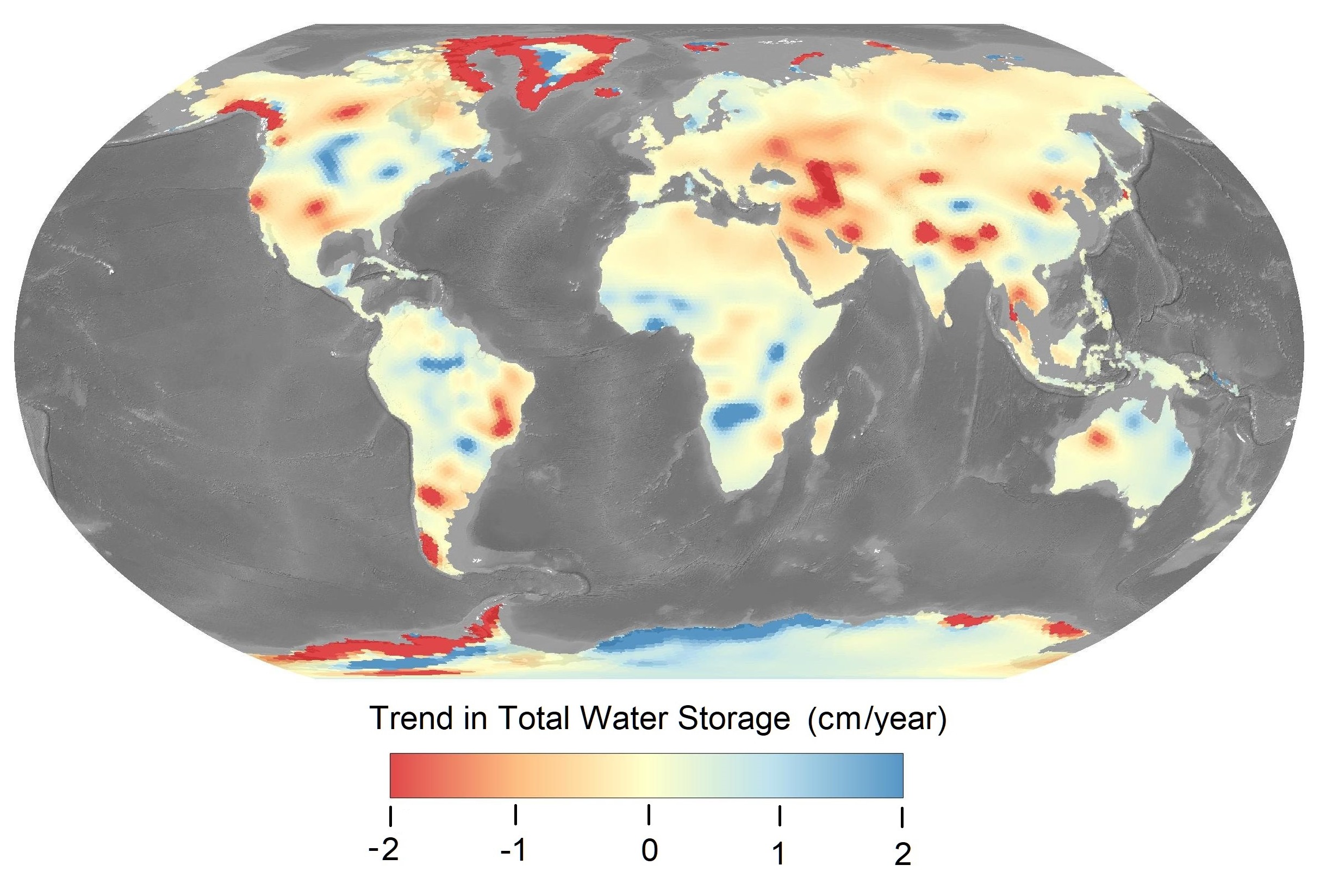
In this section, I analyze trends in total water storage, following methods used by Rodell et al. (2018). The purpose of this was two-fold: First, to verify that our handling of the data is correct by recreating the analysis in a well-known, peer-reviewed study based on GRACE data. The second purpose was to update the analysis by Rodell et al., which was based on observations through 2016. With five additional years of data, do the trends found by Rodell et al. continue or are they reversed? Furthermore, Rodell et al. (2018) used only one of the three available GRACE datasets, the one from JPL (Landerer and Cooley 2021). How does the trend in water storage vary, based on the different datasets? What is the effect on storage trends of averaging the three datasets?
For this analysis, I followed Rodell et al. (2018) in calculating the trend using ordinary least squares regression. I calculated the slope and intercept for the TWS anomaly. I repeated the analysis first for the time period from 2002 to 2016 (matching the analysis by Rodell et al.) and then for an updated time period 2002 to 2021. Maps of the trend in TWS are presented in Figure 2.22. The maps appear to be quite similar, despite some minor differences in the colors. Some differences in the maps could come from the different versions of GRACE data. My calculations and mapping were done with updated GRACE data, release 06, while Rodell et al. used a previous version, release 05. NASA continually updates the algorithms and coefficients used for processing GRACE data and estimating TWS anomalies. According to NASA, “GRACE is a first-of-a-kind mission, so not surprisingly, revisions to the data processing are more frequent than for more mature satellite measurements” (NASA Jet Propulsion Laboratory, 2018).
 (b)
(b)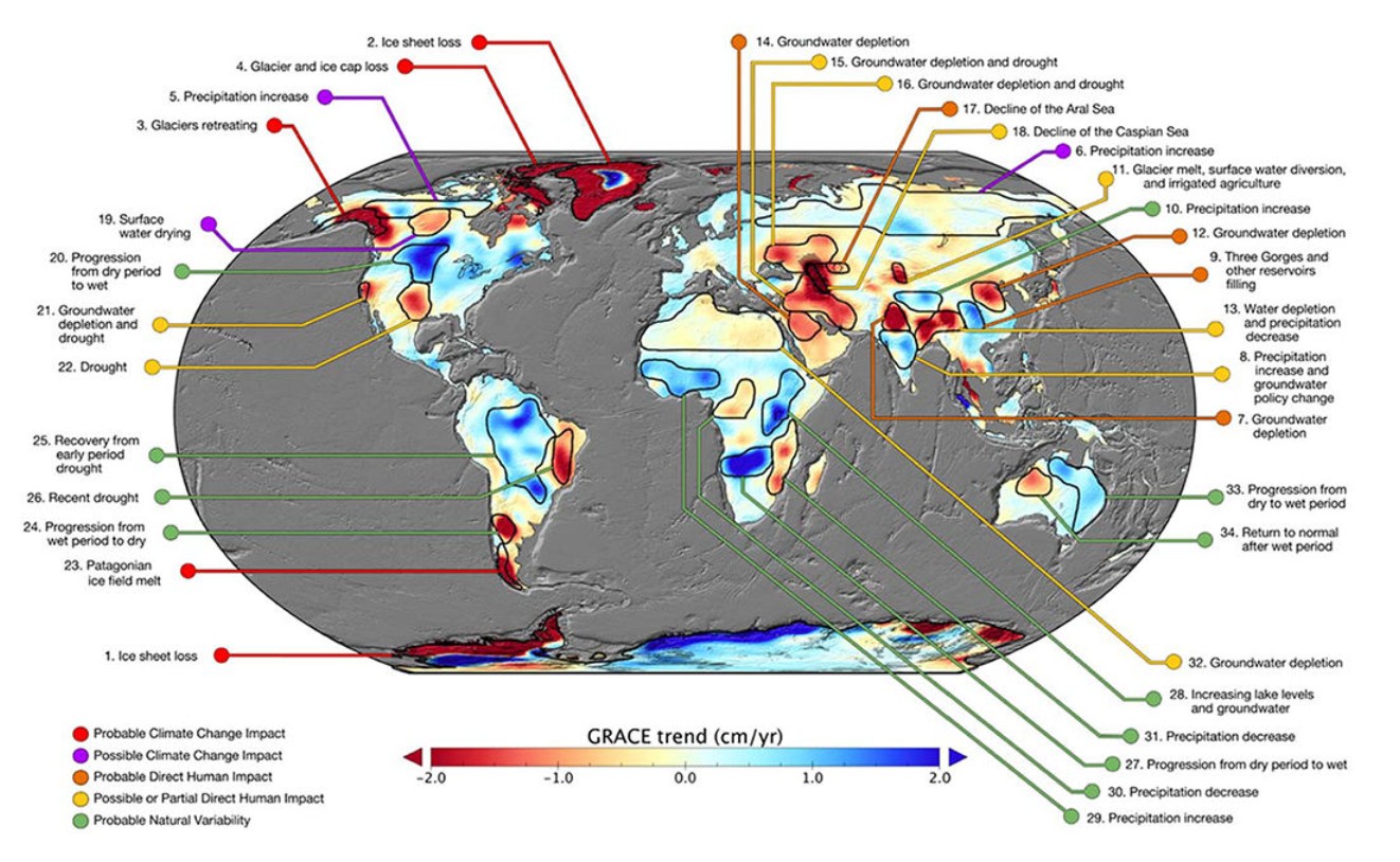
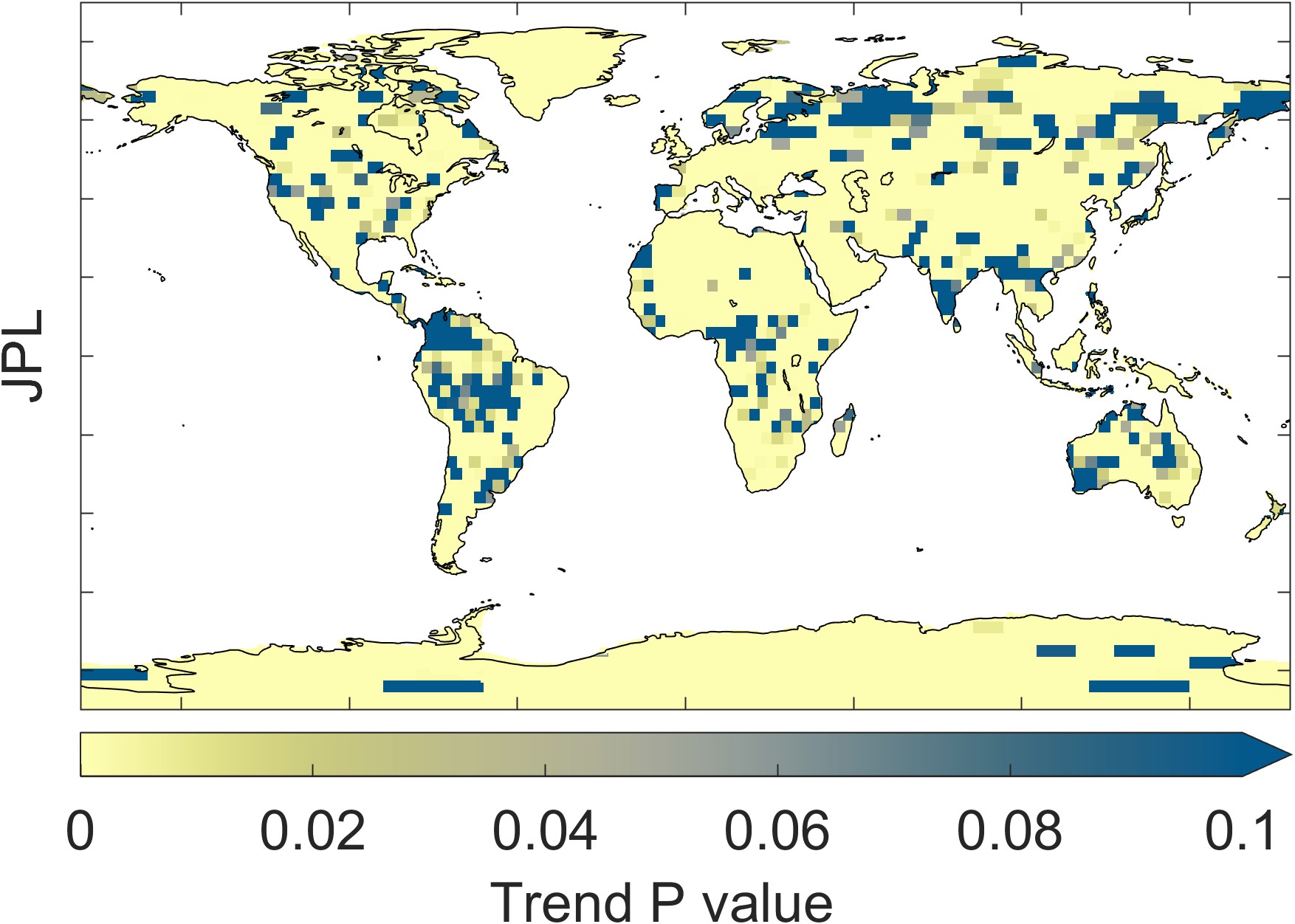
Figure 2.23 illustrates the trend in GRACE total water storage, as calculated by the three different datasets: CSR, GSFC, and JPL. Maps at the right show the P-value, or the probability that the trend is different from zero. The overall patterns appear similar, but careful comparison of the maps reveals several differences. For example, the trends appear to be somewhat different over southern Africa.
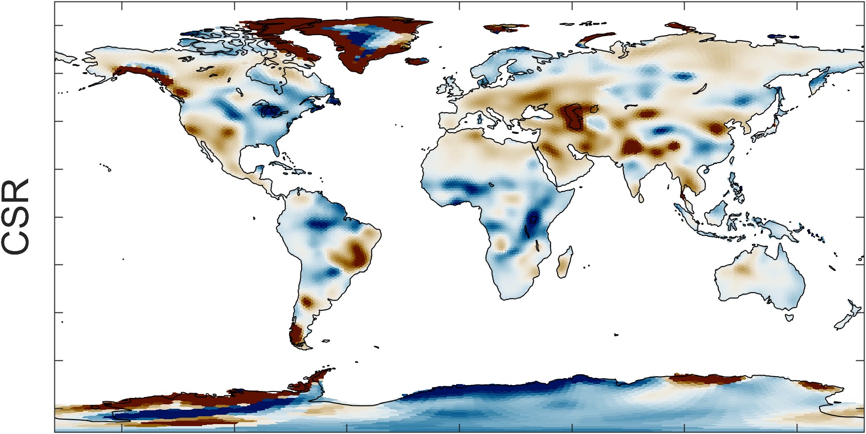
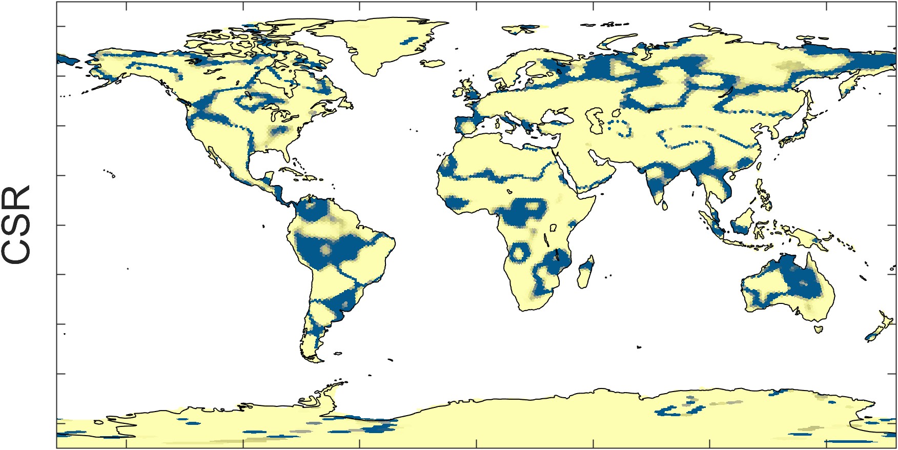
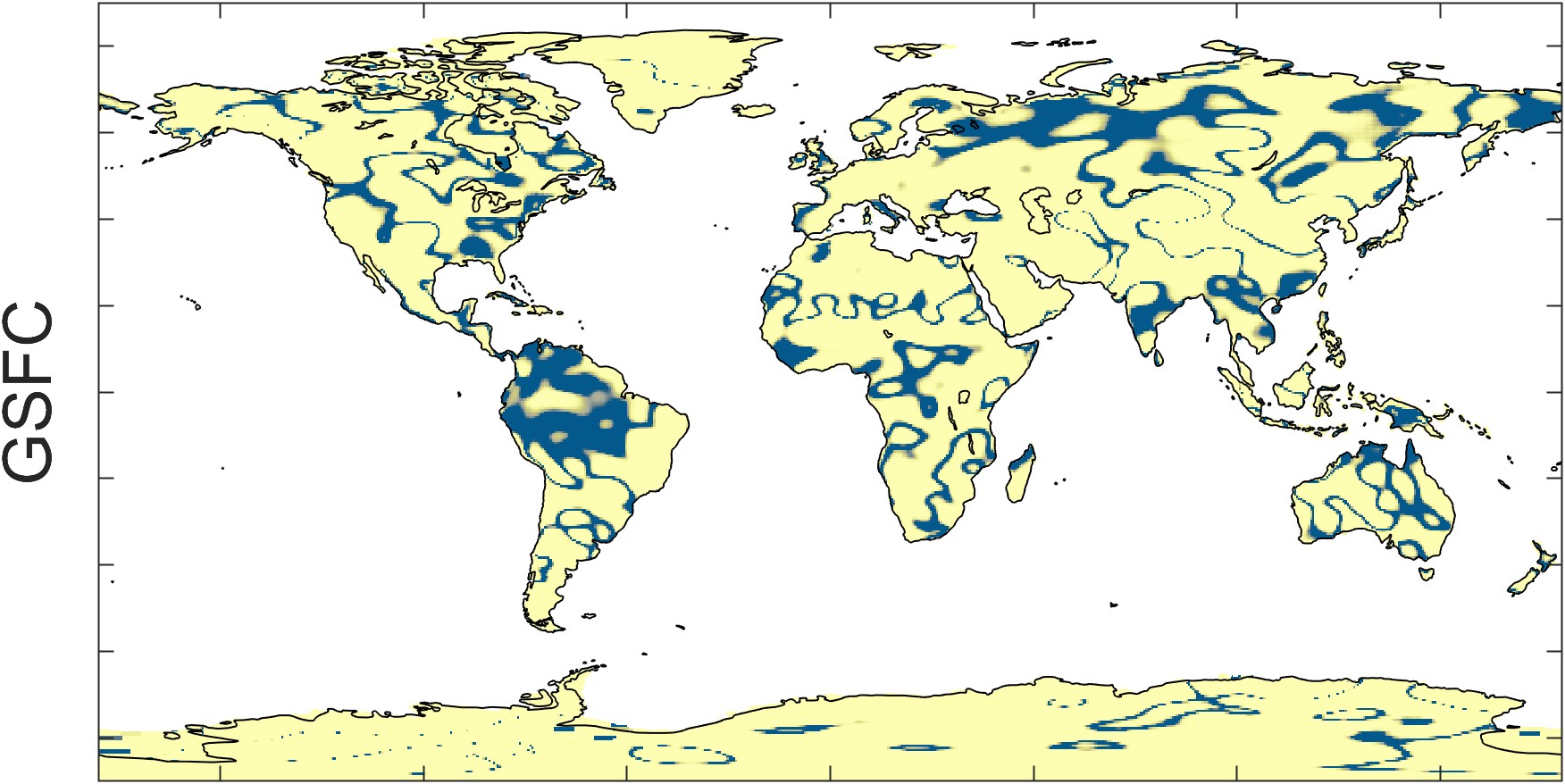
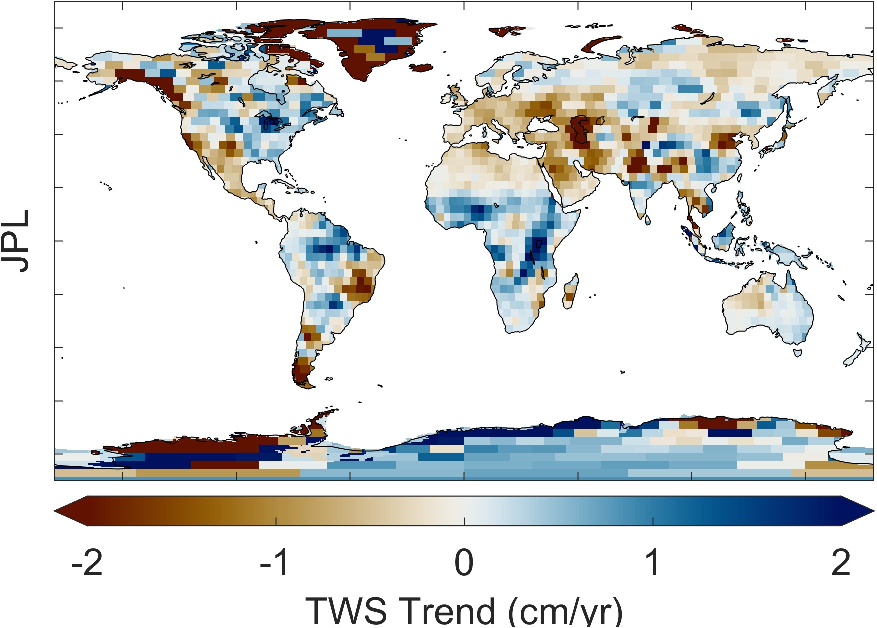
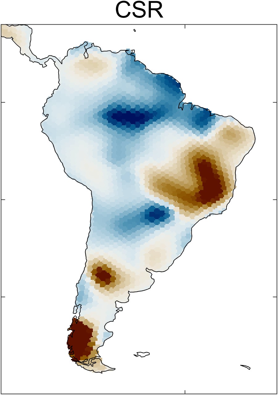
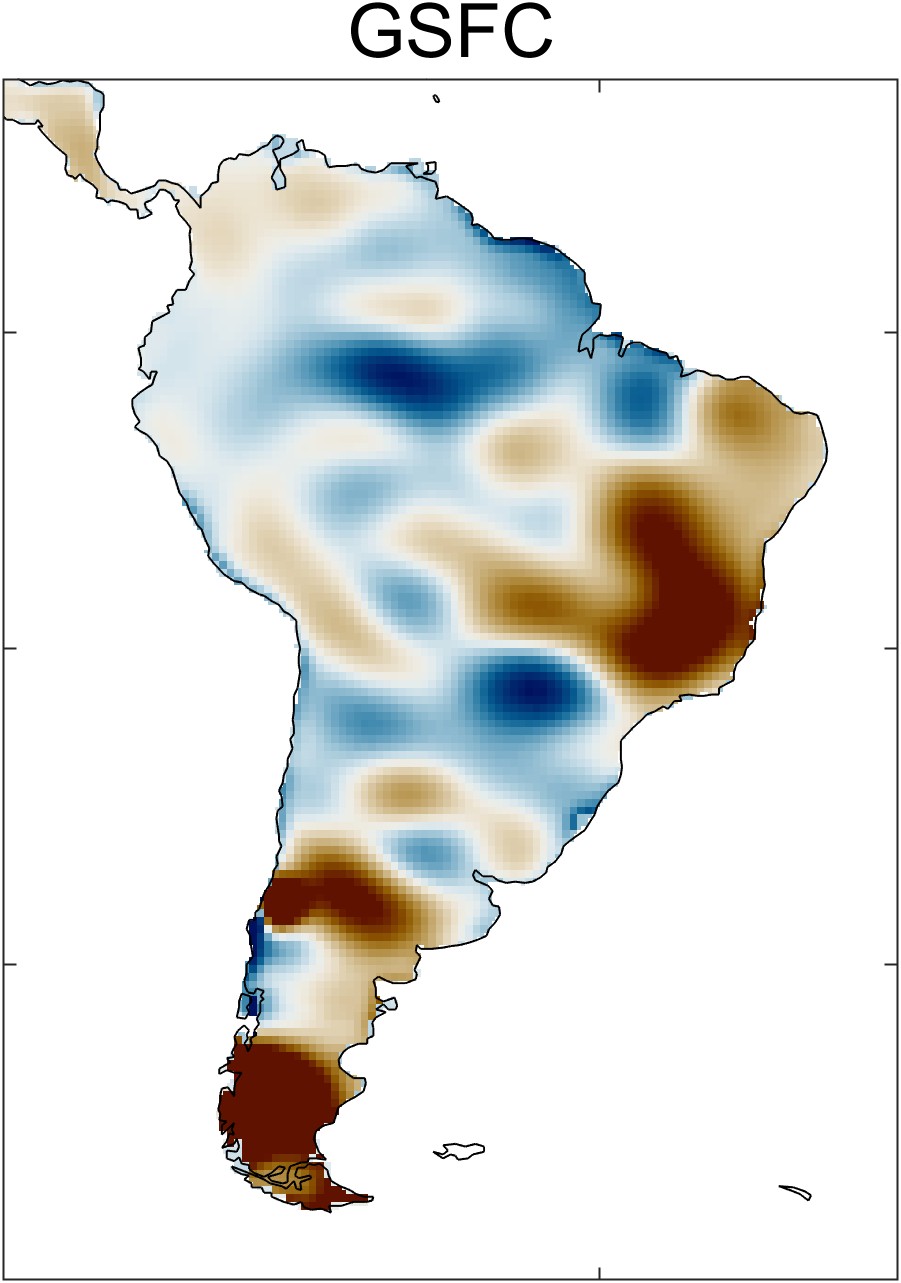
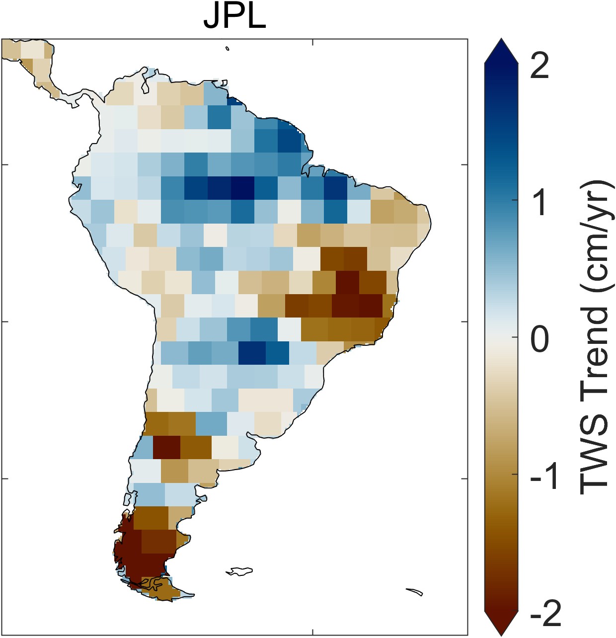
Zooming in on a single continent, such as South America in Figure 2.24, one sees distinct spatial patterns in each of the datasets. These patterns are artifacts of the data and processing used for each dataset. For example, with the CSR dataset, one can see the hexagonal grid of the mascons. The GSFC data has been smoothed with a Gaussian filter. The JPL dataset appears blocky, an artifact of the rectangular mascon 3° × 3° grid.