Wikipedia has thousands of articles about rivers. What are the most important facts about a river? Some can be described with numbers, such as its length, width, or average flow.
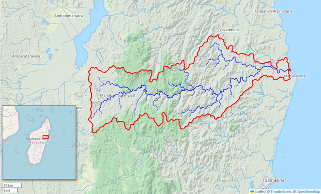
I think that every Wikipedia article about a river should include a watershed map. A map can tell you so much, including the landscape features that affect a river’s flow and water quality.
You can make a high-quality map using the free Global Watersheds web app. It is fast and easy. The best part is that you can include a link to a live, interactive map. Below is an example, followed by step-by-step instructions.
I defended my PhD thesis* in January, and decided it would be nice to put it online in HTML format. I have posted it here. The PDF is available via France’s open science portal HAL.
Heberger, Matthew. 2024. Improved observation of the global water cycle with satellite remote sensing and neural network modeling. PhD thesis. Sorbonne University, Paris, France. https://theses.hal.science/tel-04517802v1
My research had to do with using remote sensing data to describe the water cycle at the global scale, and explored methods to improve these data. There have been quite a few studies on this subject in the last several years, but we did a few things differently, namely using a much larger database of observations than previous studies, and using neural network models with some unique features. A few members of my committee said found my writing “pedagogic” and plan to share certain parts with their students. I hope that it is of some use to students or others interested in hydrology and remote sensing.
The PDF is formatted nicely and better for print. But the web version is nicer to read on a wider range of devices. It can also be resized or reformatted for easier reading. (When I’m reading long online documents, I like to use Firefox’s reader view.)
I used Latex and Overleaf to prepare the manuscript. I was hoping that it would be straightforward to convert to HTML. Unfortunately, it was not! I used the software pandoc to convert the document, but it required a lot of manual cleanup. Please let me know if you see any weird formatting or typos!
* In the US, it is customary to talk about a Master’s thesis, and a PhD dissertation. Under the British educational system, it’s the opposite. And in France, to obtain a doctoral degree, one writes une thèse.
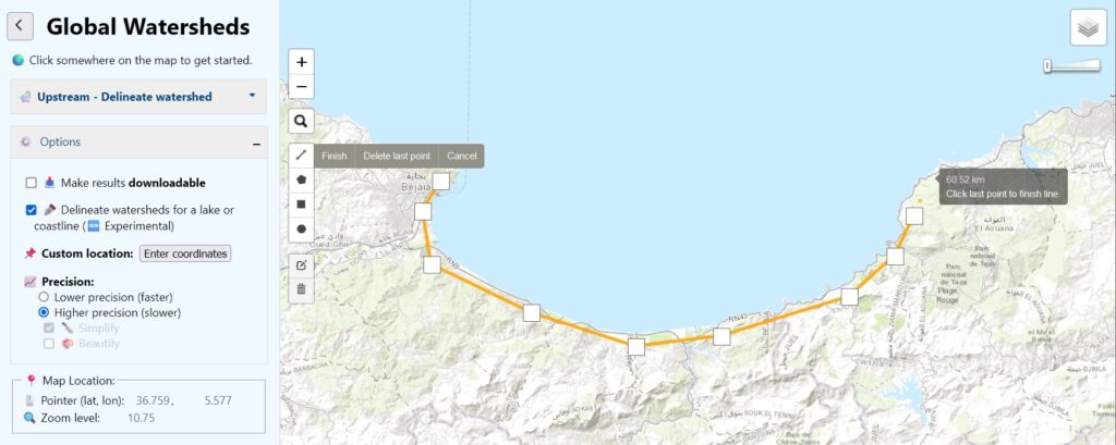
You can now delineate watersheds that drain to a polyline or polygon feature. This is useful for finding the total drainage area for a section of coastline or for an inland lake — also known as “endorheic” lakes.
To use this feature, under Options, check the box for Delineate watersheds for a lake or coastline. On the left side of the map, you will see a new drawing toolbar. Select one of the drawing tools, and create a polyline, polygon, rectangle or circle. You can only draw one feature at a time. There are also little buttons to edit your feature or to delete it. Then click on the feature and then click the button Delineate! This feature is only available using MERIT data (not HydroSHEDS), and only in “lower-resolution” mode.
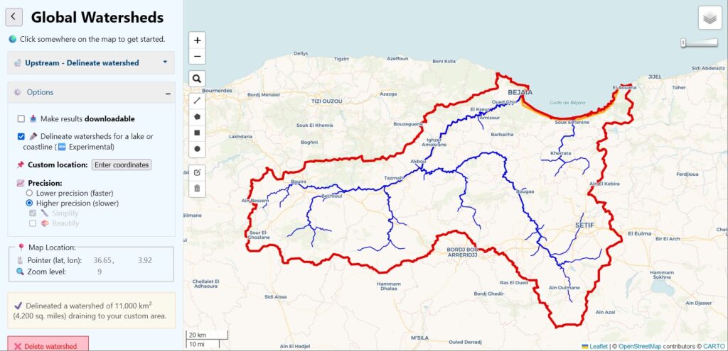
In the example below, I found the area that drains to the Gulf of Bejaia on the Mediterranean coast in Algeria, by drawing a line over the land near the coast:
The resulting drainage area includes two larger rivers or “wadis,” as well as many smaller coastal drainages.
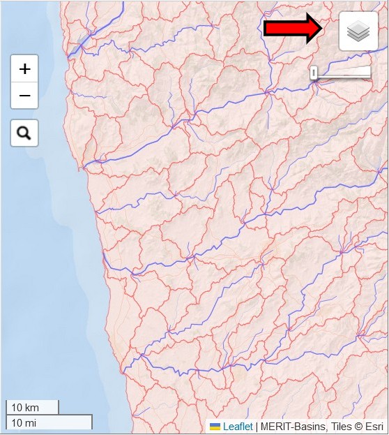
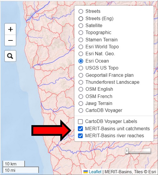
The second new feature allows you to view the MERIT-Basins layers on the map. There are separate layers for “river reaches” and “unit catchments.” These are the data layers that the app uses to construct watersheds when you choose “MERIT” as your data source. To activate these layers, just click on these new layers. They are overlays, which will display on top of your chosen basemap.
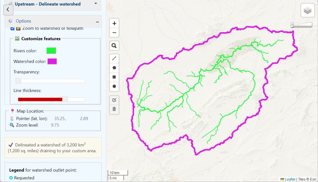
Finally, a small but fun new feature: you can now change the color of your rivers and watershed boundaries. You’ll find the color selectors near the bottom of the Options pane on the left. I’m not sure this is very useful, but you can create some interesting effects:
Please let me know what you think of these new features. Did you find any bugs? How could you use them?
I put together this list of journals with some info on their fees during my PhD research, and I’m sharing it here in case others may find it helpful. This information is likely to change fast, so make sure to verify.
During my PhD research, I became a convert to Latex for scientific writing, specifically using the website Overleaf.com. However, one feature that is missing is a good spelling and grammar checker. I like to use Microsoft Word for copyediting, as it has good built-in tools, and there are also plenty of addins available, like grammarly and ProWritingAid.
But first you need to get a clean export from Latex to Word, which is not straightforward.
Here is a method that works using Google Drive. It does not do a good job converting figures, tables, and equations, so I suppress those before continuing. It also helps to turn off hyphenation.
Add the following block to the preamble of the Latex document.
If you are interested in the Earth Sciences, you should consider attending the annual American Geophysical Union annual meeting. It is massive, with over 50,000 attendees, and thousands of scientific presentations, posters, lectures, and films. This can also make it feel overwhelming. Here are some highlights of the December 2023 conference in San Francisco from my point of view.
A former professor of mine, Rich Vogel from Tufts University, gave the Langbein Lecture. Being invited to give a named lectures is a big deal, equivalent to a lifetime achievement award. Even though he retired several years ago, he still publishes tons of papers and hasn’t lost any of his pep. It was a lot of fun.
I have really mixed feelings about poster sessions. On the one hand, it can be fun to get a quick view of a huge amount of research, and to meet researchers in person and talk to them about their work. On the other hand, it can be hard to learn much given the format. The Better Poster movement seems to have made very little impact. A good 95% of the posers are inscrutable walls of text.
I was honored to present my PhD research at the Annual Meeting of the American Geophysical Union in San Francisco, California, on December 15, 2023. My research is in the field of remote sensing and large scale hydrology. Here’s a copy of my slides if you’re interested:
For those interested in a deep dive, here is a link to the draft of my thesis (to be finalized after my defense in January). Here is a link to the final version of my PhD thesis:
Suppose you are interested in recreating my calculations or doing something related. The input datasets I used can be freely obtained via the sources listed in thesis Section 2, Datasets. The Appendix contains a much longer list of all the datasets I reviewed or considered using. I think it’s a good snapshot of remote sensing datasets describing the hydrologic cycle that were available circa 2023. The compiled data and Matlab scripts needed to perform the analysis can be downloaded from: https://doi.org/10.5281/zenodo.8101659.
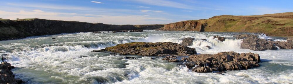
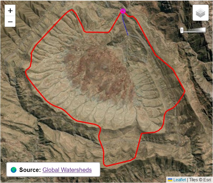
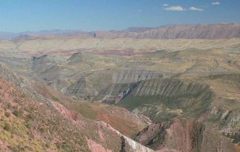
I was delighted by the look of this watershed. Can you figure out where it is?
Just a few kilometers west of Bolivia’s capital, Sucre, lies the Maragua Crater, the site of a long-ago asteroid impact.
All of the top search results are about hiking out to visit it. There are 2,000 year old cave paintings, fossil dinosaur footprints, and incredible multicolor rock formations. Wow, new place to add to the bucket list!
I recently became aware that the Global Watersheds app occasionally goes down when it’s under heavy load. At its peak, the app is delivering a watershed every 1.2 seconds. You all are loving the site to death! 🙂
I’ve upgraded my hosting plan to 2GB of RAM. Let’s see how much that helps. It costs a few hundred dollars per year, which is a lot for a hobby project by a full-time student. If you’ve enjoyed using the app, or it’s been valuable in your work, would you please support it by sending a few dollars? Thank you! 🙏 💕
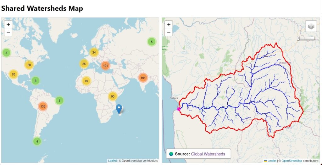
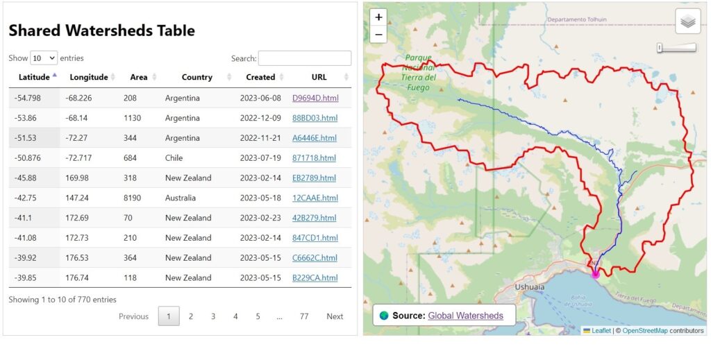
The Global Watersheds web app has a nice feature that it seems only a few people have discovered. You can create a permalink to an interactive map of your watershed (or flowpath). Then you can embed the map on a web page, send it to a friend, or post it on your favorite social media site. Just look for these buttons at the bottom left after you have created a new watershed:
Since the app was launched in October 2022, users have created 770 shared watersheds. Here is a map and a table showing all of them. In that same time, users have made over 237,000 watersheds and over 36,000 flow paths.